Real Estate Logos – Building Identity and Trust
Real Estate is an extremely responsible business in which a large part of success depends on trust and reliability. Any commercial transaction with real estate is an extremely responsible step for both an ordinary person and a business. Therefore, the logos of real estate companies should be clear, simple, understandable, inspire unconditional trust, and emphasize stability and reliability.
A logo is a distinctive mark that sets a company apart from its competitors. If you look at the logos of companies that exist on the world market today, the majority of them are of the same type. The image of a house, roof, keys, city landscape – all this is somehow played out in the emblem, with the addition of any elements of changing the color scheme.
Most often in the logos of real estate agencies, there are combined variants consisting of a logo-text and a graphic image. However, companies and the luxury segment are increasingly resorting to the use of modest and elegant monograms.
When choosing a color scheme that will become dominant in the logo, it is worth considering the business values of the company. This will create an emblem that will correctly position the real estate agency in the market of services and attract the attention of potential clients.
The traditional color scheme for real estate company logos includes blue – the color of constancy and confidence, green – a symbol of prosperity and prosperity, as well as warm shades of red and brown, which perfectly convey the state of comfort and tranquility.
Today we want to look at the logos of the world’s most famous real estate companies together with you, and maybe trace some regularity in their design. Let’s get started.
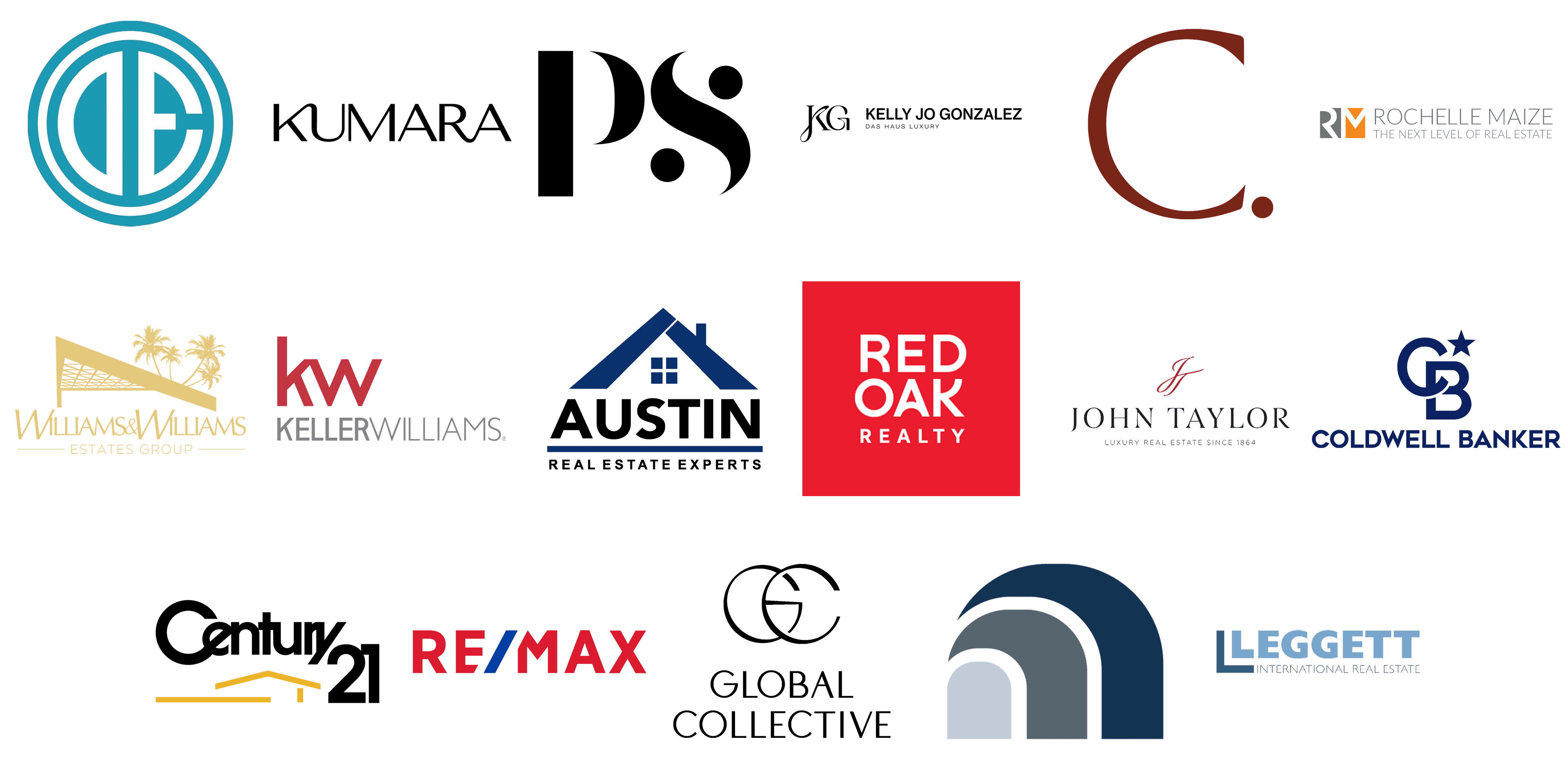
Century 21
![]()
The Century 21 logo is somewhat recognizable in dozens of countries across the globe. The combination, set in black and yellow, has its emphasis on the lettering, which is set in a geometric designer sans-serif typeface on bold black lines above the lightweight yellow schematic image of a house roof. This badge perfectly reflects the purpose of the company and looks very modern and strong.
Kelly Jo Gonzalez
![]()
One of the most luxurious logos in the real estate segment is the Kelly Jo Gonzalez insignia. The black-on-white badge is composed of an emblem, consisting of a fancy KG monogram, and uppercase lettering in a classic sans-serif with thick distinctive lines of the characters. The monogram is set in a sophisticated designer font with elongated and curved loop bars of letters.
RE/MAX
![]()
Probably, one of the most recognizable real estate insignias is the RE/MAX one. It is a bold uppercase logotype in scarlet red, with the blue stash after the “Re” part. The stash cuts off the upper left corner of the capital “M”, and the bottom right one from the “E” in “Re”. The logo is set on a plain white background, making up the perfect tricolor, which evokes a sense of precision, excellence, and professionalism.
Coldwell Banker
![]()
The Coldwell Banker logo is very chic in its simplicity. First of all, the luxurious color palette, which is navy blue in white, makes the badge look elegant and confident. Secondly, the combination of the logo, made of an enlarged emblem and a wordmark in small caps, creates a sense of trustworthiness and excellence. The emblem of the real estate agency is the CB monogram with intertwined sans-serif capitals, accompanied by a solid five-pointed star.
Austin Real Estate Experts
![]()
The visual identity of Austin Real Estate Experts agency looks quite traditional with the stylized triangular roof of a house drawn above a two-leveled lettering, with the levels separated by a thick horizontal line. Both the line and the emblem are set in a deep and calm shade of blue, while the uppercase inscriptions are written in black. The clean contours and stable shapes of the characters and graphical elements evoke a sense of reliability and trustworthiness and are elevated by the strong color palette.
Leggett Prestige
![]()
Leggett Prestige is another real estate brand, that uses blue as the basis for its color palette, but here blue is tender and airy. The lightness of the color is balanced by the heavy and stable uppercase characters, which make up the main element of the logo. The light-blue inscription is accompanied by a minimalistic geometric emblem in the shape of the letter “L”, enlarged, and placed on the left from the wordmark, in a darker shade of blue, supported by a lightweight tagline.
Douglas Elliman Real Estate
![]()
The Douglas Elliman Real Estate logo is cool and memorable. Unlike other agencies from the list, this company uses a graphical emblem with no additional lettering. The emblem is a solid turquoise circle in a double outline in turquoise and white, and the stylized white “DE” monogram with the letters placed back-to-back, hence the “D” here is mirrored. The roundel has a very interesting geometry due to the similar shapes of the characters and a thinner outline.
Global Collective
![]()
The logo of the Global Collective real estate company looks like a fashion brand insignia due to the use of a fine and elegant typeface for its enlarged “GC” monogram with two lightweight overlapped characters. The stylish emblem is accompanied by two-leveled lettering with the full name of the real estate agency written in the uppercase of a sophisticated sans-serif typeface. The use of the classic black-and-white color palette only elevates the chic of the Global Collective logo.
John Taylor
![]()
Another sophisticated insignia is the one owned by John Taylor Luxury Real Estate. The elegant uppercase lettering with delicate triangular serifs on the ends of thin bars is set in black against a plain white background, and accompanied by a fine emblem above it and a light sans-serif tagline in small caps. The emblem of the agency is a stylized cursive “JT” monogram in burgundy red, with elongated and slightly curved lines and a light inclination to the right.
Red Oak Realty
![]()
The Red Oak Realty logo is very confident and powerful, due to the use of an intense red and white color palette and a simple composition, but with interesting elements. The badge is composed of a solid red square with white lettering written on it in three levels — the enlarged “Red Oak” and the lighter and smaller “Realty”. The sans-serif typeface of the inscription has such unique features as arched short bars of the “R”, “A” and “K”, which create an interesting ornament inside the simple image.
Kumara Wilcoxon
![]()
The Kumara Wilcoxon logo is very interesting and stands out from the list of its competitors due to interesting connection lines between some of the characters in the inscription. The only element here is the uppercase wordmark in black, set on a white background, and nothing else. The distinctive geometric typeface of the lettering would look quite usual if there were no smooth connections between “K” and “U” and “R” with “A”. The first pair is connected in the top part, while the second — is at the bottom, making up kind of a wave in the logo.
Keller Williams
![]()
The Keller Williams visual identity is pretty simple, yet looks strong and confident due to the use of the red and gray color palette, where red is represented by its calm darkish shade. The enlarged lowercase monogram in a geometric sans-serif typeface is accompanied by a gray uppercase tagline, where both parts of the inscription use two thicknesses of one sans-serif font. This difference of weights works as a good harmonizer, as the thicker “Keller” becomes a full-fledged underline for the “KW”.
Philip Scheinfeld Team
![]()
Philip Scheinfeld’s visual identity is all about luxury and elegance. The badge has just two elements — the black uppercase “P” and “S”, placed against a simple white background. But here everything is about the style of the lettering. It is a thick designer typeface, with solid black roundels on the ends of the “S” line. Both the “P” and the “S” have their alleged thinnest lines erased, hence the “P” is made of two elements, and the “S” — of three.
Rochelle Maize
![]()
The visual identity of the Rochelle Maize real estate company is composed of a simple emblem and two-leveled lettering in a lightweight sans-serif typeface. The minimal thickness of the bars is intensified by the light shade of gray the wordmark is written. As for the emblem, it is formed by two squares — a dark gray with the white capital “R” on it, and an orange with the white “M”. The emblem is not framed, so the left bar of the “R” and the right bar of the “M” are dissolved on a white background.
Carolwood Estates
![]()
Another chic logo from the list is the one from the Carolwood Estates company, apart from being one of the most elegant badges, it is also the most minimalistic one. The logo consists of just one letter — a capital “C” with a solid dot after it. The “C” is set in a sophisticated font with flared ends of the lines and sharp cuts. The most important elements here are the typeface and the color, which is dark burgundy. This shade is all about luxury and excellence.
Williams & Williams Estates Group
![]()
The logo of the Williams & Williams Estates Group probably has the biggest amount of elements of all the companies from the list. However, it is balanced by a laconic color palette, which is just two shades — golden for the lettering and the emblem, and plain white for the background. The composition is based on an image of a triangular awning and four palm trees in the distance, and a sharp uppercase lettering under it, with both “W”s enlarged.
The Morgan Group
![]()
And one more cool minimalistic logo for today — the Morgan Group badge. You will find not a single letter here, just three geometric segments, making up a stylized arch. The smallest element is drawn in a light blueish shade of gray, the middle one — in dark gray, and the largest fragment of the arch uses a deep shade of blue, which evokes a sense of professionalism, stability, and trustworthiness. Overall this logo looks very confident and strong.