Aflac Logo
American Family Life Assurance Company is the largest supplier of additional insurance in the United States. Aflac’s strong point is its cancer insurance, which makes up for everything that comprehensive health insurance does not cover. It is renowned for providing payroll insurance. It provides cash benefits when the individual is unable to work following an accident or due to a serious health condition. Its disability insurance covers not only cases when an individual has cancer or heart attack, but also maternity, which allows parents to focus on their health and the baby instead of work.
Meaning and History
The Aflac insurance company began to provide its services in the 1950s. It was originally known as the American Family Life Assurance Company and provided health insurance to individuals through companies, which promoted it to their employees. In the early 1970s, the management recognized Japan as a chance to expand its market given the growing competition in the US. According to active insurance policies, Aflac is the largest Japanese insurance business. With any growth halt, the company has a chance to simply transfer its services to other markets, particularly emerging ones. In just a few years, the number of states it covered grew from 11 to 42 as of 1971. Aflac was listed on NYSE almost twenty years after the foundation.
What is Aflac?
Aflac offers insurance many are not aware of. Its payroll insurance coverage guarantees that an individual will keep on receiving a salary (often on top of disability payments from the state) in unfortunate situations. In addition, the insurance provider can reimburse for hospital treatment and offers life insurance among other options.
1964 – 1990
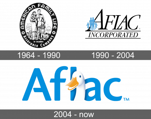
The first logo appeared only in 1964. The emblem was an image of a happy family that perfectly went along with the name inscription. The latter was written on the black oval border around the image. The white, uppercase letters contrasted nicely against the dark background. The family of four was standing with trees and sky in the background, which created a positive impression. The whole emblem was black and white.
1990 – 2004
the next logo had a more modern and professional look. It was an abbreviation of the company’s name with “Incorporated” written in smaller font underneath it and framed by two lines above and below. The company used black for the name but added a sky blue element with small silhouettes of a family of four. They slightly overlapped the letter “A” and created a feeling of trustworthiness and reliability.
2004 – Today
A duck became the new symbol of the company. It appeared when the art director was trying to think of good advertising for the company. Then, he realized that the sound of the name is very similar to the sound the ducks are making. This idea was successful as the duck got quickly associated with the company. Its head, turned slightly to the left, was placed in front of the abbreviated form of the name right between the “L” and “A”. The name was done in a light blue, which created an association with the previous logo.
Font and Color
Initially, the company used black and white color palette, which was typical for that time period. The font was bold and had rounded elements. Otherwise, it was quite basic without serifs or any other fancy elements. The next logo featured a serifed, italicized font. The black color and a more exquisite look of the font give the logo a more professional appearance. There is also a bit of blue, which stands for stability, loyalty, and confidence. The blue color was used as the main color in the latest logo. It also featured white and orange colors in the form of a duck, which evoke a sense of safety and positivity.
