AIA Logo
AIA Group provides financial and insurance services, including life insurance for both individuals and businesses, as well as accident and health insurance. It also offers commercial services, investments, as well as retirement planning, and other valuable services. Over time, the number of AIA’s competitors had grown. Nonetheless, AIA had built up a large portfolio of clients and continued to broaden its base. It is successfully serving many countries in the Asia Pacific region.
Meaning and History
The company’s roots go back to the beginning of the last century. It was 1919 when Cornelius Vander Starr established what was then known as American Asian Insurers (later American International Insurers). It started in Shanghai, China. Over time, Starr expanded his business around the world. Following the invasion of China, the headquarters got moved to New York in 1939. The company has grown by acquiring other companies as well as entering into long-term agreements and partnerships. The beginning of the Covid-19 pandemic has affected the profits of this company. In 2021, though, Hong Kong’s largest insurance group AIA Group strengthened its presence in the Chinese market. It purchased a 24.99% stake in China Post Life Insurance.
What is AIA?
AIA Group Ltd. provides general insurance services. The goal of the company is to support individuals in living healthier, better lives. It has a presence in about 20 markets around the Asia Pacific area. Hong Kong currently serves as the main office location.
1983 – 2008
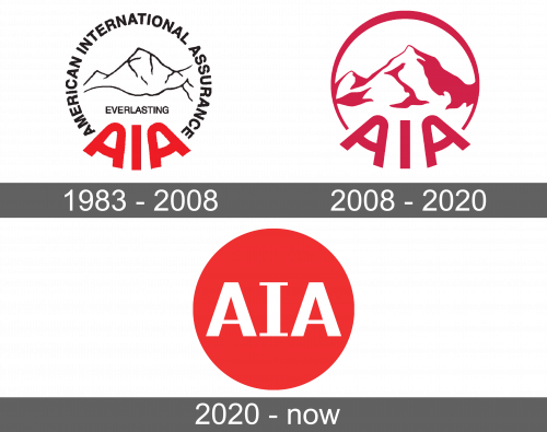
The logo was conservative. At the same time, it looked professional and sophisticated. It had an abbreviated name at the bottom done in bright red, uppercase letters. It was accompanied by the full name written in black and smaller font. Both inscriptions formed a circle that featured an outline of the Everest mountain in the center. Under the mountains, it also said “Everlasting”.
2008 – 2020
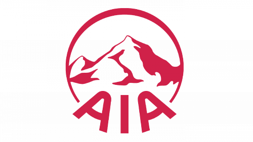
The next logo simplified the original version even more. It gave it a red and white color palette for a bold, strong, and impactful appearance. The mountain image that was kept symbolized the heights that the company wants to achieve as well as its superior current state. It left only the abbreviated version of its name at the bottom without changing the name. Instead of the inscription forming a circle, there was a simple line with varying thickness.
2020 – Today
To reflect its goal of achieving meaningful influence and impact in the world, a new version of the logo was presented. The new emblem is very simplified and balanced. It presents only the abbreviated form of the name on a red circle. The font is white with the letter “I” having serifs.
Font and Color
The company used two different fonts in its original logo. The full name was done using a very basic sans-serif font, while the abbreviation had more rounded shapes. The latest version also features a simple font with straight lines and some serifs. The logos always had at least some red elements. The color typically stands for power, strength, and energy. It is typically accompanied by black, a color that gives it a more formal and classic look.
