Allstate Logo
Allstate is one of the largest insurance agents in the US. The lion’s share of the company’s sales comes from car and home insurance policies. Also, it provides life and health policies as well as the ability to buy an annuity or choose options for coverage in case of a disaster or accident. At the same time, the company’s financial division offers investment products aimed at the middle class. Building on its long history, Allstate can offer products to meet its consumer needs.
Meaning and History
Allstate spun off its “parent” company, Sears, Roebuck, and Co. in 1931. Initially, it was not an insurance business at all, but a tire business. The idea to provide insurance was quite spontaneous. In 1934, the first office of the new insurance company was opened in Chicago. Despite all efforts, by 1941 only a quarter of all American car owners were insured. To boost insurance sales, a local law was passed that made the car owner financially liable for car accident injuries, and within 15 years, other states followed. Gradually, the list of insurance products expanded. A representative office was also opened in Canada. By the end of the 60s, the Allstate Corporation brand was finally formed as a dealer in tires, batteries, and insurance.
What is Allstate?
Allstate is one of the largest insurance companies in the US. It has a strong position in the life insurance industry, providing protection plans for a wide range of consumer products. Property insurance and accident protection is the company’s largest and most profitable business.
1955 – 1969
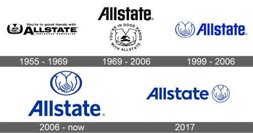
Although this is an original logo, the future logos were based on this version. It featured the name of the company in bold, uppercase letters. The first letter was stretched out lower, framing “Insurance Companies” written underneath in smaller font. Its slogan (You’re in good hands with) was placed above. To the left, there is a rectangle with rounded corners and hands holding a house.
1969 – 2006
The name of the company was done using a different sans-serif font with a combination of straight and diagonal cuts. It was accompanied by an outline of hands holding an automobile with a roof on top of it, representing the wider range of products it offered. The hands were placed on a white background with the slogan written around them and forming a frame.
1999 – 2006
The company presented an even more simplified version of its logo in 1999. It kept the same wordmark but made the whole logo a bright blue color. The hands were placed in an oval frame without holding anything. They were already a symbol of protection and reliability.
2006 – Today
There was only a minor update in 2006. First of all, the company went for a darker and more pleasant shade of blue. Although the font was changed, the overall look of the wordmark stayed the same thanks to the slanted “A”. The hands emblem was moved above the wordmark.
2017
For a short period, the company used a logo with a hands emblem on the right. It featured the hands in a round frame instead of a typical oval one. In addition, the designers played with the font again, changing small details, such as adding diagonal cuts.
Font and Color
Until 1999, the company’s logos had black and white color palettes. Afterward, it was replaced by different blue of different shades. When it comes to fonts, the company always went for relatively simple sans-serif options. A unique feature of most logos is the first letter “A”, which had only one vertical line written diagonally, while the other was drawn straight.


