Houston Rockets Logo
The Houston Rockets are a professional basketball team competing in the NBA’s Western Conference. Based in Houston, Texas, they strive to secure championships and maintain fan engagement. The team has seen various highs, including multiple title wins. Owned by Tilman Fertitta, the Rockets not only focus on games but also on community outreach and regional promotions. Their primary market remains basketball enthusiasts and the Houston community, while also attracting international fans thanks to past and present global star players. The team’s operations extend beyond the court, encompassing merchandise, media rights, and partnerships.
Meaning and history
The Houston Rockets, established in 1967, began their journey in the NBA as an expansion team in San Diego. The name “Rockets” was apt, considering the city’s strong ties to the space industry. After four seasons, in 1971, the franchise relocated to Houston.
Ownership transitions marked the team’s history. Robert Breitbard was the team’s initial owner in San Diego. After the move to Houston, the team changed hands several times. In the 1980s, Charlie Thomas took the reins. Les Alexander bought the Rockets in 1993 for $85 million, marking a significant era that saw the Rockets clinch two NBA Championships in 1994 and 1995, led by the legendary Hakeem Olajuwon.
Over the years, the Rockets have been home to several NBA legends, including Yao Ming, Tracy McGrady, and James Harden, expanding their fanbase globally. Harden’s era saw the team frequently making the playoffs and becoming title contenders.
In 2017, Tilman Fertitta acquired the Rockets from Les Alexander for a staggering $2.2 billion, setting a record price for an NBA franchise sale. Under Fertitta’s leadership, the team has maintained its competitive edge, though the pursuit of another championship remains ongoing.
Off the court, the Rockets have seen shifts in branding and jerseys, with the rocket-themed motifs being consistent. The team’s influence has grown not only in the Southwest but across the world, mainly due to the global impact of players like Yao Ming.
The Rockets’ history is rich with highs and lows, star players, and memorable moments, and as they move forward, their legacy in the NBA continues to be written.
1967 – 1971
Before becoming the Houston Rockets, the team was known as the San Diego Rockets. Their emblem featured a chic design: a deep blue rocket soaring over a rich brown basketball backdrop. Encasing this motif were dual arching rectangles in a vibrant green shade, with “san diego” and “ROCKETS” emblazoned in a sunny yellow hue. To denote their affiliation, the initials “N.B.A.” were prominently inscribed in crisp white letters on the rocket’s body. This design captured both the spirit of the team’s location and their ambitious trajectory in the league, establishing a visual identity in line with their aspirations and roots.
1971 – 1972
Following the team’s move to Houston, a fresh emblem was introduced in 1971. This revamped design showcased a whimsical portrayal of a basketball athlete with a rocket jetting from his rear. Adorned in a lively mix of yellow and red shades, this color combination soon earned the playful moniker “Ketchup and Mustard”. Despite its vivacious and humorous vibe, the emblem had a brief stint, gracing the team’s branding for just a single season. This fleeting design was a reflection of the team’s adaptability and desire to continuously evolve their brand identity in line with their ambitions and audience preferences.
1972 – 1995
Holding onto the distinct yellow-red palette, the creators fashioned a more streamlined logo, earning the playful moniker “mustard and ketchup.” Central to this new design was a golden-hued basketball, emblazoned with the uniquely styled ‘ROCKetS’ inscription in bold black. Flanking this focal point were twin scarlet crescents, framing the pristine “HOUSTON” in white. This revamped emblem encapsulated both the team’s name and its city, presenting a fresh yet familiar look that resonated with the team’s spirit and identity. The modern touch while paying homage to their colors reflected the evolution and dynamism of the team.
1995 – 2003
In 1995, the Houston Rockets initiated a creative contest, inviting fans to propose designs for a revamped logo. From the myriad of submissions, the team gravitated towards a unique concept from artist Thomas Nash, which showcased a globe-like basketball orbited by a rocket. This initial design was later refined by Chris Hill, culminating in the emblem’s finalized version. However, Nash found himself embroiled in a legal battle over unpaid prize money.
The revised emblem introduced a whimsical twist: the rocket’s apex resembled a face. The pointed end took on the appearance of a nose, augmented by stern brows, round eyes, and a menacing mouth replete with shark-like teeth. This playful rendition was tailored to align with the NBA’s inclination towards more animated logo styles during that era.
2003 – 2019
During the 2003-2004 campaign, the team unveiled a fresh logo, a creative brainchild of Alfafa Studio in collaboration with designer Eiko Ishioka. The inventive minds behind the design visualized a grand “R” emblematic of a rocket ascending skyward. Encircling this dynamic letter was a crimson hoop, symbolizing the central circle found on a basketball court. This prominent “R” ingeniously bisected the inscriptions “HOUSTON” and “ROCKETS,” both rendered in a distinct and unconventional typography. This reimagined design not only captured the essence of the team but also paid homage to the sport itself.
2019 – Today
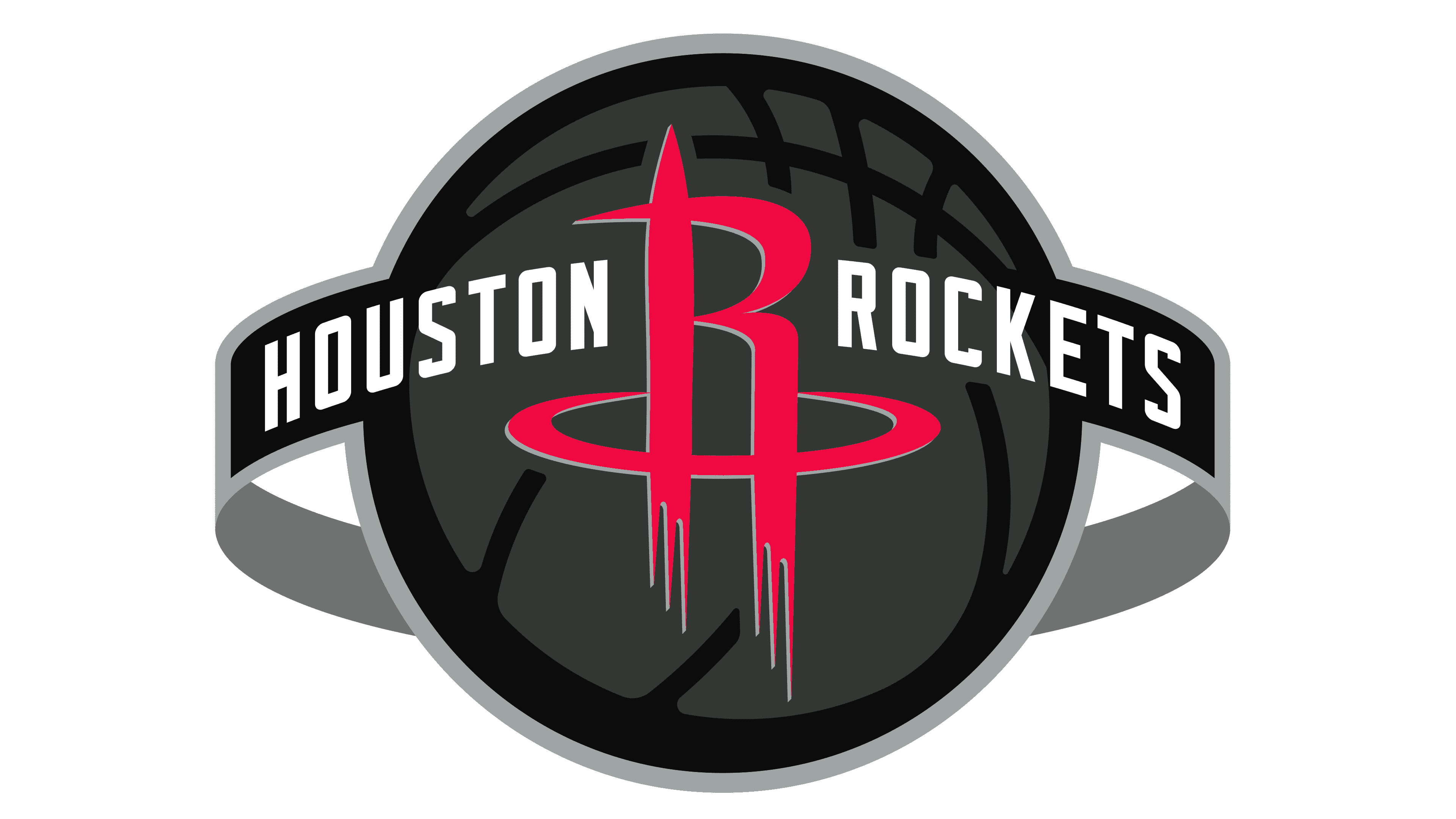
In 2019, the Houston Rockets embarked on a brand transformation, further emphasizing their celestial connection. The emblem encapsulates the very essence of space, with a basketball symbolizing a gray-and-black planetary body. Encircling this celestial sphere is an orbital band inscribed with the “Houston Rockets” in a pristine white font. Prominently displayed in the forefront is a vibrant rocket-inspired “R,” which remains the focal point of the team’s branding. The intriguing fusion of graphite gray, intense black, and vivid red serves as a testament to the team’s ambition and promises a successful trajectory.


