Missouri Tigers Logo
The Missouri Tigers represent the University of Missouri in NCAA Division I sports. Known for their competitive spirit, they’re a part of the Southeastern Conference (SEC). The teams include football, basketball, and more, showcasing athletic prowess in various sports arenas. With a rich history dating back to the 19th century, the Tigers have achieved numerous accolades, including bowl appearances in football and NCAA tournament spots in basketball, reflecting their strong sports tradition and dedication to excellence.
Meaning and history
The Missouri Tigers, the athletic teams of the University of Missouri, have a storied history in collegiate sports. Founded in the late 19th century, their journey began with their football team’s inaugural season in 1890. Originally part of the Missouri Valley Intercollegiate Athletic Association, the Tigers have since transitioned through conferences, now competing in the Southeastern Conference (SEC).
Football has been a cornerstone of their legacy. The team gained prominence with multiple conference titles, significant bowl game appearances, and notable rivalries, especially with Kansas, stemming from historical events dating back to the Civil War era.
Basketball also plays a vital role in their heritage. The men’s basketball team, established in the early 1900s, has seen numerous NCAA tournament appearances, showcasing talent and competitiveness on the national stage.
Beyond these, the Tigers excel in other sports like baseball, track and field, and wrestling, contributing to their overall athletic reputation. The wrestling team, in particular, has garnered national attention with multiple individual NCAA champions.
Throughout their history, the Missouri Tigers have not only demonstrated athletic excellence but also contributed to the spirit and identity of the University of Missouri. Their mascot, Truman the Tiger, named after Missouri-born President Harry S. Truman, embodies this spirit.
1980 – 1995
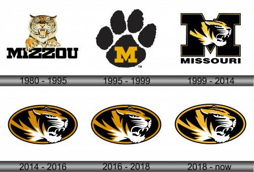
The emblem features an illustration of a tiger, mid-roar, encapsulating the ferocity and tenacity of the Missouri Tigers. Detailed with a blend of orange and beige, the tiger’s fur boasts realistic textures that convey a sense of movement and liveliness. Its eyes, fiercely set and keen, exude an aura of determination, mirroring the resolve of the athletes it symbolizes. Beneath this mighty feline, the word “MIZZOU” anchors the logo, presented in bold, capital letters that command attention. This typography conveys a sense of solidity and tradition, much like the institution it represents. Overall, the logo serves as a visual rallying cry, unifying and inspiring the university community and its supporters.
1995 – 1999
This emblem presents a bold, black tiger paw print, with a prominent golden “M” at the center, symbolizing Missouri Tigers’ pride and strength. Unlike the previous logo, which depicts a vivid tiger’s face, this design opts for simplicity and a direct association with the tiger’s powerful presence. The paw print serves as a universal mark of the tiger, implying the impact and imprint the university’s teams aim to leave in collegiate sports. Both logos share a common theme of tiger imagery, yet while the former focuses on fierce detail, the latter embraces minimalistic symbolism.
1999 – 2014
This logo merges the boldness of Missouri’s “M” with the fierce profile of a tiger. Set against the backdrop of the letter, the tiger’s face is stylized with sharp lines, contrasting with the paw print of the previous logo. The black and gold color scheme remains, signaling continuity, but the tiger’s aggressive expression and prominent mane add dynamism. “MISSOURI” is inscribed below, tying the imagery to the institution. This design speaks to tradition and modernity, a step beyond the simplicity of the paw print to a more intricate representation of the mascot’s vitality.
2014 – 2016
The logo is a stylized tiger’s head set within a circular frame, a dynamic blend of black and gold lines creating a striking profile. This design deviates from the previous logo’s combination of letter and mascot, focusing solely on the tiger’s visage, which is both majestic and aggressive. The circular boundary adds a sense of unity and completeness, encapsulating the tiger’s essence. The contrast between this and the earlier ‘M’ logo lies in the absence of text, allowing the tiger alone to symbolize the Missouri Tigers’ identity.
2016 – 2018
The logo showcases the tiger’s profile in a more subtle color palette, with brown tones lightened to softer tones, which increases visual depth and highlights the tiger’s features. This subtle shift in shade creates a more vibrant and dynamic aesthetic compared to earlier versions, reflecting a modern take on the university’s branding. The tiger’s expression remains intense and focused, encapsulating the spirit of the Missouri Tigers with a refreshed, contemporary look.
2018 – Today
This logo showcases the Missouri Tigers’ athletic spirit, featuring a tiger’s profile in stark black, white, and gold hues. Contrary to previous iterations, this design doesn’t include a lighter brown but uses a rich gold to highlight the tiger’s stripes and mane. The feline’s features are sharp and the gaze intense, set against a black backdrop encircled by a thick golden rim. The use of the oval frame focuses the viewer’s attention on the tiger’s face, symbolizing the team’s fierce focus.
