Parramatta Eels Logo
The Parramatta Eels are one of the Australian clubs that compete in rugby league football. Moreover, it takes part in junior competitions held by the governing body of the rugby league in the New South Wales, where they usually win numerous awards in a range of divisions. Only in the 1970s did the Parramatta eel become the club’s official mascot, as using a nickname or mascot was uncommon earlier.
Meaning and History
The Parramatta County Rugby League Football Club was established in 1947. Their name comes from the place where the eels live but in the language of the aborigines. The Cumberland Oval Stadium, which was renamed Parramatta, served as their home field. The team managed to get to the grand final two times in the late 70s but lost both times. Fortunately, the 80s marked the beginning of their most thriving decade. The team competed in five grand finals and managed to win four premierships in just six seasons. Their history has many other ups and downs.
What is Parramatta Eels?
The Parramatta Eels are a Sydney professional rugby league football team. Although it does not rank at the top, the club has many successful games. It has been over half a century now that the eels have been the key element of their identity.
1947 – 1974
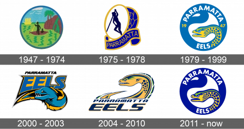
The original emblem looked more like an abstract drawing of some rural place. It is inspired by the emblem of Parramatta city, depicting the river of the same name and some fishermen. It features a green, blue, and brown color palette with some black and white. The emblem was round with a blue border. The emblem is meant to honor the original tribe that lived in this place.
1975 – 1978
The new logo was a simplified version of the original one. It featured just a silhouette of a fisherman with a slightly tilted white oval shape as a base. It had a golden border. Behind it, there was another blue oval shape with abstract golden lines. A ribbon with the club’s name on it completed the overall image. It was blue with a golden border, which was also used for the name. It looked very modern and stylish.
1979 – 1999
The new logo had a round shape like the original one, however, it had a blue and yellow eel as the center image. The emblem had a thick blue border with white swoosh lines. The name was written at the top and the bottom right on the border. It featured a basic font with all uppercase letters done in white. The foundation year was also specified on the emblem.
2000 – 2003
The eel on this logo looked more playful with a cunning look. It looked as if the snake was carrying the word “Eels” on its back, with “Parramatta” written in smaller and simpler font above. The word “Eels” was done in blue with a yellow background and black outline. The snake was done in the same color palette, only using a different shade of blue.
2004 – 2010
The new design looked quite striking. The eel drawing was still part of the emblem. this time. it had more yellow with just a bit of black and green for details. The snake’s head and tail were peaking from behind the name. The latter was done using an italicized font with smooth lines and rounded corners. It looked as if it was inspired by the snake itself.
2011 – Today
The logo designed in 1979 was brought back. It had a more modern appearance thanks to the usage of a deeper blue shade. This made the name and the snake pop against the background. In addition, the establishment date was removed.
Font and Color
With an exception of the original logo, which was more colorful, the yellow (golden) and blue colors were always the main colors of the emblem. The white and black colors were also used, although they typically did not draw attention to themselves. There was not as much consistency when it comes to the fonts used by the club. In most cases, it was a basic, sans-serif font. However, the logo introduced in 2000 featured a fancier font with pointed serifs. A logo used during the 2004 – 2010 period also features a different font. It had smooth, curved lines to resemble a twisted snake.
