Geico Logo
Geico excels in auto insurance and also provides property and business insurance. It serves the U.S. market with a direct-to-consumer model. A Berkshire Hathaway company, Geico offers affordable policies and iconic marketing with a gecko mascot. Its diverse coverage, online accessibility, and robust finances make it prominent in U.S. insurance. The company’s innovative marketing strategies have contributed to its strong brand recognition. Geico’s adaptability has enabled it to stay competitive in a rapidly changing industry.
Meaning and history
Founded in 1936 by Leo and Lillian Goodwin, Geico began as an insurer targeted at U.S. government employees and military personnel. This strategic focus provided a steady initial customer base, allowing Geico to establish itself in the competitive insurance market.
As the company progressed into the 1950s, it broadened its horizons beyond its original clientele, gradually transitioning into the wider insurance market. This period was marked by a substantial growth in policyholders and an increasing national footprint. The handover of leadership from Leo Goodwin to Lorimer Davidson, an investment banker, in 1958, marked a pivotal moment in the company’s expansion.
However, the 1970s presented significant financial hurdles for Geico. The company found itself on the brink of bankruptcy, but under the guidance of CEO John J. Byrne, it underwent a critical transformation. Byrne’s strategies, which included increasing rates, cutting costs, and focusing on more profitable customer segments, successfully steered the company back to financial stability by the 1980s.
A major milestone was reached in 1996 when Berkshire Hathaway, led by the renowned investor Warren Buffett, acquired full ownership of Geico. Buffett’s connection with Geico dated back to the 1950s when he first invested in the company. Under Berkshire Hathaway, Geico experienced substantial growth, propelled by its direct sales approach and expansive advertising efforts. The introduction of the Geico Gecko in 1999 became a hallmark of its marketing strategy.
Into the 21st century, Geico has solidified its position as a top auto insurance provider in the U.S. It has diversified its portfolio to include a wide range of insurance products, such as motorcycle, homeowners, renters, and business policies. Geico’s evolution is characterized by strategic decision-making, overcoming financial challenges, and innovative marketing. This journey has not only enabled Geico to thrive in a constantly evolving industry but also cemented its reputation as a key player in the American insurance landscape.
What is Geico?
Geico, primarily known for its auto insurance products, operates as a subsidiary of Berkshire Hathaway. Famous for its quirky ads featuring a talking gecko, Geico offers a range of insurance services, including vehicle, property, and business coverages, predominantly in the United States.
1936 – 1951
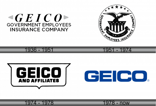
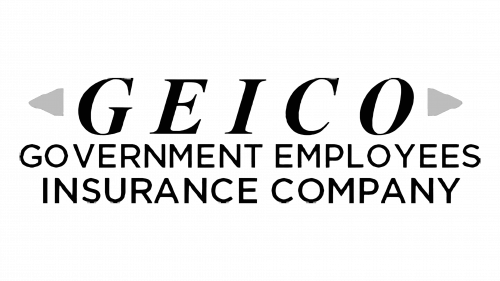
The logo is a bold, monochromatic representation of the acronym “GEICO,” which stands for Government Employees Insurance Company. The full name of the company is spelled out beneath the acronym, ensuring clarity about the entity it represents. The font used is sans-serif, which gives the logo a modern and clean look, suggesting a straightforward, no-frills approach to business. The capitalization of all letters in the acronym conveys a sense of solidity and reliability. Overall, the logo’s design is minimalistic, favoring function and readability over ornate design, which aligns with the company’s ethos of providing direct and accessible insurance services.
1951 – 1974
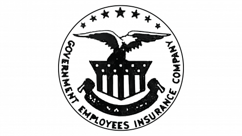
This logo depicts a more elaborate and classic design compared to the previous one. Enclosed within a circular border, the words “Government Employees Insurance Company” curve along the edge, with the abbreviation “GEICO” absent, unlike the previous iteration. At the center, an eagle with outstretched wings perches atop a classical column, symbolizing strength and stability, attributes well-suited to an insurance company’s identity. Below the eagle, a banner wraps around the column, reinforcing the logo’s symmetry and balance. This design evokes a traditional American motif, resonating with the company’s initial government employee customer base. The use of an eagle marks a significant departure from the minimalistic and modern approach of the previous logol.
1974 – 1978
The logo simplifies its aesthetics compared to its predecessor, focusing on bold typography within a speech bubble-like shape, which suggest communication and dialogue. The acronym “GEICO” is prominently featured, with “AND AFFILIATES” in a smaller size below, implying a broader corporate structure. This design eschews imagery for a straightforward, textual approach, emphasizing the company’s name as its primary identifier. The choice of a heavy, blocky font projects strength and modernity, contrasting with the previous logo’s more classical and ornate design that featured an eagle and patriotic symbols. The speech bubble contour adds a friendly and approachable aspect, aligning with the firm’s customer-centric business approach. This version of the logo marks a shift towards a more contemporary and accessible corporate identity.
1978 – Today
The logo is sleek and contemporary, with “GEICO” in bold, sans-serif letters colored in deep blue. Its simplicity, devoid of extra imagery or text, spotlights the brand name, contrasting with the prior logo’s speech bubble. Blue conveys trust and reliability, essential for an insurer’s reputation. This logo marks a move towards a streamlined, modern identity, valuing simplicity and recognizability. The ® symbol denotes Geico’s established brand and legal safeguarding. The design’s clean lines and minimalism indicate a modern, effective business model. It stands out for its visual clarity and ease of brand recall in a crowded market.
