Cigna Logo
Cigna is a company that operates in the insurance and financial field. The corporation provides group life, accident, disability, and dental policies in addition to healthcare, as well as pension, profit-sharing, and investment management. Individual and group life, casualty, health, and retirement products are also offered outside of the US. At the same time, the main clients of the organization are employers who purchase insurance for their employees.
Meaning and History
The Connecticut General Corporation, which has been operating since 1865, and The Insurance Company of North America merged in 1982 to create a new business. The latter was established at the end of the 18th century and was a reliable provider of property and casualty insurance. Connecticut General Corporation was a provider of life insurance and employee benefits. The arising corporation quickly established itself as one of the biggest US-based worldwide public insurance and financial corporations.
What is Cigna?
Cigna is one of the oldest insurers in the health insurance market, currently offering a wide range of insurance services at the international level. By combining some of the oldest and major firms in the industry, it has established itself as a leader.
1982 – 1993
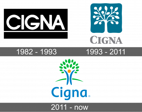
The name of the company served as the key element of the logo. It was done in bold, uppercase letters of white color. The wordmark was placed on a contrasting black rectangle. It used a sans-serif font with straight cuts and slightly rounded corners. The letters “N” and “A” were joined at the bottom, while other letters were simply spaced very closely. To add some interest to the logo, the designers added a thin line under the name.
1993 – 2011
The designers added color to the logo by placing an emblem above the name. It was a turquoise square with uneven, but smooth edges. A white tree was growing from the bottom of the square shape and filling it with its branches and leaves. It was a good representation of a company that was growing and taking care of the health and well-being of others. The name was done in cray using a serif font. Although all the letters looked uppercase, the first one was larger than the others.
2011 – Today
The company preserved the idea of a tree but presented a completely different depiction of it. The tree was placed to the left of the wordmark and had a green curved line behind it symbolizing a green hill. The tree stump was blue with an orange circle in the middle, which resembled an individual stretching out one’s hands towards the sky. There were no visible branches and green leaves formed the crown of the tree. A blue wordmark looked nice next to the emblem. It featured a basic, sans-serif font with only the first letter capitalized. This logo was not too busy, yet the color created a positive and happy feeling.
Font and Color
The company started out with a black and white logo and a basic sans-serif font. In the 90s, the color palette changed to turquoise, white, and light gray. These were muted colors that created a feeling of calmness. Along with the change in colors, there was a modification in the way the name was written. This time, the company went for a fancier font with serifs, although it still featured straight, clean lines. The latest logo used a font that resembled Myriad Pro and Rolphie typefaces. The color palette was more colorful, featuring grassy green, sky blue, and orange.
