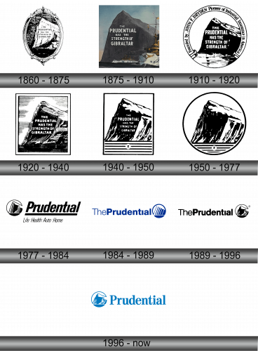
Prudential Financial Logo
Prudential Financial, a global financial powerhouse, was founded in Newark, New Jersey, by John F. Dryden. Initially called The Prudential Friendly Society, it was established to provide affordable insurance to working-class families. Over the decades, Prudential has expanded its reach, offering a wide range of financial products and services, including life insurance, annuities, mutual funds, and investment management, to millions worldwide, embodying its promise to help customers achieve financial prosperity and peace of mind.
Meaning and history
In 1875, Newark witnessed the birth of Prudential Financial, thanks to John F. Dryden’s vision. Initially, it served the working class with insurance. The name “Prudential” symbolized security and trust. By the 20th century, Prudential had become a financial titan. Its portfolio grew, embracing not just insurance but also investments and real estate. Global expansion followed, marking Prudential’s presence worldwide. The Great Depression tested it, but Prudential stood firm, supporting millions. Post-WWII, it fueled America’s growth, entering into pensions and mutual funds. Prudential is a global financial leader, offering diverse services across continents, still committed to its foundational promise of financial security for all.
What is Prudential Financial?
Prudential Financial stands as a beacon of financial strength, originating in 1875 in Newark, New Jersey. With roots in providing accessible life insurance, it has blossomed into a global financial behemoth, offering a spectrum of services from investment management to retirement solutions, dedicated to fostering financial well-being worldwide.
1860 – 1875
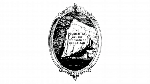
Encased within an ornate frame, the logo features the iconic Rock of Gibraltar, symbolizing solidity. Inscribed boldly, the words “The Prudential has the strength of Gibraltar” convey a message of unwavering reliability and enduring strength, attributes that Prudential Financial has championed since its inception. The monochromatic palette lends a classic touch, echoing a legacy that has withstood the test of time in the financial realm.
1875 – 1910
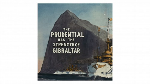
The emblem pairs the Rock of Gibraltar with a tranquil sea, colored to highlight Prudential’s enduring legacy. A steamship against the rock symbolizes Prudential’s progress and resilience through time. Bold text on the rock emphasizes Prudential’s strength and stability in finance.
1910 – 1920
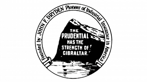
This logo introduces a circular boundary framing the indomitable Rock of Gibraltar, with the bold declaration “The Prudential has the strength of Gibraltar” across it. Notably, it pays homage to founder John F. Dryden, hailing him as the “Pioneer of Industrial Insurance in America”, thus intertwining Prudential’s robust legacy with its visual identity. The design encapsulates a rich history within a simple yet profound emblem, reflecting a legacy of innovation in American insurance.
1920 – 1940
The iteration features a more streamlined design, encapsulating the Rock of Gibraltar within a sharp, rectangular border. Gone are the circular frame and the homage to John F. Dryden, placing entire focus on the rock’s silhouette and the emblematic slogan. This simplification signifies a modern approach, highlighting the rock’s silhouette against a stark background to emphasize Prudential’s enduring solidity and commitment to reliability in the financial world.
1940 – 1950
This logo variation preserves the solid Rock of Gibraltar imagery, now with a stylized “R” at the base. The rock’s portrayal remains a testament to stability, while the simplified sea and sky lines beneath exude calmness and order. The framing, still rectangular, has evolved subtly, incorporating delicate linear elements that add depth and texture to the logo’s perimeter. It’s a nuanced evolution, maintaining the core message of steadfast reliability inherent to the Prudential brand.
1950 – 1977
Transitioning from a rectangle, the logo now takes a circular form, encapsulating the iconic Rock of Gibraltar. This change presents a softer, more universal symbol of wholeness and continuity, aligning with the company’s enduring presence. The “R” remains subtly placed at the base, signifying a quiet yet constant reminder of the Prudential name. The shift to a round shape represents a timeless approach to branding, suggesting inclusivity and stability in Prudential’s financial services.
1977 – 1984
The logo has undergone a substantial redesign, integrating the iconic Rock of Gibraltar within a compact circle beside the bold, capitalized name ‘Prudential’. Below, a new addition lists services: ‘Life, Health, Auto, Home’, directly communicating the company’s diverse offerings. This design shift reflects a modernized, service-oriented branding approach, conveying Prudential’s broadened scope in the insurance and financial sectors with clarity and confidence. The minimalist use of space and clean lines speaks to a contemporary aesthetic.
1984 – 1989
The logo now showcases a streamlined aesthetic with the word “ThePrudential” in a contiguous, bold blue font, signaling unity and coherence. The Rock of Gibraltar motif is reimagined into a simplified, stylized emblem within a circle, reflecting a modern and minimalist design philosophy. This iteration sheds previous details for a clean, contemporary look that underscores Prudential’s progressive ethos while maintaining its recognizable brand symbol. The use of blue symbolizes trust and dependability, key attributes of the brand’s identity.
1989 – 1996
In this evolution, “ThePrudential” remains prominent but the logo now includes a definitive detail: a clear silhouette of the Rock of Gibraltar within a circle. The rock’s outline is crowned with a singular, distinguishing peak, adding a unique touch to the familiar symbol. The overall design is stark, clean, and authoritative.
1996 – Today
In this rendition, the logo shifts to a calming blue palette, both for the text and the emblem. “ThePrudential” is simplified to “Prudential,” embracing a more direct and modern approach. The emblem retains the iconic peak of Gibraltar, now enclosed in a circle with a gradient blue, enhancing visual depth and interest. This color choice symbolizes trust and professionalism, key attributes for a financial institution. The typography is clean, with uniform spacing, reflecting a contemporary, streamlined corporate image.

