Farmers Insurance Logo
Farmers Insurance is a prominent player in the insurance sphere as they control 3-4% of the market. It has over 10 million customers for a reason. Farmers Insurance has around 50 thousand agents and one of the biggest things is that they are fully committed to their employees. It is also quite stable as it has enough money available to pay claims. It is notable that Farmers Insurance does not raise its rates very much in comparison to its competitors when a client has a poor credit score. It is, though, on the more expensive side overall. However, it offers a large number of discounts, which means that customers have several ways to save on their policy. When it comes to claims, the process is relatively simple, including the actual filling and management of an ongoing claim.
Meaning and History
Farmers Insurance is not a new player in the insurance market as it was founded back in 1928. Farmers Insurance was created by John C. Tyler and Thomas E. Leavey as vehicle insurer for farmers and ranchers. Both had experience in the insurance industry and believed that farmers and ranchers offer lower auto insurance risks. Since then, the company has expanded to include not just vehicle insurance, but also homeowners, renters, life, and business insurance. After being owned by B.A.T. For many years, Farmers Insurance changed ownership in 1997 when B.A.T. merged with Zurich Insurance Company, creating a new company called Zurich Financial Services Group.
What is Farmers Insurance?
This is an insurance group that provides various financial and insurance products in the United States. Farmers Insurance has average customer service, which indicates that customers generally have a decent experience when trying to manage their policy or file a claim. It can be a good choice for individuals who want coverage from a larger insurance company with a wide range of services, coverage options, and discounts.
1928 – 1940s
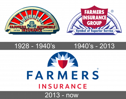
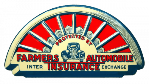
The original logo was detailed and had a car in the center with the inscription “Protected by Farmers Automobile Insurance”. The image and the inscription were set on a 3D half circle with rays that reminded of a crown on the Statue of Liberty. This showed that the company was loyal to the American population. The whole emblem was done in a blue, gold, and red color palette.
1940s – 2013
The company kept a half circle base with rays, although it slightly changed its appearance and used a blue and white color palette. There was no automobile, as the company added other services to the list. A red banner in the shape that reminds of a shield had “Farmers Insurance Group” written in all uppercase, white letters. The base of the half circle had “Symbol of Superior Service” written in blue. Under the emblem, it stated “Farmers” in bold, uppercase letters of red color with pointed serifs.
2013 – Today
The new logo was based on the previous version. The half circle looked more abstract with a smaller red shield shape in the center. Under the emblem, it stated “Farmers Insurance”, which was written in two lines. The first word was written using a similar typeface only without serifs and in blue. The second word was done using a smaller font and red. There were no other inscriptions. Such a simplified version of the original logo made it look more modern and be a good representation of any Farmers service.
Font and Color
Throughout the years, Farmers Insurance used relatively basic bold fonts that looked great back then and still look contemporary and sleek. It played with shadows and serifs to add some interesting touch to the name but left it plain for a modern feel. The color palette is blue, white, and red, which are national colors of the United States. The blue color stands for trust and security, while red is the color of power.
