Indiana Pacers Logo
The Indiana Pacers, an American professional basketball team, call Indianapolis home. Businessman Richard Tinkham, along with his partners, established the team. Their creation aimed at participating in the American Basketball Association (ABA). Indianapolis, Indiana, became the birthplace of this sports entity. The Pacers sought to embody the state’s rich racing heritage, hence their name.
Meaning and history
The Indiana Pacers came into existence in 1967. Initially, they played in the ABA, where they achieved significant success. The team transitioned to the NBA in 1976, following the ABA-NBA merger. Throughout the years, the Pacers have built a strong competitive legacy, marked by multiple playoff appearances. In 2000, they reached the NBA Finals, a milestone in the team’s history. Their journey reflects a commitment to excellence and community representation.
What is Indiana Pacers?
The Indiana Pacers are a professional basketball team based in Indianapolis, Indiana. Competing in the NBA, they have a history of strong performances and playoff appearances. The team’s name reflects Indiana’s racing culture.
1967 – 1976
The logo presents a bold, stylized letter “P” in dark blue, cradling a vibrant yellow basketball. A white hand reaching up implies a player’s skillful handling of the ball. This minimalistic design captures the essence of the game, symbolizing both the team’s name and its basketball roots. The contrasting colors make a striking visual statement, ensuring the emblem stands out. The hand’s detail adds a human touch to the otherwise geometric and abstract depiction.
1976 – 1990
In this evolution of the logo, the design gains the bold inscription “Indiana Pacers” below the graphic. The team’s name, in a sans-serif, uppercase typeface, complements the minimalist art above. The typography is dark blue, harmonizing with the color of the “P” and framing the yellow basketball. This addition reinforces the brand identity, making the team’s origin unmistakable. The white hand remains, preserving the continuity with the previous emblem. Overall, the logo balances dynamism with a clear statement of identity.
1990 – 2005
This iteration simplifies, removing the hand and now featuring three horizontal yellow stripes across the “P”. The stripes suggest speed and motion, resonating with the Pacer’s name linked to racing. The word “Pacers” is positioned directly under the emblem in a simple, clean font, contrasting with the blue background. The basketball, still in yellow, is more integrated within the “P”, giving a seamless appearance. This logo’s design leans towards a more modern and streamlined look.
2005 – 2017
The rendition introduces a silver outline around the “P”, adding depth to the design. The yellow basketball now appears bolder, set against the dark blue, which is more pronounced. The horizontal stripes maintain their presence, continuing the theme of speed and movement. Below, “Pacers” is written in a contemporary font, which seems more pronounced and grounded. The design shifts towards a three-dimensional look, aiming for a sleeker and more polished presentation.
2017 – Today
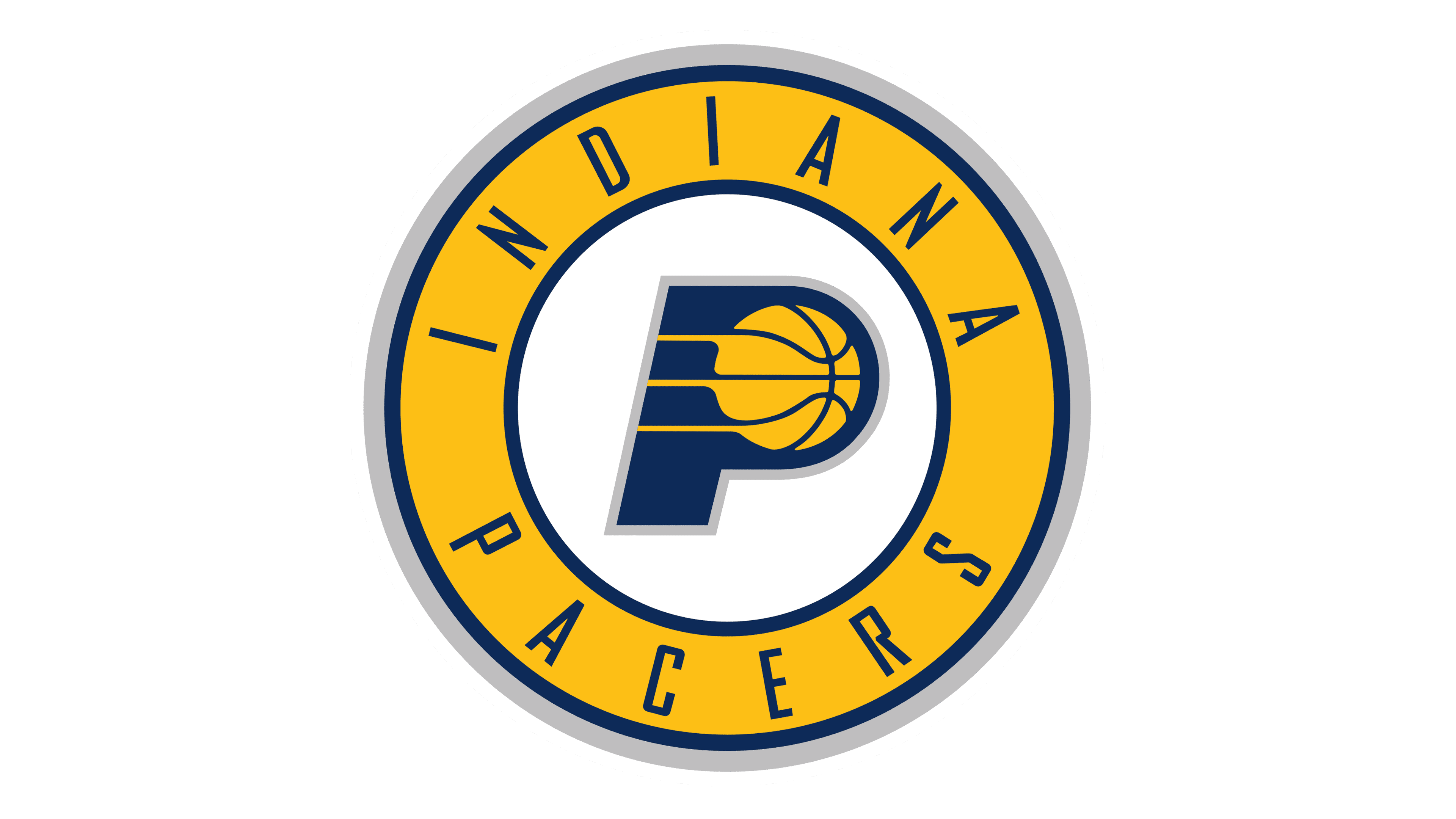
The logo now sits within a circular badge, a classic design choice suggesting unity and continuity. “Indiana” arches above while “Pacers” mirrors below, encircling the central “P”. The letter adopts a solid, navy silhouette, housing the familiar basketball graphic. This shift towards circularity represents a communal spirit, evoking the feel of team badges of old. The silver outline has been refined, contributing to a cleaner finish. The color palette remains consistent, preserving the team’s visual heritage.


