Manulife Logo
Manulife is a major international financial services group. John Bethune founded it in Toronto. It started as a life insurance company. Its creation aimed to make financial security accessible. Manulife offers diverse services including wealth and asset management.
Meaning and History
Manulife was established in 1887. Initially named “The Manufacturers Life Insurance Company”, it simplified to Manulife Financial Corporation over time. In 1999, it went public, broadening its financial base significantly. The company marked a milestone in 2002 by acquiring Boston-based Hancock Financial. This move expanded its global footprint. Manulife has grown through strategic acquisitions and innovations in financial products.
What is Manulife?
Manulife is a leading global financial services provider. It offers life insurance, wealth management, and asset management solutions. The company serves millions worldwide, aiming to provide financial advice and security. Manulife operates in Asia, Canada, and the United States, among other regions.
1887 – 1897
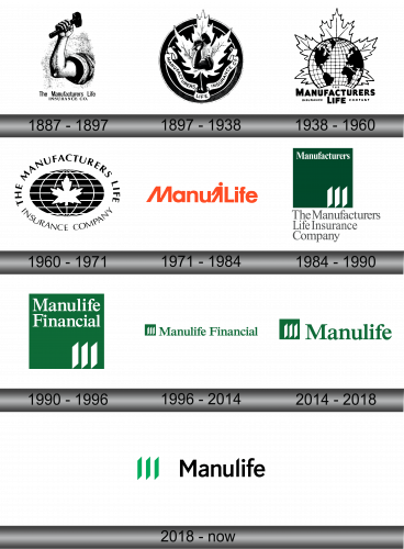
The logo features a hand holding a hammer, symbolizing strength and endurance. This stark black-and-white image symbolizes robust health and the enduring nature of life insurance protection. Below the muscular depiction, “The Manufacturers Life Insurance Co.” is written, projecting solidity and trust. The choice of a traditional weightlifting image underscores the company’s commitment to supporting its clients’ financial wellbeing over time. The visual is straightforward yet powerful, conveying a message of resilience and reliability in safeguarding one’s legacy.
1897 – 1938
In this iteration, the logo gains a circular boundary, embracing a proud maple leaf backdrop, symbolizing a strong Canadian heritage. A hand gripping a hammer, offering enlightenment and guidance rather than pure power. “Manufacturers Life Insurance Co.” encircles the design, a testament to the all-encompassing protection the company offers. This change reflects a shift from physical prowess to a broader, more inclusive message of nurturing and perpetual guidance. The arm’s elevation towards the center of the leaf further emphasizes a commitment to growth and national pride.
1938 – 1960
The logo is transformed again, now with a globe in front of the maple leaf in the center, signifying its global reach. This time, the hand has vanished, emphasizing a shift from individual might to universal presence. The words “The Manufacturers Life Insurance Company” frame the globe, underlining a worldwide service commitment. This evolution reflects a broader vision, positioning the company as a protector of clients around the world. The sharp contrast of black on white remains, maintaining the emblem’s striking visual impact. The globe and leaf together suggest a synergy between Canadian roots and international expansion.
1960 – 1971
This logo refines its predecessor’s design, presenting a neater and more cohesive appearance. The text “The Manufacturers Life Insurance Company” now arcs over the globe, encapsulating the central maple leaf. This structuring leads to a harmonious balance, emphasizing the brand’s Canadian roots and global span. The graphic elements are cleaner, with the globe’s latitude and longitude lines achieving greater precision. The maple leaf, prominently at the core, reinforces a sense of identity and origin. This emblem further solidifies the message of a strong, internationally-minded insurer with a proud Canadian core.
1971 – 1984
The logo undergoes a dramatic transformation, shifting to a bright orange color and modern typography. The intricate details of the globe and maple leaf are replaced with the bold, stylized text “ManuLife.” “Manu” and “Life” successfully combine the human figure, symbolizing an individual approach and individual care. The new design reflects a contemporary and approachable brand, moving away from traditional symbols to a simplified, human-centric approach. This marks a significant rebranding, highlighting the company’s evolution and its focus on humanizing insurance. The vibrant color choice conveys energy, warmth, and optimism.
1984 – 1990
The latest logo shifts to a classic and conservative style, abandoning the vibrant orange for a dignified dark green. The text returns to “The Manufacturers Life Insurance Company”, detailed in a serif font that denotes tradition and stability. Instead of the stylized “ManuLife”, the design introduces a clean, abstract motif with three vertical bars. These bars could represent growth, progress, and the foundational pillars of insurance: risk management, underwriting, and investment. The new design communicates a return to formality and a deepening of corporate identity, a blend of modernism with an acknowledgment of the company’s longstanding heritage.
1990 – 1996
In the newest design, “The Manufacturers Life Insurance Company” gives way to “Manulife Financial”. This change reflects a broader scope of financial services beyond life insurance. The serif font is replaced by a sans-serif typeface, suggesting modernity and accessibility. The vertical bars are retained, still signifying growth and stability but now aligned with the “Financial” text for a streamlined look. This evolution emphasizes the brand’s expansion into diverse financial territories while maintaining its core values and solid foundation. The green color persists, upholding the identity’s professional and reassuring essence.
1996 – 2014
The logo has been streamlined for a cleaner, more contemporary look. The “Manulife Financial” text is now horizontally aligned, reflecting simplicity and directness. The graphical element, three vertical bars, remains on the left, standing alone as an emblem of growth and solidity. This minimalist approach suggests a modern, efficient, and accessible company, while the uniform green color sustains the brand’s connection to its heritage of trust and reliability. The logo’s transformation conveys a focus on clarity and efficiency in the financial world.
2014 – 2018
The logo iteration introduces a concise change: it drops the word “Financial”, now simply reading “Manulife”. This trimming indicates a brand confident enough to stand on one name. The design keeps its clean and uncluttered look, featuring the same trio of vertical bars before the text, symbolizing stability and strength. The font remains the same, preserving the approachability and modernity of the prior design. This simplification to the core brand name demonstrates a trend towards minimalism and highlights a focus on a singular, strong identity in the financial industry.
2018 – Today
The logo retains its simplicity but introduces a bold contrast by pairing the vibrant green bars with black text. The shift from a single color scheme to a two-tone color palette adds visual interest and makes the logo stand out more prominently. The typeface remains unchanged, maintaining the brand’s modern and approachable feel. This color update enhances the logo’s visibility and recalls the company’s heritage through the use of its signature green, now juxtaposed with stark black for a fresh, contemporary edge.
