Mary Kay Logo
Mary Kay is one of the most popular cosmetic companies in the US. Young girls and middle-aged women from different countries use the products of this brand every day. The brand’s assortment includes creams and scrubs, lotions, tonics, and shower gels and this is not a complete list of products. It is worth mentioning the perfume collection separately as a wide range of fragrances for men and women sets the company apart from other competitors in the industry. Mary Kay creates unique products, thanks to innovative and latest technologies.
Meaning and History
Mary Kay was founded in 1963 in Dallas, Texas by the amazing woman Mary Kay Ash. She worked in the company for nearly 20 years. This brand was founded in order to enable women to use high-quality cosmetics at affordable prices. Initially, the company had only a small office, furnished with old furniture. Now, trademark Mary Kay is a world-famous cosmetics manufacturer. In 1969, the construction of its own Mary Kay factory began, which produces a huge number of different cosmetics as of today. In early 70s, the company entered the global market by opening its first branch in Australia.
What is Mary Kay?
The key to its success was the fact that Mary Kay gave women not only high-quality cosmetics but also an individual approach to skincare. Every year, the company spends millions of dollars on research and conducts more than 500,000 tests to ensure the highest standards of safety and quality of Mary Kay products. Mary Kay has over 1,500 worldwide patents that are bought by well-known brands.
1963 – 1967
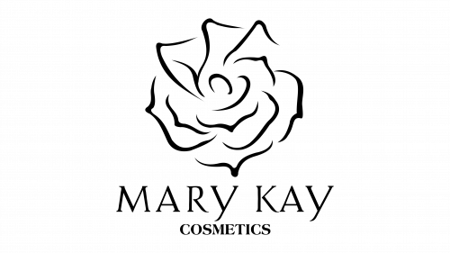
The original emblem of the brand was very appealing as it depicted a drawing of a rose combined with the name of the company. It was done in a black and white color palette. The rose was a lovely depiction of a flower with black outlines of the petals using fine, delicate lines. The font used to write “Mary Kay” looked classic and elegant. The letter “Y” added an interesting detail. While all the letters were capitalized and of the same height, the “Y” extended slightly below all the other letters, making it seem that it is a lower case letter. Right under the name, it said “Cosmetics” in much smaller font but still in uppercase letters. Overall, the logo was very appropriate for a brand that focused on bringing beauty into the world.
1967 – Today
It was not long before the company decided to make an update to its original emblem. The rose was removed along with the word cosmetics. This might be partially due to the expansion of the company’s products, including the creation of products for man. Thanks to the fact that the logo still had the familiar “Mary Kay”, the brand image was still very recognizable. It kept the same font and black color. Now, the logo looked more universal and timeless, which is proven by the fact that it was kept the same for over half century.


