Lego Logo
The world-famous Lego brand was founded in 1932 by a carpenter and joiner Ole Kirk Christiansen in the Danish village of Billund. Initially, a small, family-owned company made stepladders, stools, ironing boards, and wooden toys. The father was assisted by his 12-year-old son Godfred. Two years later, in 1934, Ole asked the company’s employees to come up with a name, offering a bottle of the homemade wick as a prize. Christiansen was offered the two names Legio (from the English “Legion of toys” – a legion of toys) and Lego (from the Danish “leg godt” – play well). The choice was made in favor of “Lego”.
Meaning and history
Founded in 1932 by Ole Kirk Christiansen, LEGO began as a small carpenter’s workshop in Denmark. The name “LEGO” is derived from the Danish words “leg godt,” meaning “play well,” which encapsulates the company’s vision. Transitioning from wooden toys to plastic bricks in the 1940s, LEGO introduced its now-famous interlocking brick design in 1958, a unique system that offered endless possibilities for building. This innovation marked a pivotal moment in the brand’s history, setting the foundation for its future success.
Over the decades, LEGO expanded its offerings with themed sets, including space, pirates, and the medieval “Castle” series, which captivated young minds and cultivated a loyal global fanbase. The company also ventured into media, digital games, and film, most notably with the successful release of “The LEGO Movie” in 2014, further solidifying its cultural and market presence. LEGO’s ability to adapt and innovate has made it the largest toy company in the world by revenue, with products sold in over 140 countries.
What is LEGO?
LEGO is a creative toy manufacturing company known for its iconic plastic bricks that interlock to build anything from simple structures to complex replicas. These toys not only foster imagination and problem-solving skills but also bring joy to both children and adults, making LEGO a beloved brand worldwide.
1934 – 1936
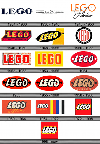
The first company logo was constructed in 1934 and was used in correspondence, labels, and other printed materials, but not on toys. It was a simple outline of the brand name in black capital letters.
1936 – 1946
The Fabriken LEGO Billund ink print was first used on wooden toys in 1936. The word Lego was highlighted and placed in the center of the logo. Below you can see the short slogan “Fabrik for Traevarer og Legetoj”.
1946 -1950
Another version of the Lego logo was very widespread at the same time period. It was accepted in 1946 and was used till 1950. It represented the trademark, written in capital orange letters. It was supplemented by a black cursive inscription “Klodster”. Due to this, the logo began to look stricter and wealthier.
1946 – 1950
The new logo was invented in 1946. Unlike the previous ones, it was already colored and was widely used on wooden toys, usually in the form of an applied sticker. The main colors were black and orange, which symbolized energy, happiness, and smiles.
1948 – 1955
The logo, proposed in 1948, stands out thanks to the bright yellow hue of the letters set against a black background.
1950 – 1953
In 1949, LEGO first released a plastic toy – the predecessor of modern bricks. In this regard, in the next year, the emblem was modernized: elongated red letters inscribed in a bold black circle became the symbol of the brand. Also, in the frame, there is a white inscription with the name of the city and country from the company’s original.
1952 – 1953
The image shows the iconic LEGO logo with its familiar bold, red lettering. The logo is set against a clear backdrop that creates a reflection and suggests transparency. The capitalized letters of “LEGO” are designed with a heavy, sans-serif typeface, exuding a sense of sturdiness and reliability, which aligns with the brand’s products. The edges of the letters are slightly rounded, giving the logo a friendly and approachable feel that resonates with its audience of both children and adults.
1953 – 1955
The bright and rich logo was introduced in 1953. The company name was written in large red letters and placed in a bright yellow rectangle.
1954

In 1954, the first of the oval logos appeared, appeared in the LEGO Mursten catalogs. The company has not yet standardized the color of the brand, so there are examples of the logo in several variations, usually depending on the color of the catalog. The most common logo in 1954 was the one with an oval in bright red, where the abbreviation Lego had a white color and a thin black outline. An unusual element that distinguishes this logo from all previous ones is a thin white line with two balls at the ends. Thanks to her, the emblem becomes like a button.
1955

In 1955, the creators only slightly modified the logo. For example, they made it more flattened and elongated. The border of the letters has become thicker and the color of the horizontal divider has become black.
1955 – 1960
In 1955, the first of the oval logos appeared, appeared in the LEGO Mursten catalogs. The company has not yet standardized the color of the brand, so there are examples of the logo in several variations, usually depending on the color of the catalog. The most common was considered a logo with an oval in bright red, where the abbreviation Lego had a white color and a black outline. An unusual element that distinguishes this logo from all previous ones is a thin black line with two balls at the ends. Thanks to her, the emblem becomes like a button.
1958 – 1960
In this image, the LEGO logo from an earlier era is depicted in an oval shape, with the brand name styled in a playful, handwritten script that feels personal and whimsical. The red and white color scheme is consistent with the brand’s identity, but the script gives the impression of something crafted by hand, which ties back to the brand’s roots in creativity and construction. Below the brand name, the word “SYSTEM” in a serif font hints at the interlocking nature of LEGO bricks and the system of play they create.
1960 – 1964
In the 1960s company changed its logo one more time. Capital letters of the trademark were placed inside a red rectangle. Inside it could be noticed a cursive yellow inscription “System”.
1964 – 1972
The 1964 variant of the logo, which includes yellow, red, blue, white, and black stripes, was the first trademark registered with the LEGO name.
1972 – 1998
With the entry into the US market in 1973, the need arose for a single emblem. So, the logo got a modern look: a square shape, the corporate Lego Font with “chubby” letters, and bright colors – red and yellow. This symbolism is intended to reflect lightness, joy, and fun.
1998 – Today
In 1998, the brand revamped the logo slightly to make it look better on digital media. The letters are larger and the colors are brighter. In this form, the logo exists to this day.
Emblem and Symbol
With the entry into the US market in 1973, the need arose for a single emblem. So the logo got a modern look: a square shape, the corporate Lego Font with “chubby” letters and bright colors – red and yellow. This symbolism is intended to reflect lightness, joy and fun.
