Michigan Wolverines Logo
Whether it is football, gymnastics, cross, country, tennis, or hockey, Michigan Wolverines know how to defeat their rivals. Fifteen various sports have men’s and women’s teams representing this public university. Football, basketball, and ice hockey are considered some of the most beloved games. The teams are known for winning the Big Ten Tournaments and being part of the NCAA’s Division I.
Meaning and History
The University of Michigan was founded all the way back in 1817. The legacy of its sports teams is just as old. It all started with baseball with the team officially forming in the 1865-66 season. The first football team, for instance, was officially formed in 1879. Michigan State is nicknamed “Wolverine State “ as many wolverines were roaming the peninsula before. It is not surprising the university chose this name to represent its athletic division.
What is Michigan Wolverines?
Michigan Wolverines is the name for sports teams that represent the University of Michigan during the games. Its teams have taken many top places throughout its history and made the university well known among sports lovers.
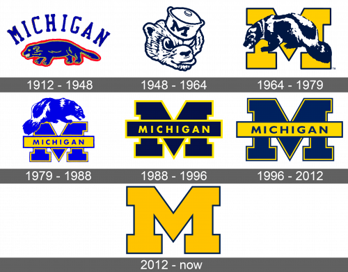
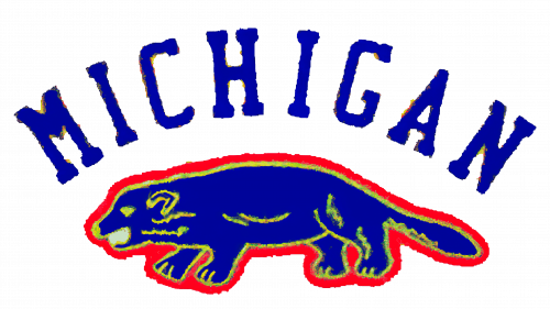
1912 – 1948
The first part of the name was printed, while the second one was represented by an image. The latter was a blue wolverine with yellow details and outlines. The whole image was outlined by a thick red line. The word “Michigan” was arching above the image. It was featuring a bold, serif font.
1948 – 1964
This logo was just a drawing of a mischievous and determined wolverine. It was just the head that sported a hat with the team’s initial on it. The drawing was black and white and had rather thick lines to reflect the strength and willpower of the team.
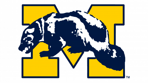
1964 – 1979
This version is just as impressive. In this emblem, a realistic image of an aggressive wolverine is placed in front of a bold letter “M”. The latter is done in deep yellow color with a thick black outline and large, slab serifs. The whole logo looks bold and full of energy.
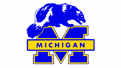
1979 – 1988
The letter “M” was now a blue color with a yellow followed by a thinner blue outline. The wolverine was now on top of the letter and facing right. It was also a blue color. A yellow banner was placed across the “M” with the word “Michigan” written in uppercase, blue letters.
1988 – 1996
This logo is based on the 1964 version, but instead of the wolverine, it had the banner with “Michigan” on it similar to what was featured in a previous version. The whole logo was black while the outlines and the inscription were done in bright yellow. Such contrast and bold color choice created an impression of a powerful team.
1996 – 2012
There was a minimal adjustment as the team decided to use dark blue instead of black. The banner was now a deep blue color while the letters on it were done in dark blue. The letter also acquired a double border for more interest.
2012 – Today
A minimalistic and modern spin was given to the team’s logo. It was just the letter “M” from the logo introduced in 1964. The letter “M” was already well associated with the Michigan Wolverines team and there was no need for additional inscriptions or images.
Font and Color
The company used blue and red in the first logo with just a bit of yellow. The blue was also seen in the logo introduced in 1979. Otherwise, the company stuck to a yellow and black/deep blue color palette. These were bold colors that represent power, energy, and masculinity.

