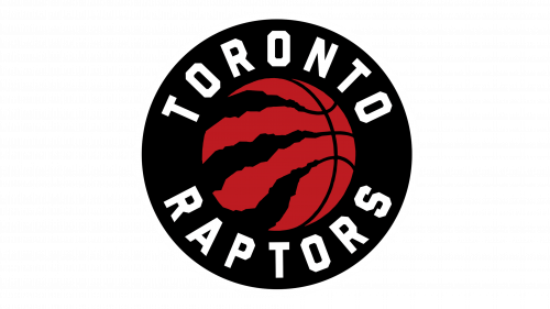
Toronto Raptors Logo
The Toronto Raptors are relatively a new team, but they already managed to win multiple titles and basketball fans. There were many great players on the team. When it seemed that the team was already in the top ranks in the Eastern Conference and the NBA, it surprised its fans with drastic changes and the first NBA Championship in 2019. The changes to their logo were not as drastic, but there are still two eras with two different logo styles.
Meaning and History
The National Basketball Association expanded in 1995 and a new team was born. It took some time for the team to achieve greater success, but it made it to the NBA playoffs three times (2000, 2001, 2002) and even went as far as the Eastern Conference semifinals. With the appearance of Masai Ujiri on the team, the Raptors were the regular team at playoffs and even won five Division titles. There were several other significant achievements in the short history of the team. The current name, Toronto Raptors, has been with the team since 1994. The “Jurassic Park” movie released in 1993 gave the team an idea for the name.
What is Toronto Raptors?
This is a basketball team from Toronto. It grew from a 1995 expansion team to 2019 NBA Champions and has a great foundation to keep its fans happy.
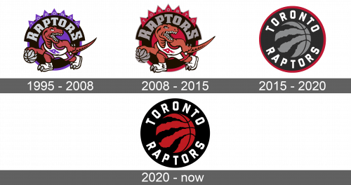
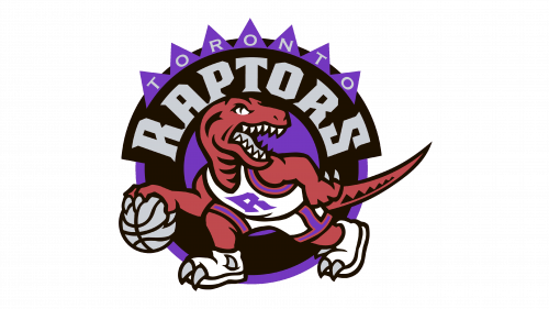
1995 – 2008
The center element of the emblem is a Velociraptor dinosaur done in red with a black outline and some white elements in the form of a T-shirt, shorts, shoes, and teeth. The uniform has purple lines and a large, purple “R” on the T-shirt. Two gray claws stick out of each shoe. The raptor is walking and holding a gray basketball in its right hand. Its mouth is wide open. Behind, there is a circle with a purple outline and center. On the black portion of the circle, it states “Raptors” in large capital letters with the first and last letters being slightly larger. Above the name, there are seven purple triangles that follow the arch of the circle and have “Toronto” done in smaller and thinner gray letters.
2008 – 2015
The update created a more homogeneous and professional look as there was no more purple. It was switched for the red that matched the dinosaur. The exception was the letter “R” on the T-shirt, which was done in black. Besides an introduction of a slightly different color palette, the emblem stayed very much the same.
2015 – 2020
There was a drastic redesign of the logo. It maintained a black circle with a red border, which got slightly thinner and darker, as the background. However, the key element changed from a dinosaur to a basketball. The basketball was placed in the center of the emblem and was done in light grey color. The lines were black. An interesting element was three thicker, uneven lines on one side of the ball that resembled the scratches from the claws of a dinosaur. The name of the team was written around the ball. it was done in white, uppercase letters with one word being at the top half and the other at the bottom half. The letters looked quite simple, although cut corners and straight lines gave them some character. Despite the completely new look of the emblem, it still had some resemblance to the ones used before.
2020 – Today
Similar to what the team has done in 2008, it has changed the color scheme of the emblem. There was no more border around the circle, which was seen on every other logo the team had. Instead, the read was brought to the centerpiece of the emblem. The grey color of the ball was switched to a bright reddish-orange color. The name around the perimeter was kept the same.
