Chicago Blackhawks Logo
The Chicago Blackhawks, an iconic team in the National Hockey League (NHL), are currently owned by Wirtz Corporation, led by Rocky Wirtz. Originating in Chicago, this team has a rich history and has secured multiple Stanley Cups. The Blackhawks play their home games at the United Center and are renowned for their skilled roster and dedicated fan base. They are a part of the Central Division in the Western Conference and continue to be a formidable presence in the league, fostering a legacy of excellence and sportsmanship in professional hockey.
Meaning and history
The Chicago Blackhawks, founded in 1926, are one of the Original Six NHL teams. Originating as the “Black Hawks,” their name was later consolidated to “Blackhawks.” The Wirtz family has held ownership since 1954, with Rocky Wirtz currently at the helm. The Blackhawks have a storied history, bagging several Stanley Cup victories, with notable eras of success in the 1960s, 2010s, and beyond. They’ve been home to hockey legends like Stan Mikita and Bobby Hull. Despite facing challenges, including controversies over their name and logo, they have remained resilient, maintaining a strong presence in the NHL. The Blackhawks continue their journey, blending rich traditions with modern innovations, as they foster new talents and build upon their illustrious legacy in the hockey world.
1926 – 1935
The inaugural emblem of the Chicago Blackhawks was the creative brainchild of Irene Castle, spouse to the team’s proprietor, Frederic McLaughlin. This emblem showcased a profile depiction of a Native American’s head, adorned with three feathers and a distinctive braid. Surrounding this illustration were the inscribed words, “Chicago Black Hawks,” delineating the team’s original moniker. The palette employed for this initial symbol was strictly monochromatic, utilizing only shades of black and white. This design set the stage for the visual identity of the team, blending historical elements with the spirit of the sport, establishing a foundational representation for the Blackhawks in the world of hockey.
1935 – 1937
In 1935, the logo’s color scheme was enriched with the introduction of two additional hues, enhancing the black and white foundation. The Native American’s visage was now depicted in a vibrant red, contrasted by his hair, illustrated in a subdued light brown shade. Despite these alterations, the fundamental elements like the encompassing black ring and the white, script-lettered designation of the team were retained in their original form. This updated, multicolored representation maintained the essence of the team’s identity while infusing a new visual vitality, preserving its legacy while adapting to the evolving aesthetic landscape of sports symbolism.
1937 – 1941
The rendition revealed in 1937 bore considerable resemblance to its predecessor, with the notable alteration being in the background hue: the erstwhile black was supplanted by white. The portrayal of the Native American with red skin remained unaltered, maintaining its visual continuity, and the team’s moniker set against a black backdrop experienced no modifications. This subtle transformation in design elements showcased the team’s inclination to maintain a consistent visual identity while experimenting with contrast and background elements, ensuring the emblem’s recognizability and its enduring connection with the team’s heritage and legacy.
1941 – 1955
In 1941, the emblem underwent subtle refinements while preserving the quintessential representation of the Native American’s head. A meticulously detailed visage supplanted the contemplative depiction, introducing nuanced elements to the design. The countenance exhibited gentler facial attributes; the erstwhile red complexion transformed into a warm yellow shade, and the strands of hair transitioned to black, interspersed with slender green streaks. The adornment of the hair included three feathers, articulated in red and white hues. The surrounding black circumference was finessed with a slender contour in red, adding a layer of detail and cohesion to the overall aesthetic, ensuring that the iconic visual identity of the team was enhanced and contemporized while respecting its historical lineage.
1955 – 1957
In 1955, the Blackhawks unveiled a revamped version of their emblem. This rendition displayed a more intricately illustrated Native American head, its visage embellished with stripes of red and white, adding a layer of complexity to its appearance. The figure adorned a red earring and sported four vibrantly colored feathers in his hair—green, yellow, and two in red, intensifying the logo’s visual interest. To confer a three-dimensional effect to the image, a white streak was integrated into the hair. The black circular boundary encapsulating the team’s name was flanked by two crimson bands, enriching the overall aesthetic and offering a refined and detailed homage to the team’s visual identity, meticulously intertwining tradition with enhanced design elements.
1957 – 1965
The sixth iteration of the Chicago Blackhawks symbol underwent subtle refinements. The encompassing black circle bearing the inscription “Black Hawks Chicago” persisted in its original form. The white streaks embellishing the Native American’s hair underwent a transformation to a yellow hue, injecting a subtle vibrancy into the image. Furthermore, one of the emblematic red feathers transitioned to an orange shade, adding a diverse palette to the emblem’s aesthetics. Additionally, alterations were made to the Native American’s facial features, offering a refreshed and detailed representation, subtly evolving the iconic imagery while maintaining its essential elements and heritage.
1965 – 1989
1965 marked the advent of modifications to Black Hawk’s portrayal, establishing a foundation that would persist for over twenty years. The iconic black roundel was omitted from the emblem, enabling the Indian’s head to stand alone as the central crest of the team. The facial contours were rendered with a more gentle and streamlined approach, and the forehead appeared slightly extended. The visage showcased a neutral demeanor, reflecting a serene and balanced expression. The distinctive red and white stripe adorning the forehead underwent a transformation to a black shade. This emblem has experienced only minor alterations, maintaining its essence throughout the years, reflecting a timeless and enduring visual identity for the team.
1989 – 1996
As the 1980s reached their conclusion, both color and graphical elements witnessed substantial enhancements. The feathers adorned in the hair, distinguished by red and orange hues, were intricately detailed with white lines to emphasize their texture and structure. Concurrently, the feathers exhibiting green and yellow tones were meticulously outlined with yellow and blue lines respectively, adding to the vibrancy and visual appeal of the depiction. These thoughtful embellishments contributed to a more refined and sophisticated visual identity, enhancing the intricacy and dynamism of the overall design. The meticulous attention to detail reflected a commitment to evolving the visual narrative of the emblem while maintaining its iconic elements.
1996 – 1999
The squad embarked on a further refinement of their emblem. This involved subtle modifications in the color palette: the facial hue deepened, while the boundary embraced a more vivid shade of yellow. The hues of green, yellow, and blue adorning the feathers underwent an enhancement, manifesting in brighter and more precisely defined contours. This nuance in adjustment underscored the continued evolution in the aesthetic representation of the logo, focusing on the accentuation of individual elements to convey vibrancy and clarity. The emblem continued to be a symbolic representation, with every iteration aiming to strike a balance between tradition and contemporary visual appeal. This subtle transformation reflects a thoughtful approach to maintaining the emblem’s inherent identity while embracing visual vividness and distinction.
1999 – Today
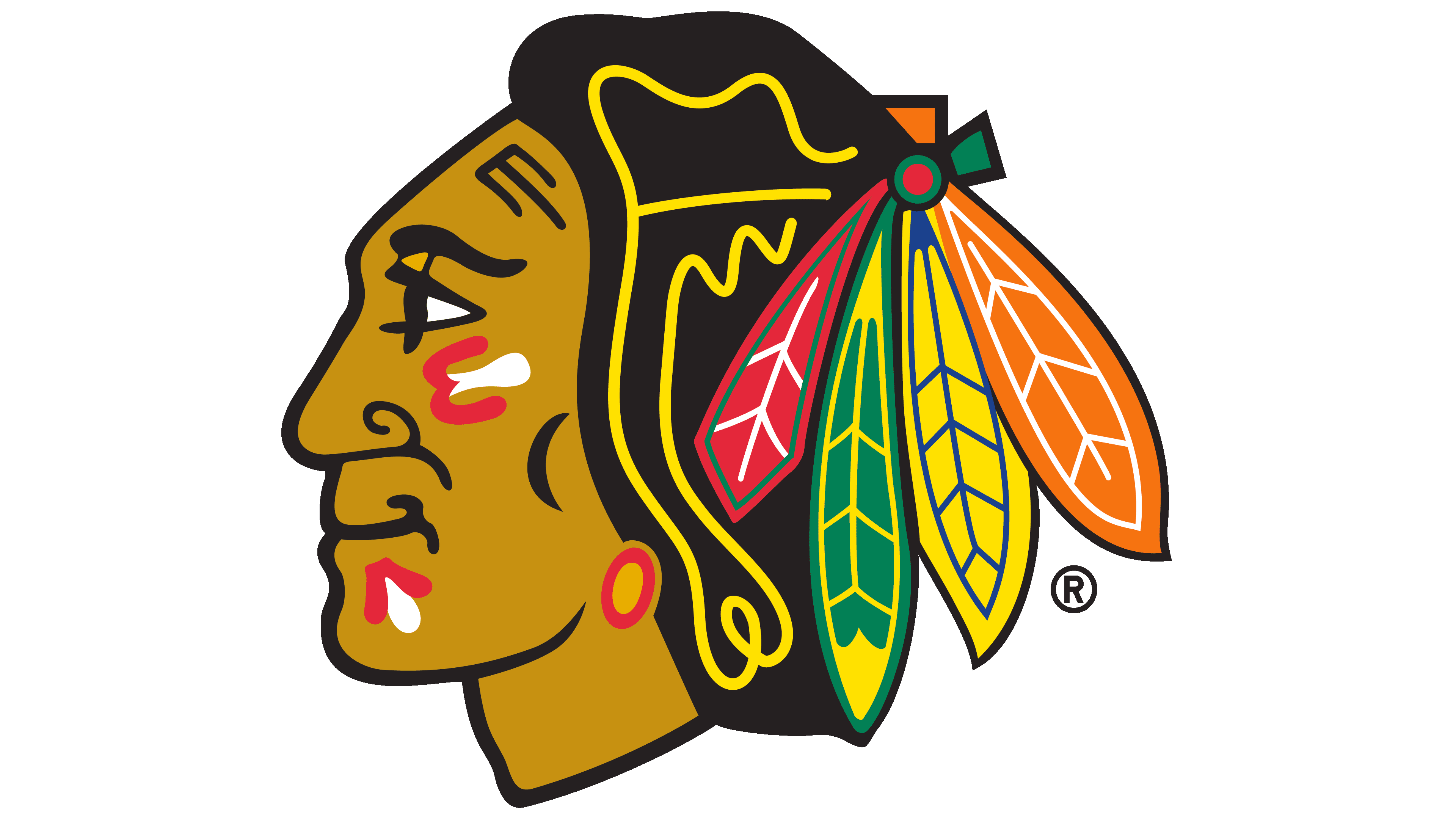
Currently, a symbol featuring a smiling native U.S. figure is being utilized. It is developed upon the preceding version but with a more vibrant shade. Presently, the hues are radiant, striking, and dynamic. The figure sports war paint on his face, symbolizing the team’s preparedness for resolute endeavors in their athletic pursuits. Four distinctively colored feathers adorn the hair, bound together and fastened at the rear of the head.
The profile of the Native American figure is depicted facing to the left. Notably, in this rendition, the representation is seemingly younger compared to the pre-1989 imagery. The facial features have undergone subtle refinements, rendering them more universally relatable. This iteration of the logo, with its nuanced modifications, seeks to embody a broader inclusivity while maintaining its foundational elements. It emanates a sense of renewed energy and approachability, intending to resonate with a diverse and wide-ranging audience, reflecting both historical respect and modern-day sensibilities.


