Energizer Logo
Energizer is a well-known brand primarily recognized for its extensive range of batteries and portable lighting products. W.H. Lawrence invented the brand’s first dry cell battery in the United States. He developed it to power consumer devices, marking a significant innovation in portable power sources. Energizer Holdings stands as a giant in the battery industry, noted for its reliable and long-lasting power solutions that cater to a global market.
Meaning and history
Energizer began its journey in 1896 when W.H. Lawrence patented the first dry cell battery, revolutionizing energy storage. Energizer became a distinct brand when the Eveready Battery Company decided to highlight its hallmark product, the Energizer battery, during the 1980s. Notable milestones include the launch of the first AA lithium battery in 1992 and the introduction of the world’s longest-lasting AA battery, the Energizer Ultimate Lithium, in 2008. These innovations underscored Energizer’s commitment to advancing battery technology. The brand also made a significant leap in 2010 by acquiring another major battery company, significantly expanding its global footprint.
What is Energizer?
Energizer is a global leader in the production of batteries and portable lighting. Known for innovation, the brand offers products that provide dependable power for a wide array of devices. Energizer’s range includes the world’s longest-lasting AA battery, symbolizing their commitment to efficiency and reliability.
1980 – 1987
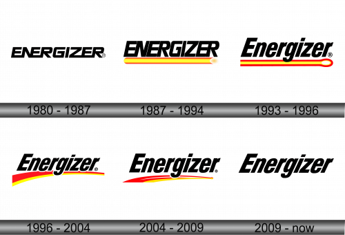
The logo displays the word “ENERGIZER” in bold, uppercase letters. Its design is sleek, modern, and exudes strength. The typography uses a sans-serif font, giving it a clean and uncluttered look. The letters are equally spaced, emphasizing clarity and readability. This emblem is synonymous with energy and longevity, reflective of the brand’s promise.
1987 – 1994
This iteration of the Energizer logo adds a dynamic visual element below the text: a gradient yellow to red bar. Evoking the look of a glowing battery, this bar symbolizes power and energy flow. It starts with a vibrant yellow on the left, transitioning to a warm red on the right, culminating with a bright spot suggesting illumination or the positive end of a battery. The gradient bar underlines the text, literally supporting the brand’s name and enhancing the logo’s impact. It transforms the simple text logo into an emblem of energy, hinting at the brand’s core product — batteries. This design choice reinforces Energizer’s identity as a provider of enduring and powerful energy solutions.
1993 – 1996
The logo displays the name “Energizer” in bold, uppercase letters, emphasizing strength and reliability. Below the brand name is a distinctive red and yellow stripe, which starts as a thin line and expands into a rounded end. This design element suggests the continuous and expanding flow of energy, akin to the widening of a beam of light or the dispersion of power. The colors transition smoothly from a bright yellow to a deep red, further invoking the imagery of a charge or a spark. Overall, the logo marries simplicity with the visual representation of energy and power, true to Energizer’s brand identity.
1996 – 2004
In this logo version, the stripe beneath the “Energizer” text has been transformed into an arc, suggesting motion and continuity. The gradient stripe now bends, reinforcing the idea of energy in motion. This curvature introduces a sense of movement, implying the ongoing and enduring nature of the brand’s energy products. The oval at the end of the previous design has disappeared, streamlining the image to focus on the core brand name and its newfound momentum. The bold, uppercase letters of “Energizer” maintain their strong presence. These changes subtly but effectively refresh the brand’s visual identity, aligning with a more contemporary and dynamic aesthetic.
2004 – 2009
The logo accentuates a fluid motion with its red and yellow streak, which now flows beneath the “Energizer” text. The streak has been refined, featuring a yellow hue that gradually turns into red, symbolizing a charge that intensifies. The tapering design, reminiscent of a battery’s shape, suggests constant energy discharge. The red color is more pronounced, contrasting sharply with the yellow, and the swell at the end of the streak gives a visual cue of power reaching its peak. The black text remains strong and unaltered, standing out against any backdrop. This logo variant communicates a sense of motion and the continuous output of power.
2009 – Today
The logo presents a return to minimalist design, stripping away the previous version’s color swoosh. Now, it’s solely the word “Energizer”, bold and direct. The design relies on strong, black, sans-serif letters, each uniformly sized for a clean, straightforward look. This stripped-back approach signals confidence in the brand’s recognizability without the need for additional graphic elements. It speaks to a modern ethos, emphasizing clarity, efficiency, and a no-frills attitude that aligns with the brand’s focus on straightforward energy solutions. The design’s simplicity ensures versatility across various media, from digital platforms to physical products, highlighting the brand’s adaptability in a rapidly evolving market.


