Kingston Logo
Kingston Technology Company, Inc. is a multinational corporation with American roots that develops computer components related to memory. These include flash memory cards, USB flash drives, RAM modules, audio players, SIM cards, and SSD drives. The brand is ranked as the largest independent manufacturer of DRAM memory modules, representing half of the market in this area. Kingston is the third largest supplier of flash cards, the second largest supplier of flash memory, and the leader in sales of USB flash drives.
Meaning and History
Kingston founders, engineers John Tu and David Sun from Hong Kong, produced memory for computers under the Camintonn brand. It was profitable, but in 1987 the US stock markets crashed, putting the business $1 million into minus. Kingston Technology, named after John Tu’s favorite band, was their new venture. From the first months, the company gained credibility in the computer market. The company’s memory was inexpensive, available in the shortest possible time, and very reliable. In 1996 the SoftBank holding bought out 80% of the company’s shares for $1.5 billion. This helped to launch production in the USA, England, Taiwan, China, and Ireland and allocated $100 million for bonuses to employees. Kingston has been actively developing since then and brought new technologies to the market.
What is Kingston?
Kingston’s core business is the design and manufacture of data storage devices and drives. Kingston’s customers include large enterprises around the world. The company earned a good reputation and consumer trust due to the high quality and reliability of its products.
1992 – Today
![]()
Kingston has a very memorable logo. It features the name, Kingston Technology, written in two lines, and an interesting drawing of a head. The first line is done in a bold serif font that had a very classic appearance. The first letter was uppercase, but it was aligned at the top instead of the traditional bottom alignment. The second line used a basic font and had all uppercase letters. The word was written in line with the first letter of the first line. The most intriguing element of this logo was an abstract drawing on the left. It was a half profile of a man done in red with black shadows and white highlights. It seemed as if the head served as a type of bowl or vase as it was cut right above the eyebrows. It was a reference to the company’s advertising where memory devices were added to the head to improve one’s memory.
Font and Color
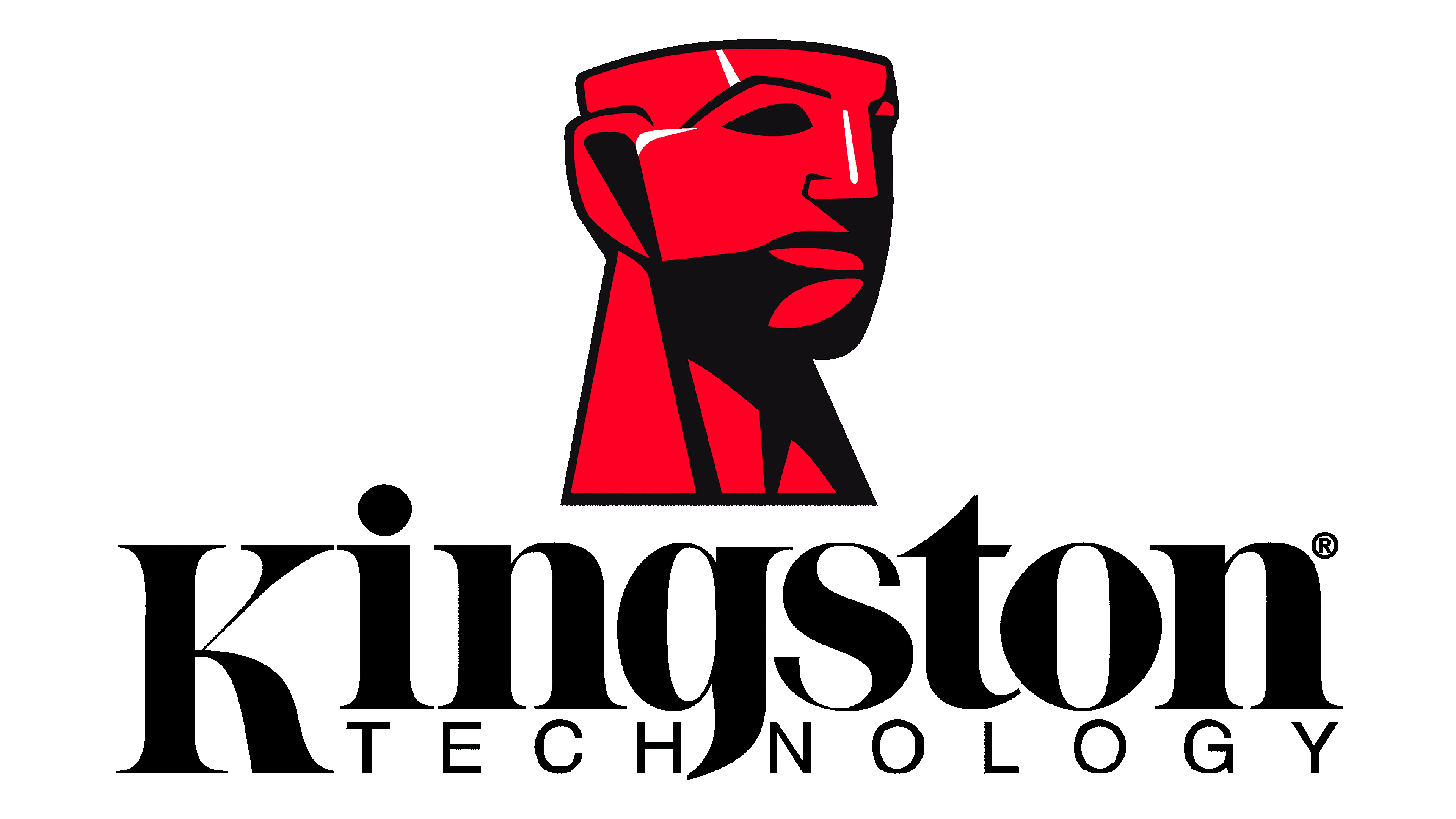
The company used a custom font that is based on traditional typefaces with a transitional serif type. A beautiful combination of delicate, thin lines with bolder ones gave the wordmark a sophisticated appearance. The color palette is just as impressive. They went for bold red and classic black. These are colors of power, energy, and strength.