Razer Logo
Razer is a major manufacturer of mice and keyboards, although its products are not limited to these. For instance, Razer has released a range of gaming laptops and PCs. The company did not immediately achieve its current position. It had a long and bumpy road, overcoming many difficulties and managing to break into the forefront of the gaming technology market. Razer has never been afraid to experiment and bring gaming to the masses, as well as look at it from many different angles. Interestingly, Razer names many of its products after animals. Mice, for example, are named after different types of snakes, keyboards are named after spider species, and headphones and headsets are named after sea creatures.
Meaning and History
![]()
Razer was founded in 1998 with two main offices – one in the USA and another in Singapore. The founders of the company are Robert Krakoff and Min-Liang Tan. After a successful launch and many hardships in the early 2000s, 2006 was one of the most thriving years in Razer’s history. The company released several successful gaming products at once. It is interesting to mention that the company’s original name, Razor, was a suggestion made by Krakoff after the entrepreneur remembered how he accidentally cut themselves with a razor. It was mistakenly put as Razer into the register by Ming-Liang. The name was kept since the developers thought it had an interesting spin to it.
What is Razer?
Razer is probably one of the most well-known manufacturers of esports gaming accessories. Beyond mice, keyboards, and headsets, Razer has a lot more to offer. This is not just a manufacturer of devices, but a whole cult that has taken over the world.
1998 – Today
![]()
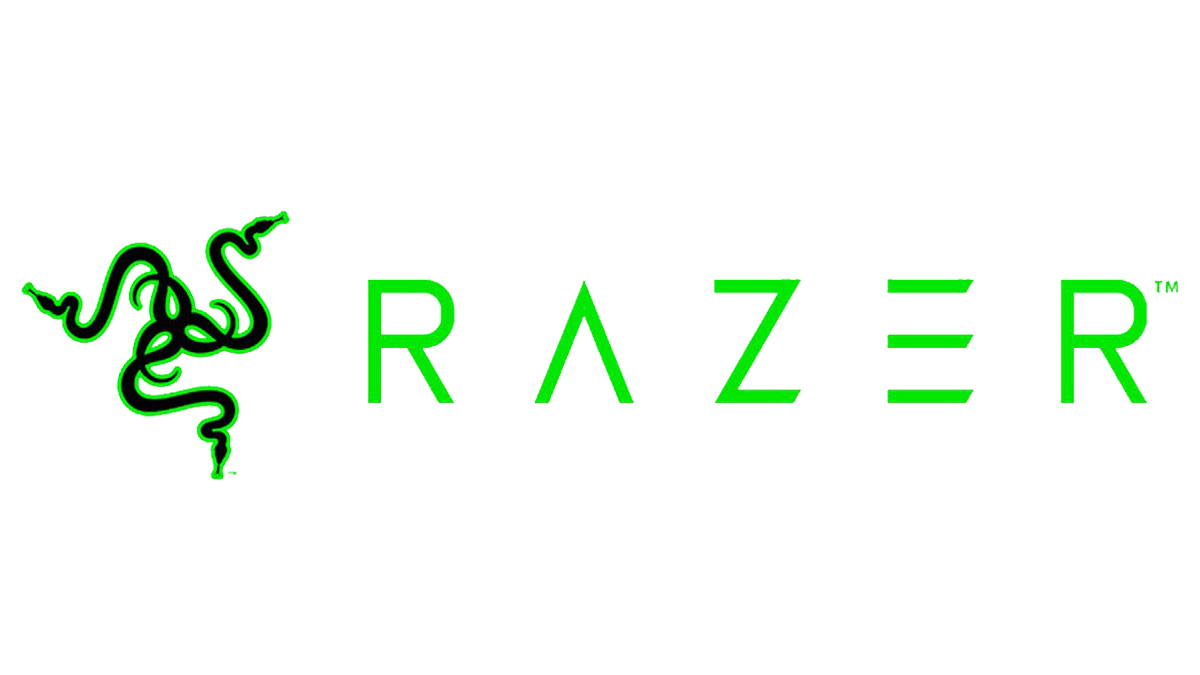
The logo represents three South African Boomslang snakes with intertwined tails. The logo had a nice symmetry to it. The black color of the snakes with a neon green outline looks appropriate for the industry. The entrepreneurs thought that snakes are much cooler and definitely dominate the mice. Accordingly, their first product, a computer mouse called Boomslang, was going to be superior to any other such device on the market and it surely took a top place among other products. Moreover, the snake’s traits, such as being sleek, silent, quick to strike and react, as well as deadly bites, are generally favorable for gameplay and gear.
1998 – 2016
![]()
The neon green color seen in the original logo was used for a wordmark for almost twenty years. It featured the word “Razer” written with the first letter being capitalized. Some of the edges of the letters were quite uneven. In addition, thin diagonal lines were coming through the wordmark, which created an appearance as if the name was cut with a razor, shifting parts of the letter up or down.
2016 – Today
![]()
The new logo had a much slimmer and cleaner look. It was still the name of the company in green, but there were no diagonal lines. The letters had a geometric appearance with clean, straight lines and corners and pointed sharp ends. It was a good representation of the cutting-edge technology the company was implementing in its products.
Font and Color
The first logo that featured the company’s name used a rather unique font. It was a blend of clean lines with lines that had uneven edges. Moreover, all the letters were sliced vertically with some parts being shifted up or down. A distinct characteristic of the wordmark’s typeface introduced in 2016 was the lack of a horizontal bar in the letter “A” and a vertical line in “E”. The letters had pointy ends and smooth, straight lines. Without these details, the font would look quite basic. When it comes to the color, an acidic neon green, which is often associated with poison and can make one feel more alert as well as energized, served as a primary color. Neon green is also believed to create a feeling of positivity and optimism.