FIFA Logo
Headquartered in Switzerland, FIFA is a global football community with over 200 national football federations. The organization’s income has increased significantly with the liberalization of the television football market, an active marketing policy, and the sale of a variety of football products. It is difficult to imagine how the fate of the game many love so much would have been, if not for FIFA. People created it from nothing. They just loved football and wanted to develop it. Thanks to them, everyone has an opportunity to watch great players and matches.
Meaning and History
![]()
Even though football was often banned during the reign of kings, it nevertheless became very popular in England and then conquered America and all of Europe. As a result, there was a need for the creation of an international football organization. The initiative was made by the French, so representatives of Spain, Denmark, Holland, Spain, Sweden, Switzerland, and Belgium gathered in Paris. On May 21, 1904, they formed the International Federation of Football Associations, which today is referred to as FIFA. The first competitions under the auspices of FIFA were held in 1906. The next competition, the football tournament at the London Olympics in 1908, was more successful than the first one. FIFA ceased to be a purely European organization when Soutthe h African Football Association (1909), the Argentine Football Association (1912), and the US Football Federation (1913) joined it.
What is FIFA?
Federation Internationale de Football Association or FIFA was the result of the cooperation of several European countries. The main purpose of the organization’s creation was to unite national football federations and promote world-class competitions.
1924 – 1928
![]()
The first logo appeared only 20 years after the association was founded. It was black and white and featured the name of the association written in two lines. The first line used a bigger font than the second. Both were printed using the same classic, serif font. The inscription was split in half right in the center by an image of our planet. It was meant to reflect the international nature of the association and could even be linked to the round soccer (football) ball.
1928 – 1977
![]()
The update to the FIFA emblem is meant to make a true reflection of the global expansion. It now had two images of the globe, showing all the continents. The name was now printed in one line underneath and had a thin line underlining it. All uppercase lettering was much smaller in relation to the globe element compared to the original.
1977 – 1998
![]()
The designers took the emblem a step further by making the two globe drawing resemble soccer (football) balls. A sans-serif abbreviation replaced the full name. In addition, it stated the date of the foundation in smaller, lowercase letters. In some cases, the logo was placed on a blue background.
1998 – 2009
![]()
The globe/ball image was now done in color and had some volume thanks to shadows and highlights. The continents were done in golden, while the oceans featured a deep blue. The ball pattern was done in white over the continents. The name abbreviation was enlarged to be the same length as the globes. It was done using a sans-serif font of a blue color. A diagonal cut of the “F”, which repeated the vertical line of the “A” gave the logo some dynamics, boldness, and sharpness. In some cases, the logo was done in black and white, just like the versions seen earlier, or blue and white.
2004 – 2015
![]()
In honor of the 100th anniversary, the association released a new emblem. Although it had a football ball as part of the logo, it did not look anything like the logos created before. It featured curved lines in two shades of blue going upward on the right. On top was a football ball, while in the bottom right corner, the logo featured the name printed using the same font as in the previous logo. The logo was dynamic and modern, and the lines going upward reflected the growth of the association. An alternate version featured an emblem without the blue and white ball.
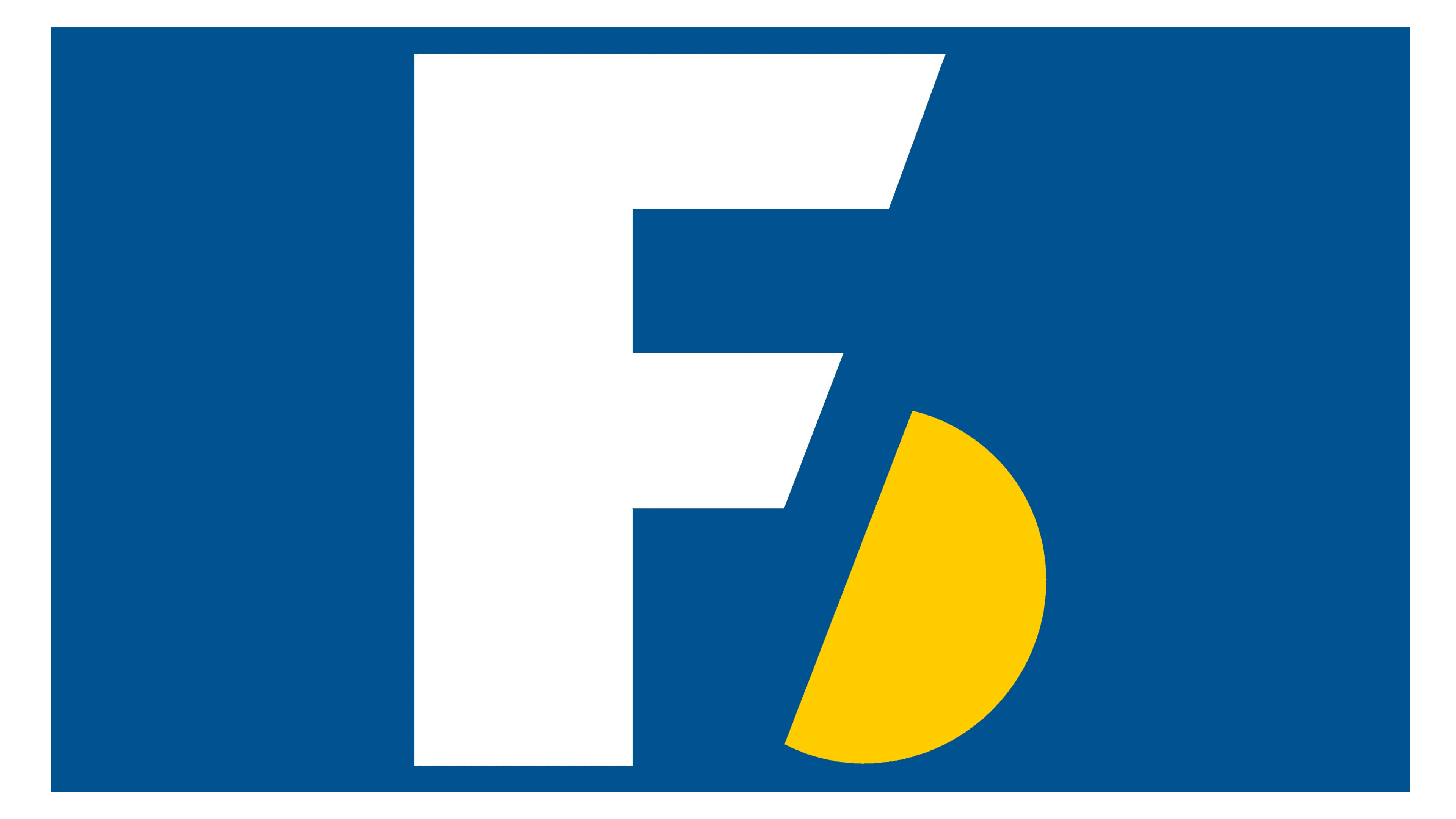
2009 – Today (Primary), 1998 – 2009 (Secondary)
![]()
A modern, minimalistic logo that was used as a wordmark since 1998 became the primary emblem of the association in 2009. It was just the name of the association in deep blue and featuring the bold, uppercase letters with a diagonally cut “F” seen in some other versions.
Font and Color
Originally, the association used a stylish, serif font. In 1977, it was replaced by a rather basic, sans-serif one. The designers used the same font since 1998. It was very similar to Outlast Regular. For many years, the color palette of the association was black and white. Later, different shades of blue were introduced, which stand for stability and confidence of the association.