NASA Logo
NASA, the United States government agency, is at the forefront in exploring outer space, conducting scientific research, and developing new space technologies. Currently, it’s working on missions to the Moon and Mars, researching Earth’s climate, and exploring distant universes. It doesn’t operate in commercial markets, and its undertakings are primarily funded by the U.S. government, focusing on advancements in aerospace knowledge and contributing to international space endeavors.
Meaning and History
![]()
NASA, established in 1958, has been a steadfast entity with no change in ownership, being a United States government agency. Its inception was spurred by the Cold War space race, and it was tasked with ensuring American leadership in space-related activities. Over the decades, NASA has been instrumental in a myriad of groundbreaking projects, from the Apollo moon-landing missions to the Space Shuttle program.
It has forged international collaborations, like the International Space Station, illustrating its commitment to global scientific endeavors. Despite budgetary fluctuations and evolving government priorities, NASA has maintained its focus on space exploration, research, and technological innovation. It continues to pioneer projects exploring distant planets, moons, and the outer reaches of our solar system and beyond, pushing the boundaries of human understanding of the universe.
NASA’s organizational structure and mission priorities have evolved, adapting to new scientific discoveries and technological advancements. It has expanded its research scope to include studies of Earth’s climate, development of new aerospace technologies, and exploration of the potential for life on other planets. The agency remains a symbol of exploration and discovery, driving progress in aerospace technology and enriching humanity’s collective knowledge of the cosmos.
1915 – 1958
![]()
NACA (National Advisory Committee for Aeronautics) has been the major precursor to NASA. Most of the agency’s initial resources and research have been taken over from NACA, which meant the latter became the basis on which NASA was founded.
NACA’s logotype, in turn, looked like a shape of a sheriff’s badge with two wide wings attached to it seamlessly on each side. It was supposed to relay that this institution is the central authority in promoting aeronautics in the country.
Across the logo were put the letters ‘NACA’ in thin black font.
1959 – 1975
![]()
In 1959, the newly-created agency was given its first official logo. To clearly get the point across, the basis was a blue circle with white dots (representing stars) hanging in some places.
The acronym ‘NASA’ has been written in white letters across the circle. The characters were white, thick and notched. In addition, there were two objects hanging around the acronym
The first is a thin V-shaped form that passes behind the three first letters, and whose other half passes over the ‘S’. This object is supposed to look like a rocket, obviously. Another object is a comet circling around the acronym’s axel. Logically, it shouldn’t do it, but it has a tail and a necessary shape.
1975 – 1992
![]()
In 1975, NASA decided to scrap the previous logo and be more futuristic and concise. They basically took the acronym, painted it red and simplified the letters. The lines of the letters have become uniform, fluid and it looks as if each was drawn with a single stroke.
It’s also a small throwback to the red rocket from the previous logo.
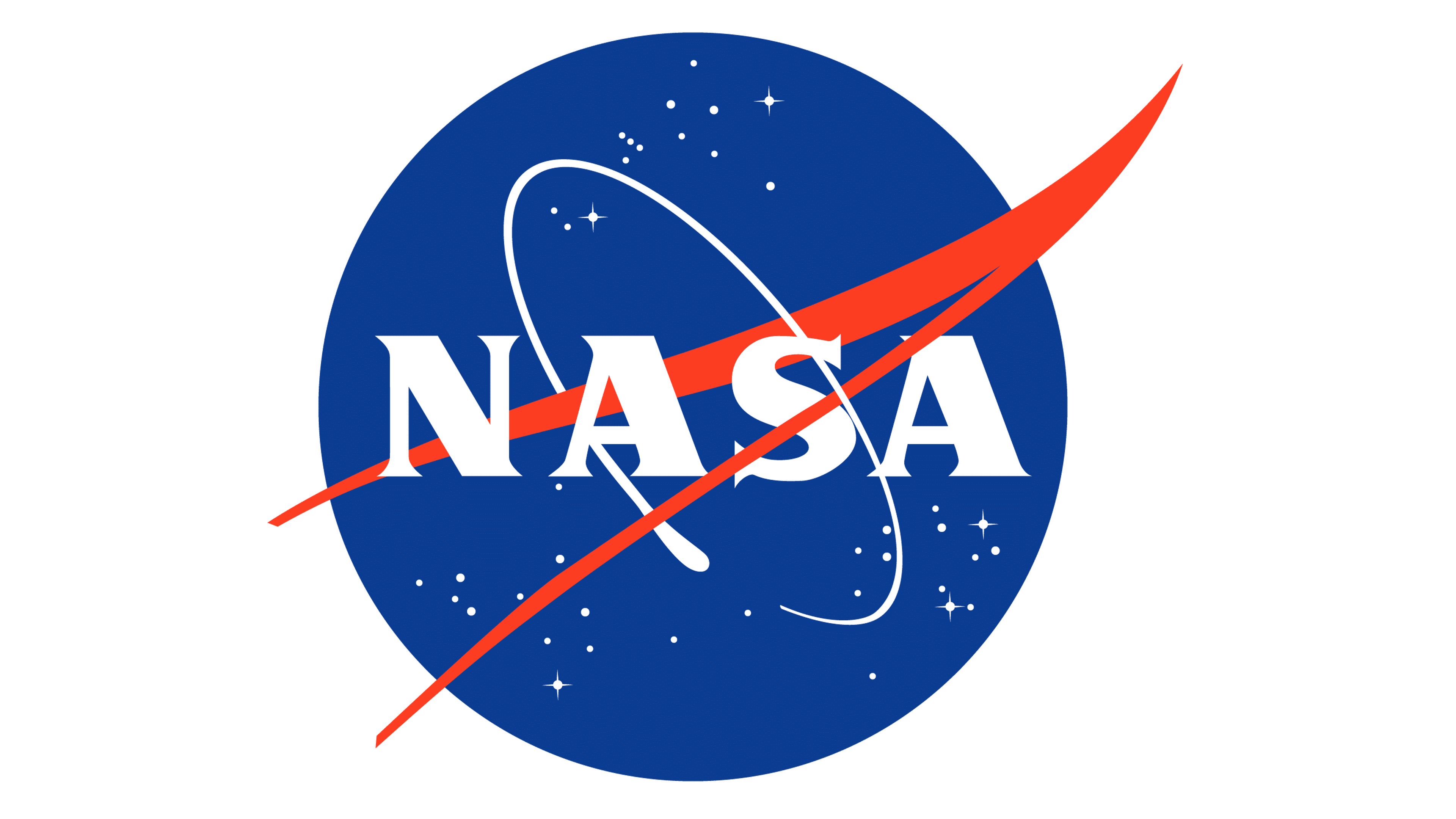
1992 – today
![]()
In 1992, the agency decided to return the iconic circle logo and use it alongside the acronym version. Nothing changed, except the color scheme became noticeably paler.
Emblem and Symbol
The reason why the old symbol had to be returned is possibly because the people got nostalgic. In addition to that, by 1992 the Space Race was over, and research in this field has pretty much returned to the good old days of massive cooperation on all fronts, which gave NASA an idea to return an old lighthearted emblem.


