Fujifilm Logo
Fujifilm, originally known for its photographic film products, has significantly diversified. Today, it’s a multinational corporation with a broad portfolio, including digital imaging, medical equipment, biopharmaceuticals, and material solutions. Major markets span across the globe, with significant presence in Asia, North America, and Europe. The company remains independently owned, headquartered in Tokyo, Japan. Its innovation-driven approach keeps it at the forefront in various sectors, continually adapting to technological advancements and market needs.
Meaning and history
Founded in 1934 as Fuji Photo Film Co., Ltd., Fujifilm began as a pioneering force in Japan’s nascent photographic film industry. Initially, it focused on producing photographic films, but soon expanded into x-ray and motion picture films post-World War II, demonstrating early signs of diversification.
In the ensuing decades, the 1960s and 70s, Fujifilm ventured beyond its core photography business. It delved into medical imaging, electronic imaging, and magnetic materials, signifying its adaptability and foresight in embracing emerging technologies.
The 1980s and 90s marked a period of intense global competition, notably with Kodak in the photographic film market. Fujifilm embraced the digital revolution, launching its first digital camera in the late 1980s. This period signified a strategic pivot towards digital technologies, shaping the company’s future direction.
The dawn of the 21st century brought substantial challenges, primarily due to the decline in traditional film demand amidst the digital boom. Fujifilm responded with a transformative strategy, reducing its dependence on photographic film and investing heavily in sectors like healthcare, advanced materials, and imaging solutions. This shift led to groundbreaking advancements in pharmaceuticals, medical diagnostics, and even cosmetics.
During the 2010s, Fujifilm accelerated its diversification through strategic acquisitions. Notable examples include the integration of Toyama Chemical, a pharmaceutical company, and Cellular Dynamics, a U.S.-based biotech firm. These acquisitions marked Fujifilm’s significant foray into healthcare and regenerative medicine.
Despite these evolutions, Fujifilm has maintained its independence, with its headquarters steadfast in Tokyo, Japan. The company’s journey from a local photographic film producer to a global, diversified conglomerate underscores its resilience and innovative spirit. Fujifilm’s ability to continuously reinvent itself in response to technological shifts and market dynamics remains a cornerstone of its enduring success and relevance.
What is Fujifilm?
Fujifilm, originally renowned for its photographic film, has evolved into a multifaceted global corporation, pioneering in fields ranging from digital imaging to healthcare. This Japanese giant, with its innovative ethos, continuously adapts, embracing technological advancements across diverse sectors like medical imaging, biopharmaceuticals, and material sciences. Today, Fujifilm stands as a symbol of adaptability and innovation, transcending its photographic roots to impact various aspects of the modern world.
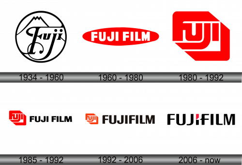
1934 – 1960
Encased within a perfect circle, this artistic logo depicts the word “Fuji” in an elegant, flowing script that exudes a classical charm. The bold, black strokes of the letters are reminiscent of traditional calligraphy, suggesting a sense of heritage and craftsmanship. Above the “j”, the logo features a stylized representation of Mount Fuji, an iconic symbol of Japan, which adds a layer of cultural identity to the brand. The circular boundary signifies unity and completeness, while the clear, contrasting black-on-white color scheme offers a timeless aesthetic. This design, with its blend of organic shapes and structured formality, embodies a harmonious fusion of natural beauty and refined artistry, reflecting the company’s long-standing association with visual excellence.
1960 – 1980
The logo features an elongated oval in a bold red hue, encapsulating the company name “FUJIFILM” in capitalized, sans-serif, white font. The simplicity of the design conveys modernity and efficiency, while the red color symbolizes energy and passion. The use of white for the text establishes a stark, visually arresting contrast against the red, ensuring the brand’s name is instantly recognizable and memorable. The oval shape suggests continuity and innovation, mirroring the company’s commitment to ongoing advancement in its field. Overall, the design encapsulates a contemporary aesthetic that aligns with the company’s forward-thinking ethos.
1980 – 1992
The Fujifilm logo showcases a dynamic, hexagonal shape with a bold red background, punctuated by the stylized white letters “FUJI.” The geometric form conveys precision and innovation, while the sharp angles imply forward movement and cutting-edge technology. This iteration represents a departure from the previous oval design, adopting a more angular and futuristic appearance. The encapsulated “FUJI” is both a nod to the company’s heritage and a statement of modern identity, emphasizing the brand’s evolution and adaptability in the digital era. The red and white color scheme remains, a testament to the brand’s enduring vibrancy and contrast.
1985 – 1992
The logo showcases a hexagon framing the stylized letters “FUJI,” alongside the word “FUJI FILM” in bold, black, sans-serif font. This design introduces a duality of color with the red and black, suggesting a balance of passion and sophistication. The hexagon, a departure from previous designs, leans towards an abstract representation, signifying innovation and structure. The separation of “FUJI” and “FILM” highlights the company’s roots in film yet signifies its broader identity. This version of the logo marries tradition with a modern, edgier aesthetic, reflecting the company’s evolution while maintaining its foundational identity. The stark contrast between the intricate red symbol and the simplicity of the “FUJI FILM” text creates a visually compelling and memorable brand image.
1992 – 2006
The logo presents a harmonious blend of a geometrically stylized “FUJI” emblem in a vibrant red, adjacent to the “FUJIFILM” in a solid, black typeface. The emblem’s design, with its hexagonal boundary and internal whitespace, reflects a modernist vision, speaking to the company’s innovative spirit. This iteration retains the red and black color scheme, yet the textual component “FUJIFILM” is more pronounced, asserting the company’s expertise in its foundational industry. The stark contrast of the red symbol against the black text creates a strong visual statement, symbolizing a balance of legacy and evolution. The updated design suggests a seamless fusion of tradition with contemporary aesthetics, encapsulating Fujifilm’s journey from its photographic film roots to a diversified technological entity.
2006 – Today
The logo presented is a minimalist yet powerful rendition of the Fujifilm brand identity, consisting of the company name “FUJIFILM” in bold, black, sans-serif lettering. A single red rhombus accentuates the “I” in “FUJIFILM,” injecting a splash of color that has become synonymous with the brand. This design marks a notable evolution from earlier versions by simplifying the graphics and focusing on the typography, which speaks to the company’s modernity and streamlined approach. The red accent, while small, is a deliberate nod to the company’s heritage in imagery and photography, symbolizing a heart of creativity within a robust, monolithic text. This blend of simplicity and a touch of vibrancy reflects Fujifilm’s commitment to elegance and innovation in their field.


