Kentucky Wildcats Logo
The Kentucky Wildcats refer to the athletic teams representing the University of Kentucky, a prominent institution in Lexington, Kentucky. Created in the late 19th century, the Wildcats compete in NCAA Division I as part of the Southeastern Conference. Known for their storied basketball program, which has won multiple national championships, the Wildcats also excel in other sports. The teams symbolize school spirit and athletic excellence, drawing fans nationwide. The Wildcats were created to foster competitive sportsmanship and university pride.
Meaning and history
The Kentucky Wildcats, representing the University of Kentucky, have a rich athletic history. The term “Wildcats” was coined in 1909 after a football victory. The color blue was adopted in 1892, becoming a symbol of the university’s athletic teams. The Wildcats have seen a series of coaches bring glory to their basketball program, with Adolph Rupp and John Calipari among the most notable. The athletics program has expanded over the years, including a variety of sports and generating a community known as the Big Blue Nation.
What is Kentucky Wildcats?
The Kentucky Wildcats embody a dynamic array of sports teams from the University of Kentucky, celebrated for their spirited competitiveness, particularly in basketball. They stand as a beacon of athletic prowess and university spirit in Lexington, captivating fans with each game and season.
1973 – 1988
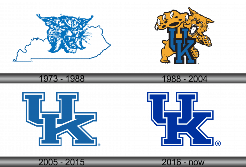
The logo captures Kentucky’s essence with a wildcat superimposed over the state’s silhouette. Its fierce gaze embodies competitive spirit. The wildcat’s detailed fur hints at Kentucky’s rugged natural beauty, while the state outline grounds the emblem in regional pride. This mark, steeped in shades of blue, symbolizes the Wildcats’ sports teams, marrying ferocity with a deep connection to place.
1988 – 2004
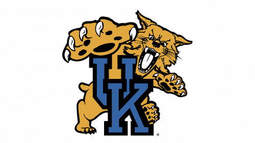
This emblem showcases a growling wildcat, aggressively perched on the initials ‘UK’. The feline’s fierce expression and bared teeth convey a fighting spirit. The illustration is more animated and detailed compared to the previous silhouette, with the wildcat’s golden hue and black detailing adding depth. The ‘UK’ letters in bold, dark blue provide a strong contrast, highlighting the university’s initials. This logo is a vivid portrayal of the tenacity inherent in the Wildcats’ identity.
2005 – 2015
The logo transitions to stark simplicity, featuring bold, blue ‘UK’ initials outlined in white. Absent is the wildcat, focusing solely on the university’s acronym. This minimalist design contrasts sharply with the prior complexity, opting for clean lines and solid color. It’s a refined, direct visual that resonates with clarity and academic identity, leaving behind the aggressive wildcat imagery for a more universal collegiate symbol. This evolution reflects a modernized approach to university branding.
2016 – Today
The updated logo maintains the simplicity of its predecessor, presenting the ‘UK’ in a solid, deep blue without an outline. It’s a subtle yet distinct shift, emphasizing a sleeker, more contemporary design. This minimalistic approach reflects a modern aesthetic, focusing purely on the iconic initials synonymous with the University of Kentucky.
