Knorr Logo
Knorr is a brand known for its wide range of soups, bouillons, seasonings, and sauces. Carl Heinrich Knorr founded it in Heilbronn, Germany. He aimed to provide nutritious, flavorful meal solutions that were easy to prepare. The brand originated with the purpose of enhancing the taste and healthiness of meals through better preservation techniques.
Meaning and history
Knorr was established in 1838 by Carl Heinrich Knorr, who began experimenting with drying seasonings and vegetables to preserve their flavor. By 1873, Knorr’s experiments had led to the launch of their first dried soups across Europe. This innovation was pivotal, making nutritious, delicious meals accessible to more people. In 1957, Knorr introduced the world to its first dehydrated soup, further simplifying meal preparation. The 1980s saw the introduction of the Knorr Stock Cube, revolutionizing flavor enhancement for home cooks globally. Knorr products are sold in nearly 90 countries, continuing to evolve with new tastes and dishes that cater to modern-day palates.
What is Knorr?
Knorr is a food brand specializing in seasonings, sauces, and dehydrated soup products. It focuses on bringing rich flavor and convenience to kitchens around the globe. Knorr products help cooks create nutritious, tasty meals easily.
1938 – 1988
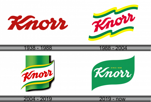
The Knorr logo presents itself in a vibrant shade of red, capturing attention immediately. Bold, cursive letters flow across the image, suggesting a sense of fluidity and tradition. The initial “K” stands tall, with a distinctive flourish, setting the tone for the rest of the letters that follow in a smooth, connected script. This typographic choice exudes confidence and a legacy feel, hinting at the brand’s longstanding history in the food industry. There’s a homely charm to the way the letters interlock, akin to ingredients in a well-prepared dish. The logo’s color and style together embody the warmth and zest that the brand aims to bring to kitchens around the world.
1988 – 2004
In this evolution of the Knorr logo, a dynamic wave-like banner in green and yellow cradles the red script. The banner adds a fresh, organic touch, hinting at natural ingredients and vibrant flavors. This emblem sits on a slightly tilted plane, creating an illusion of movement and energy. Green and yellow often symbolize freshness and vitality, reinforcing the brand’s connection to wholesome, lively food experiences. The red script remains prominent, now enlivened by the colorful background, further standing out and speaking to the brand’s passionate commitment to taste. This design choice underlines Knorr’s identity as a brand that infuses meals with excitement and joy.
2004 – 2019
Now the Knorr logo unfurls on a curvaceous, three-dimensional green backdrop, simulating a cylindrical shape. The iconic red script remains at the forefront, enhanced by the shadow it casts, adding depth. Green, the color of freshness, now wraps around, embracing the emblem in a way that suggests a panoramic, all-encompassing experience. The yellow and green wave retains its position beneath the brand name, but now it appears to ripple across a broader surface. This design choice seems to convey a global reach, echoing the brand’s worldwide presence. The shadows and highlights lend a modern edge to the logo, mirroring the brand’s continuous innovation in the food industry.
2019 – Today
The logo now flaunts a cleaner, flat design, reflecting modern minimalist trends. The cylindrical illusion is gone, replaced by a simple, elegant green flag-like shape. In this iteration, the Knorr name takes center stage in white, maintaining its script character but with a refreshed clarity. Notably, “SINCE 1838” is now included in gold, proudly emphasizing the brand’s heritage and trust built over centuries. The removal of the red color for the script creates a more harmonious green-on-green palette, symbolizing a seamless connection to nature and health. This design feels timeless yet contemporary, aligning the historic brand with the present day’s aesthetic values.
