Doritos Logo
Doritos is a marque of corn chips, produced by an American food manufacturer, Frito-Lay, since 1964. Now, the company works under the PepsiCo’s management. There are numerous Doritos kinds for various tastes and preferences. Doritos has achieved its success via distinctive marketing campaigns, often affecting worldwide sports events and shows, enlisting many marketing campaigns conducted during the Super Bowl championships.
Meaning and history
The ‘Doritos’ name was authored by Arch West, the head of marketing office of Frito-Lay at the time of the brand invention. He came up with the ‘doritos’ word, originating from the Spanish ‘oro’ word for gold plus ‘ito’ suffix plus capital ‘d’ at the front.
The original tortilla chips were manufactured in 1964 and introduced in Disneyland Park shop named Casa de Fritos, or Rancho Del Zocalo today. The initial idea was to make a nachos-like product made of seasoned maize tortillas. It got tasteful to the customers, which led to spreading of the brand nationally and adding of various tastes, beginning with toasted Corn in 1966, Taco in 1967, and Cheese in 1972.
What is Doritos?
Doritos is an American brand of chips produced by Frito-Lay. This is one of the most popular names of the tortilla chips, having various flavors. Launched in 1964, the brand has attracted everybody’s attention via resounding marketing campaigns held on various large events, such as Super Bowl.
1964 – 1968
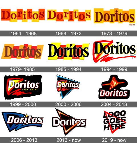
The very first logotype depicted a friendly nameplate, written in dark red letters, having small rounds and serifs at their tips. They showed up in small rectangles, one for every character. The shapes for ‘d’, ‘r’ ,’t’, and ‘s’ characters were yellow, while the other ones were orange. Below the ‘o’ letter, they wrote the ‘brand; word in all bold capitals.
1968 – 1973
The image features the logo for Doritos, a brand synonymous with bold flavors and vibrant snacking experiences. Each letter is contained within its own rectangle, creating a visual rhythm across the design. The letters themselves are stylized in a serif typeface, which adds a sense of sophistication and timelessness to the branding.
The color palette is a fiery mix of red, orange, and yellow hues, each rectangle transitioning to the next like a gradient. These colors are evocative of heat and spice, aligning with the brand’s identity, which often incorporates strong and spicy flavors in its products. The variation in color from letter to letter also suggests diversity in taste and choice, resonating with the variety that Doritos offers.
1973 – 1979
The second logotype has continued the concept set up by its predecessor and improved it. The letters became brown, and they stood in orange and darker orange rectangles. The word’s typeface also became a bit softer than before: the curls got smaller, and the serifs – slimmer. The whole logotype was also grouped, so the characters stood closer to one another, while their rectangles got narrower.
1979 – 1985
The 1979 wordmark represents the bold brown name caption, positioned over (not inside) 7 tilted figures, colored some yellow, some beige. The letterforms weren’t that different from the previous ones – they just got bolder. As for the other elements in the design, so there was the ‘tortilla chips’ inscription centrally below. It had a slim serif typeface with all capitals.
1985 – 1994
The next logotype performed the black name with all letters outlined white. The ‘i’ had a triangle instead of a dot above the line. All the letters showed up over 5 large parallelograms. The first, third and fifth of them were yellow, white the remaining two were bright red. Each of them had a small black bar at the bottom. Actually, the whole logotype has become way larger comparing with the previous ones – the letters got higher, and the background shapes – larger.
1994 – 1999
During the second part of the 90s, there was a special logotype designed for the Doritos chips. It depicted the lettering put over a triangular red chip, styled in a bold contour, with another yellow triangle behind it. This red triangle left a bold trace after it. The lettering reminded the previous 1985 variant in many aspects, but it also had some differences. For example, the ‘d’ character had rounded tips, while the ‘s’ got its serifs rounded.
1999 – 2000
For some time, this whole composition was put on a black rectangular background with abrupt edges, and accompanied by the ‘corn chips’ words. In this logotype the nameplate had received a new style with italicized characters written in a heavy straightforward typeface.
2000 – 2006
With the new century upcoming, the brand designers from Doritos had developed a redesign for the chips logo. As previously, it showed the inscription, again performed in a new typeface, standing over the familiar triangle leaving a bold trace. The new feature here was a third equilateral rectangle, way larger in size and black, blue & white in color.
2004 – 2013
For the 2004 logotype, the Doritos marketers came up with quite an unusual emblem – a cardiogram styled as a chip. Below it, they wrote the nameplate in 3D typeface, having metallic characters without serifs.
2006 – 2013
In the 2007 logo design, they’ve taken that old red and yellow triangle with a bold red trace, and colored it all dark blue for the contour & trace and black for the inner part of the triangle. They also made this image a bit more ordinary, not abrupt and dirty as before. Over it, of course, was the inscription – it had the typeface similar to the 2004 version, but italicized and contoured black. The triangle above the ‘i’ also changed the coloring to yellow.
2013 – today
The latter logotype of the company represents a fresh style – it’s the triangle, going through the ‘o’ letters’ holes with its right and left bars. The central letters stand inside the figure, while the first and the last ones are put along its left and right edges.respectively.
2019 – today
For the 2019 marketing campaign, the Doritos’s marketers have developed quite a simple logotype – they drew a red frame in the shape of a triangle, and wrote the ‘logo goes here’ text in capitals. The ‘o’ and ‘s’ characters were almost planted on the lines, while the ‘e’ symbol was clearly behind it. The rest of the wording was over the shape.
Color
The modern 2013 Doritos signature has a black, white, and gradient orange & white color composition. Here’s how the colors are set: the background triangle has a black fitting, contoured gradient of orange and white, the color pair which reminds of a flame. The inscription is metallic white, and its highlightened by a very bold black contour, containing another very slim red contour inside itself.
Font
The word’s metallic typeface has angular and bold letter shapes without serifs. There are very small intervals in between, and the central characters are visibly smaller than the first and the last ones. The ‘i’ character looks like a rectangle with a triangle above.
