Foodpanda Logo
Foodpanda is an online food and grocery delivery platform, known for connecting users with local restaurants and shops. The company was founded by Ralf Wenzel, Benjamin Bauer, and Felix Plog in 2012. It initially launched in Singapore and has since expanded its operations to over 40 countries across Europe, Asia, Latin America, and the Middle East. This widespread presence highlights Foodpanda’s significant growth and influence in the food delivery industry.
Meaning and history
Founded in 2012 by Ralf Wenzel, Benjamin Bauer, and Felix Plog, Foodpanda quickly emerged as a key player in the online food delivery service sector. The company’s initial success in Singapore set the stage for rapid expansion. By 2013, Foodpanda had extended its services to 16 countries, significantly marking its global footprint.
A major achievement was its acquisition by the Berlin-based company Delivery Hero in 2016, which further solidified its position in the market. This move enabled Foodpanda to benefit from synergies within the Delivery Hero network, fostering innovation and expansion. The company has also been at the forefront of technology, introducing features like AI-powered recommendations and sustainable packaging options.
Currently, Foodpanda continues to grow, with a presence in over 40 countries. It has diversified its offerings, now including grocery delivery alongside food services. Its commitment to fast and convenient delivery, coupled with a vast selection of culinary choices, keeps Foodpanda at a competitive edge in the ever-evolving online delivery landscape.
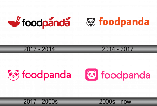
2012 – 2014
The logo is composed of a stylized bowl in bright red, with two white lines suggesting chopsticks or steam emanating from the dish, signifying hot food ready to be enjoyed. Adjacent to the bowl is the brand name “foodpanda” in lowercase letters, with two ‘a’ in “panda” playfully represented by red apple-like shapes. The overall design is modern and minimalist, conveying a sense of simplicity and convenience associated with the brand’s service. The color red dominates the palette, often associated with appetite and passion, which is fitting for a company in the food service industry.
2014 – 2017
This iteration prominently features a playful and inviting panda bear’s face in black and white to the left of the brand name. The panda, a symbol of friendliness and reliability, adds a charming touch to the logo. The word “foodpanda” is written in a bold, sans-serif, lowercase font in a vibrant orange color, providing a strong visual contrast to the panda illustration.
Comparing this to the previous version, the most notable change is the replacement of the abstract red bowl and apple-like shapes with the panda’s face, which gives the brand a more personable and recognizable mascot. This shift indicates a strategic move towards a more relatable and memorable brand identity. The orange hue remains consistent, maintaining the energetic and appetizing appeal of the brand.
2017 – 2000s
The logo is a variant of the Foodpanda brand, showcasing a circular panda icon next to the brand name in a vivid pink hue. The panda icon is simplified, with subtle details to suggest a friendly and approachable image. The brand name follows in a clean, sans-serif typeface, with the “oo” in “food” and the “a” in “panda” slightly stylized to add character.
When compared to the previous orange version, the most apparent change is the color scheme, shifting from a bold orange to a playful pink. This iteration retains the whimsical essence with the panda motif but chooses a softer color palette. The panda design in this version is more rounded and less detailed, suggesting a move towards a more abstract and modern aesthetic. This logo variation maintains the brand’s recognizable identity while injecting a fresh, youthful vibe.
2000s – Today
The logo depicts the Foodpanda brand with a modern twist, featuring the iconic panda in a simplified, rounded form within a pink square, reminiscent of an app icon. The brand’s name is written in a vibrant pink, sans-serif font against a black background, providing a striking contrast.
Comparatively, this logo retains the pink color and friendly panda from the previous design but introduces a square framing for the mascot, aligning with digital trends for app icons. This version projects a more tech-savvy image, potentially appealing to a mobile-first audience.
