Kodak Motion Picture Film Logo
Kodak Motion Picture Film refers to the film stock for motion pictures developed by Eastman Kodak. George Eastman created it in Rochester, New York. This invention aimed to provide filmmakers with high-quality film stock for shooting movies. Its development was crucial for the evolution of cinema, offering reliable, standardized film.
Meaning and history
Kodak introduced its Motion Picture Film in 1888, revolutionizing film technology. In 1891, they developed the first commercial transparent roll film, which Thomas Edison then used to build the motion picture camera. Kodak’s film underwent continuous improvements, which included the addition of sound on film in the 1920s. These advancements made film a pivotal medium in entertainment and communication. Over the decades, Kodak’s film has captured some of history’s most significant events and cinematic masterpieces.
What is Kodak Motion Picture Film?
Kodak Motion Picture Film is a type of film stock specifically made for capturing motion pictures. It provides a medium for filmmakers to record visual narratives. This film is notable for its high quality and durability, which makes it a preferred choice in the cinematic industry.
1989 – 1999
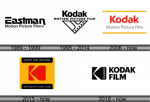
The logo displays the name “Eastman Motion Picture Film” in bold, capitalized letters. The text “Eastman” stands out in larger font above “Motion Picture Film”, establishing a visual hierarchy. Both lines of text employ a sans-serif typeface that conveys modernity and efficiency. The logo’s monochromatic scheme imparts a classic, timeless feel.
1995 – 2014
This logo integrates the iconic “Kodak” brand name above “MOTION PICTURE FILM”, arranged in a two-tiered format. The bold, sans-serif font enhances readability and impact. A distinct triangular element encases a strip of film, creating a dynamic visual metaphor for the brand’s industry. The film perforations within the triangle add a touch of specificity, echoing the actual product. The logo’s sharp contrast and clean lines offer a modern and professional appearance.
2006 – Today
This rendition of the logo exhibits a vibrant color shift to red for “Kodak” and gray for “Motion Picture Film”, enhancing visual separation. The text is underscored by golden horizontal lines, adding a distinguished flair. The typeface for “Kodak” retains a rounded, friendly style, while “Motion Picture Film” uses a more straightforward, sans-serif font. The absence of previous triangular and filmstrip elements signifies a turn towards simplicity and contemporary design sensibilities.
2015 – Today
In this latest logo, “SHOT ON KODAK” is proudly displayed at the top, suggesting exclusivity and quality. A stylized red “K” dominates the center against a yellow background, symbolizing Kodak’s brand. Below, “MOTION PICTURE FILM” is written in a straightforward, black sans-serif font, encapsulated in a black rectangle. The overall design departs from minimalism, opting for bold color contrasts and geometric shapes, reflecting a modern and assertive brand identity.
2018 – Today
The logo has shifted to a striking monochrome palette, with the “K” icon and “KODAK FILM” in bold white against a black background. The “K” is abstracted, while the font is modern, sans-serif, and strong, suggesting reliability. This design simplifies the logo further, focusing on the brand’s core identity and heritage in film.
