Longines Logo
Longines is a prestigious Swiss watch brand, renowned for its elegance and precision. Established by Auguste Agassiz in Saint-Imier, Switzerland, Longines boasts a long tradition of craftsmanship and innovation in watchmaking. It was created to offer high-quality timepieces that blend technical expertise with timeless style. Known for their involvement in sports timing and aviation, Longines watches have become symbols of sophistication and durability, reflecting a strong heritage and commitment to excellence in watch design.
Meaning and history

Longines, a Swiss legacy in watchmaking, began in 1832 in Saint-Imier. Founded by Auguste Agassiz, it revolutionized timekeeping. Initially, Longines focused on pocket watches, blending elegance with precision. In 1867, they introduced their first factory, innovating with mechanized production. This move marked a significant industry shift, enhancing quality and efficiency. By 1880, Longines was globally recognized, acclaimed for accuracy and design. Pioneering spirit led them to sports timing. They timed Olympic events from 1896, showcasing technical prowess. The 1900s brought aviation watches, aiding pioneers like Lindbergh. Longines became synonymous with reliability, aiding explorers and aviators. Post-WWII, Longines diversified, blending tradition with modernity. They launched iconic models, setting style standards. Longines thrives, merging heritage with innovation, epitomizing timeless elegance in watchmaking.
What is Longines?
Longines is a revered Swiss watchmaker, known for its blend of tradition and innovation. Since its inception in 1832, the brand has become synonymous with precision and elegance, crafting timepieces that epitomize sophistication and technical mastery.
1867 – 1880
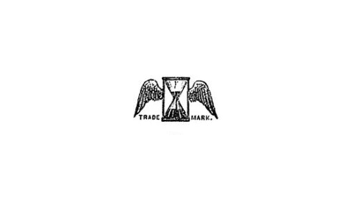
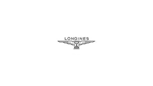
The logo captures a winged hourglass, eloquently conveying time’s fleeting nature. Wings spread, symbolizing swift passage, flanking the poised hourglass. “TRADE MARK.” underscores its authenticity, a hallmark of heritage and quality. A minimalist yet profound emblem, it represents a timeless narrative of endurance and legacy, evoking the brand’s storied past and commitment to excellence. This iconic insignia stands as a testament to the brand’s longstanding history in horology.
1880 – 1889
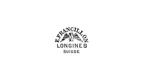
The evolution of the logo adds textual elements, enhancing its identity. Atop, “EFrancillon” pays homage to the founder, Ernest Francillon. Beneath the winged hourglass, “LONGINES” stands out, asserting the brand’s prominence. “SUISSE” anchors the design, a nod to its Swiss origins. The addition of names provides context, linking the timeless symbol to its historical roots and geographical home. It’s a subtle yet significant transformation, enriching the emblem with layers of meaning, reflecting the brand’s growth and prestige.
1889 – 1925
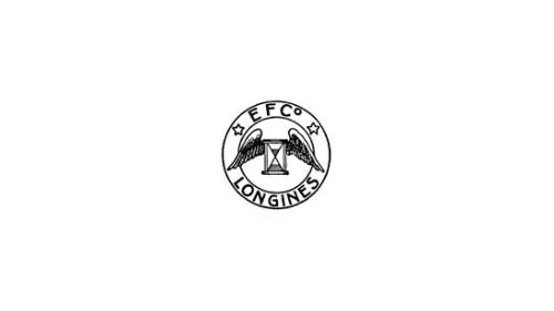
This iteration encircles the winged hourglass within a ring. “EFCo” appears, abbreviating the founder’s name, Ernest Francillon & Co. “LONGINES” remains prominently displayed, asserting brand recognition. Stars punctuate the circle, suggesting excellence and perhaps milestones or achievements. This design shifts towards a more emblematic and official appearance, implying a seal of quality and distinction. The circular boundary denotes unity and completion, encapsulating the brand’s legacy and standing in the watchmaking world.
1925
The logo simplifies dramatically, eschewing imagery for a stark textual presentation. “LONGINES” stands alone, stripped of previous adornments. The typographic choice exudes confidence, relying solely on the power of the name. This minimalist approach reflects a modernist design ethos, suggesting a brand comfortable with its prestige, requiring no embellishments to convey its value. The solitary word becomes a statement, signifying a brand with enough renown to be instantly recognized by name alone.
1925 – 1930
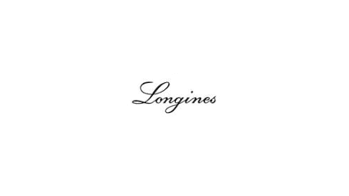
Transitioning from stark to graceful, the logo now features “Longines” in a flowing, cursive script. This design conveys elegance and fluidity, reflecting the brand’s association with sophistication in watchmaking. The script’s curves and flourishes add a personal, almost signature-like quality to the logo, enhancing its luxury appeal. It’s a visual shift from the straightforward to the ornate, emphasizing the brand’s artistry and attention to detail.
1930 – 1940
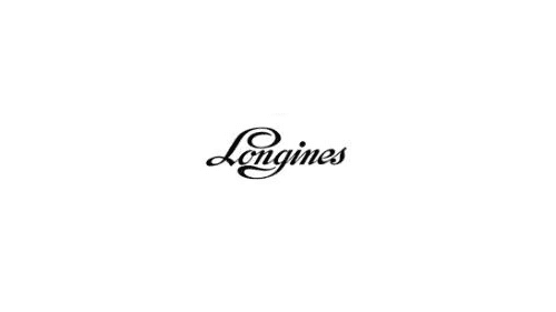
The logo retains its cursive elegance but introduces a subtle change in the font’s weight and form. The “L” in “Longines” displays a more pronounced curve, adding a distinct flair that suggests a blend of tradition and modernity. This typographic refinement speaks to a brand evolving with the times while still cherishing its heritage. The overall effect is one of understated refinement, mirroring the brand’s commitment to craftsmanship and timeless style in their timepieces.
1940 – 1942
The logo shifts from cursive to a bold, capitalized sans-serif typeface, marking a return to minimalism. This stark typography suggests a modern, forward-thinking brand, one that emphasizes clarity and impact over flourish. The uniformity of the letters in “LONGINES” conveys a sense of stability and strength, reflecting the brand’s enduring reputation for quality and precision in the watchmaking industry. The simplicity of this design aligns with a mid-century modern aesthetic, indicating a focus on functionality and elegance.
1942 – 1954
The logo reintroduces the iconic winged hourglass, placed centrally beneath the “LONGINES” text. The wings extend outward, symbolizing swiftness and the passage of time, a tribute to the brand’s aviation heritage. The sans-serif font is retained, ensuring the brand name stands out with clarity and modern appeal. This fusion of the classic emblem with contemporary typography reflects Longines’ respect for its rich history and its commitment to current design trends. The logo is a balanced blend of past and present, a visual narrative of the brand’s journey.
1954 – 1957
In this rendition, the winged hourglass is reduced in size and nestled directly below the “LONGINES” text, suggesting a subtler approach. The text itself maintains its sans-serif font, continuing the theme of clean, modern lines. This downscaling of the emblem reflects a confident brand that relies on the strength of its name, with the hourglass serving as an understated reminder of its heritage. The design speaks to an era where less is more, emphasizing finesse over grandiosity.
1957 – 1965
The logo now features an elliptical outline encapsulating the winged hourglass, adding a dynamic contour to the design. The “LONGINES” text remains prominent above the emblem, preserving its sans-serif clarity. This elliptical border introduces a sense of motion, echoing the perpetual movement of time, a fitting metaphor for a watchmaker. This new boundary around the hourglass and text symbolizes the brand’s global reach and the continuity of its legacy, enhancing the logo’s visual interest and brand recognition.
1965 – 1981
The elliptical frame is discarded, returning to a minimalist approach. The winged hourglass is now a detailed, textured emblem, positioned above the “LONGINES” text. This iteration of the logo simplifies the overall design yet adds complexity to the hourglass, emphasizing the brand’s craftsmanship. The text remains unchanged, signifying steadiness in brand identity. This design choice reflects a focus on the core elements that represent the brand’s heritage and expertise in watchmaking.
1981 – Today
The logo now adopts a bold navy hue, with the “LONGINES” text in a strong, blocky serif font. The winged hourglass is reimagined with geometric clarity, sitting centrally below the brand name. This color choice and font selection convey a sense of reliability and professionalism, while the simplified hourglass suggests a modern interpretation of the brand’s historical symbol. The design’s evolution reflects a balance between heritage and contemporary aesthetics, a visual commitment to timelessness and innovation.

