Rolex Logo
Rolex is the leading manufacturer of luxury watches and is also one of the most expensive watch brands. brand’s creator achieved a significant advancement in the art of watchmaking by introducing to the world chronometers that were not only stylish and sophisticated but also very precise and accurate. Wilsdorf meticulously crafted the clockwork while also paying close attention to the design. Swiss chronographs are now frequently linked to the Rolex brand.
Meaning and History
Hans Wilsdorf, then 24 years old, and Alfred Davis, his brother-in-law, established Wilsdorf & Davis Ltd. in 1905. This company brought in Swiss movements, put them in British cases, and then sold them to jewelers. Wilsdorf coined the name Rolex in 1908, which is simple to say in any European language. This name means nothing. The main thing is that it sounds good and looks well on the accessories. To guarantee the stability of the business and the durability and reliability of its products, Hans Wilsdorf created a non-profit company in 1945. The most influential watch brand belongs to a charitable foundation. It could no longer be sold, taken over, or made public.
What is Rolex?
Rolex chronographs rank among the most prestigious. Each collection stands out for its originality, one-of-a-kind style, superior craftsmanship, and durability. The Hans Wilsdorf Foundation owns Rolex since 1945, donating a large portion of its income to charities and social causes, and reinvesting the profits back into the company.
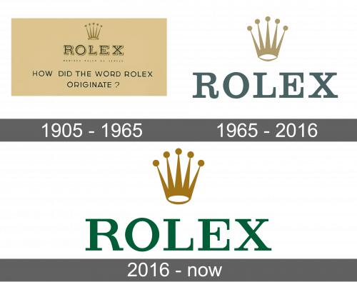
1905 – 1965
The name of the brand was the center of the logo. It was done in black (or dark green) with a beige and gold outline. A five-pointed crown, which was placed right above it, has a double meaning: a watch crown, which sets the time, and the crown as a symbol of luxury and prestige. It is done in traditional gold color with pretty long spikes and small round decorations on the ends.
1965 – 2016
The brand removed the outline around the name and slightly modified the font, keeping transitional style serifs. The letters look bolder and a deep green color gives the name a royal and sophisticated appearance. The crown acquired a more elegant look thanks to bolder lines, fewer details, and a more muted golden shade.
2016 – Today
Although there were only minimal changes, this version looks more confident and modern. Both the green and the golden look more saturated, yet they preserve an elegant and premium brand image. The typeface was also changed to give it a stylish form.
Font and Color
The original logo features Egyptian 505 Regular or similar typeface with transitional serifs and bold lines. It was created by Andre Gurtler and published by Linotype. It was later modified to resemble Harmony or a similar typeface. It looks like the latest emblem uses a font similar to Clarendon font. It is a transitional serif old-style font with bold, clean lines. The green and gold color palette has been used by the brand for many years. There were slight changes in shades from logo to logo, but the overall royal impression was not changed.


