TAG Heuer Logo
Heuer, the founder, wanted to make a breakthrough in watchmaking and present ultra-precise and modern chronographs to the world, which he managed to do. The company invented iconic chronographs. In addition, it boasts legendary watches, such as the Carrera and Monaco, which delight lovers of premium accessories. Today TAG Heuer is one of the leaders in the production of racing chronographs, with sales points in 120 countries. It controls about 85% of the world turnover of its products.
Meaning and History
The company known as TAG Heuer was founded in 1860 in the Swiss town by the son of a shoemaker, Édouard Heuer. The word “TAG” in the name is an acronym for Techniques d’Avant-Garde. In 1869, Eduard Hoyer change the direction of watchmaking history by presenting his first patented invention: a crown remontoir that did not require a crown. In 1880, Eduard Hoyer was the first to start producing chronographs. After the death of Hoyer Sr. in 1892, the inventor’s sons Jules-Edouard and Charles-Auguste continue his work. In 1902, they bought out the shares from the co-owners, turning the watch business into a family business, focusing on the production of chronographs. During the reign of the Hoyer brothers, the company patented a number of their own developments on top of their father’s.
What is TAG Heuer?
TAG Heuer watches traditionally occupy high positions in the world market. The company’s specialists create not only original sports watches but also revolutionize the watch industry by introducing unique chronometer models with unusual technical complications.
1860 – 1985
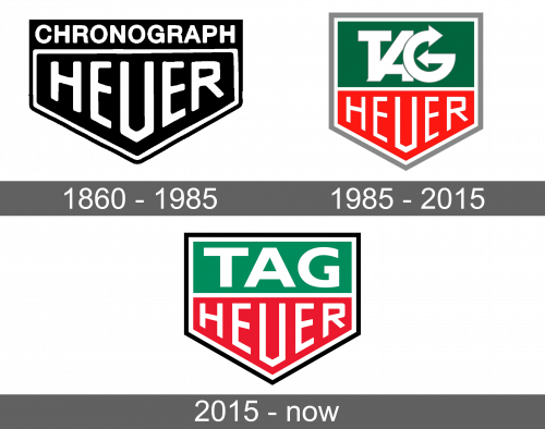
The original logo looked brutal and masculine and at the same time timeless and professional. An arrow pointing down served as the base. It was black with a white outline that was contoured by a thin black line for contrast. The word “Heuer” filled the shape, featuring white, sans-serif letters of geometric shape.
1985 – 2015
The company decided to add “Techniques d’Avant-Garde” or rather an acronym of the phrase to the logo. It has simply added a green rectangle on top of the previous logo. The “TAG” was done in a very bold way with clean lines, overlapping letters, and the letter “G” having arrows on both ends. The bottom portion was now a bright red color, while the border was changed to a light gray, thicker border. The overall look was impressive.
2015 – Today
The brand made more modifications to its logo. The green and red emblem was enhanced by the black inscription “TAG Heuer” on one line and “Swiss Avant-Garde Since 1860” on the second. Both lines were about the same length, which made the “TAG Heuer” much bigger and bolder. The company used a basic sans-serif font for all the inscriptions.
Font and Color
TAG Heuer has been pretty consistent with the style of its logos using bold color palettes. Initially, it was just black and white, then it added bright green and red colors. The red color added some energy, while the green stands for growth and balance. Black is known to represent luxury and have a formal and elegant appearance.


