MLB Logo
MLB stands for Major League Baseball – the nation-wide league where top baseball teams from all over America compete each year. Just as the sport itself has an extremely long and proud history in this country, the league is also one of the longest organizations of its kind in the US.
Meaning and History
Before the 1902, baseball was mostly played by interested individuals or in amateur leagues, at best. By the start of the 20th century, these leagues banded together to create the nation-wide organization that would govern the sport throughout the country – this organization became MLB.
1969 – 1991
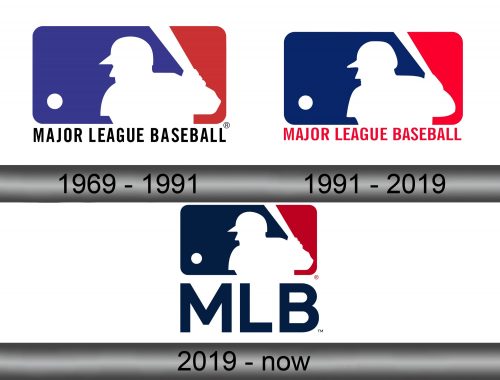
MLB didn’t really have any official emblem before 1969. That year, inspired by other leagues, such as NBA and NFL, created a blue-red logo with a player’s white silhouette on it. In this instance, it was rectangular: three-fourths on the left were blue, and the last quarter was red – separated by a white baseball player between them.
The player was ready to swing a bat at a ball that flew directly at him – they put that one in the middle of the red space simply as a white circle.
Beneath it were the words ‘MAJOR LEAGUE BASEBALL’ in tall, plain letters written in pretty much the same red as the logo itself.
1992 – 2018
In 1992, MLB changed the color palette slightly by making the blue a noticeably darker, and that’s it.
2019 – today
Again, they made the blue even darker by 2019. This time, however, they also got rid of the red writing below, which increased cleanness of the overall emblem.
Emblem and Symbol
There were also several secondary logos. For instance, they like to take the logo proper and put it right next to the name’s acronym written in big, dark-blue letters. These emblems aren’t used as commonly, but they are there. There are also many more semi-official logos, but a lot of them aren’t even in use.


