Nascar Logo
The NASCAR is one of the most sought-after sports championships conducted in the United States. The top division Sprint Cup races are second in popularity only to American football matches. In addition to the breath-taking races, in which several dozen drivers compete nonstop for around four hours, the NASCAR fanbase is expanding thanks to the down-to-earth racers. After all, originally, car racers were predominantly individuals who illegally smuggled whiskey from one state to another during the Prohibition era.
Meaning and History
NASCAR President William (Bill) Franz established the National Association for Stock Car Auto Racing. Races on the beach and along the pedestrian promenade of Daytona Beach are what it all started with. Originally, the association was called the National Championship Stock Car Circuit or NCSCC. Since 1949, NASCAR is not just a race for enthusiasts, but an official event in which there are uniform rules and classes. By 1979, NASCAR was a fairly popular race, but the real breakthrough came when the Daytona 500 was aired on TV. Since 2009, it has been owned by his grandson, Brian Franz.
What is Nascar?
For over half a century, NASCAR is a kind of family business holding the largest (and most prestigious) auto racing in the US. Commitment to traditions plays an important role as NASCAR does not care much about making supercars, relying more on tradition and attractiveness for the audience.
1948 – 1955
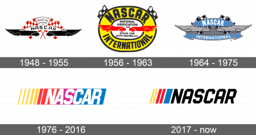
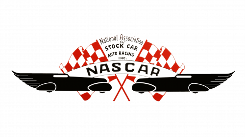
The original logo had a lot of details. Two black racing cars facing each other are placed towards the bottom of the screen in front of two red and white checkered flags. The cars have an elongated form with wing-like backs that give the logo some dynamics and reflect the speed of racing. A white banner arches above the cars and has an abbreviation of the association in bold, black sans-serif letters. The full name is written using a fancier typeface between the flags.
1956 – 1963
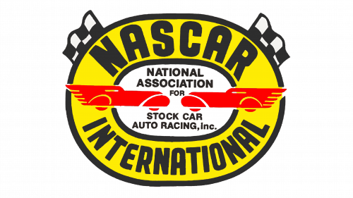
An addition of a bright yellow oval for a background is the first thing one sees. It has a black border on the outside which is repeated on the inside, framing a white oval shape in the center. It reminds of a racing track and says “NASCAR International” in large, bold, black letters. The white oval shape has the full name printed in a classic style. The designers kept the racing cars seen in the original logo but changed the color to a bright red and made them not as stretched out. The flags were also integrated into the new emblem and were added to the upper corners of the oval shape. Their color was also changed to black and white and their smaller size made them less dramatic.
1964 – 1975
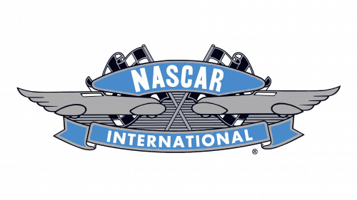
The new logo looked a lot more like the original one, but the color palette was changed to predominantly gray with some blue and black. The banner above the cars, which were now gray, was made wider since there was no more full name above it. Instead, there was a banner under the cars that said “International”. As in the previous logo, the flags were kept black and white.
1976 – 2016
The logo designers steered away from the original idea and created a bright and eye-catching emblem. The abbreviated name of the association was placed on a horizontal banner that had alternating yellow and white vertical bars on the left that were replaced by red, purple, and then blue. The name was done in white using a font that featured straight lines and diagonally cut corners. The name was italicized to go with the slanted bars on the banner and aligned to the right.
2017 – Today
An updated version was presented in 2017, although the old one is still being used on some occasions. It had the same wordmark, only in black. The colorful banner behind it was replaced by vertical bars to the left of the wordmark. The purple color was eliminated, leaving only two yellow, two red, and one thicker blue bar with white space between them.
Font and Color
For almost thirty years, the fonts used in the logos were quite basic. In 1976, a geometric font was introduced. It was Pluto Sans by Hannes von Döhren. When it comes to colors, the logos designed for NASCAR were always quite colorful and bright.

