Nationwide Logo
Nationwide refers to a major financial institution in the United States. The Ohio Farm Bureau Federation created it to provide affordable auto insurance. They established this entity in Columbus, Ohio. The main goal was to help farmers obtain financial services more easily, particularly insurance. Nationwide has grown to offer a wide range of financial services beyond just insurance.
Meaning and History
Nationwide began as a small mutual auto insurer for Ohio farmers in 1926. Its philosophy: provide affordable coverage for its members. Rapidly outgrowing its initial scope, it embraced an expansion strategy. By the mid-20th century, Nationwide had extended its services nationwide, living up to its name. The company’s offerings evolved to include a broad spectrum of insurance and financial products, encompassing life, banking, and even pet health. Nationwide’s trajectory has been marked by innovation, like pioneering the first-ever comprehensive home and auto policies. Community focus has remained constant, with disaster relief and philanthropy being central to its ethos. Today, Nationwide stands as a testament to adaptability and member-centric service, thriving as a Fortune 100 company.
What is Nationwide?
Nationwide is a diversified insurance and financial services organization based in the United States. It provides a range of insurance and financial products, including auto, life, homeowners, and pet insurance. Nationwide is known for its commitment to customer service and financial stability.
1926 – 1955
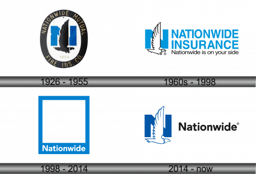
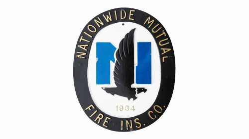
The logo features an imposing eagle in black, set against the bold blue silhouette of the letter ‘N’. Gold lettering outlines “Nationwide Mutual Fire Ins. Co.” around the central design. Below, the year “1934” is prominently displayed. The eagle’s detailed wings spread upwards, symbolizing strength and protection, central tenets of the company’s identity. The use of gold, blue, and black conveys trustworthiness and tradition. This emblem encapsulates the company’s commitment to steadfast service and security.
1960s – 1998
This logo showcases a modern transformation from the previous one. “Nationwide Insurance”, written in bold, capitalized blue letters, conveys stability and strength. The emblem now features a white eagle in profile, wings aloft, symbolizing freedom and protection. The blue color is brighter, more optimistic. The eagle overlaps with the letter ‘N’, integrating the imagery with the text seamlessly. Below the main text, the slogan “Nationwide is on your side” is presented in smaller font, emphasizing customer support and reliability. The design is clean, simple, and conveys movement and evolution, reflecting a progressive brand image.
1998 – 2014
In this iteration, the logo simplifies to a minimalist design. The graphic elements are removed, leaving only the name “Nationwide” in a confident, sans-serif typeface. The blue frame encapsulates the space, hinting at protection and boundary. The color remains a vivid blue, consistent with the brand’s identity, but the overall look is starkly more contemporary. There is a palpable shift towards a more abstract, less literal representation of the brand’s values. The design echoes modernity and focuses on the brand name as the sole element, emphasizing brand recognition and a modern, streamlined approach.
2014 – Today
The latest logo marries minimalism with the brand’s heritage. The iconic eagle makes a comeback, depicted in profile within the letter ‘N’, symbolizing vision and vigilance. The ‘N’ itself is bold and blue, standing confidently beside the word “Nationwide”. The sleek, modern sans-serif font carries the text with contemporary flair. A melding of tradition with the modern age manifests in the design choices. Stripping back to essentials marks a departure from earlier, more ornate frames, honing in on the brand’s foundational attributes. Crisp and forthright, the logo foregrounds the eagle, a reaffirmation of Nationwide’s enduring identity.
