Navy Midshipmen Logo
The Navy Midshipmen are a group of athletic teams representing the United States Naval Academy in intercollegiate sports. Emphasizing both academic and physical excellence, these teams are known for their competitiveness in the NCAA, particularly in football. The Midshipmen’s rich history is marked by traditions and rivalries, most notably with the Army Black Knights, culminating in the annual Army-Navy football game. This event symbolizes the deep respect and rivalry between the two service academies. The Midshipmen’s identity is deeply intertwined with naval values, reflecting commitment, discipline, and teamwork, essential in shaping future Navy and Marine Corps officers.
Meaning and history
The Navy Midshipmen represent the U.S. Naval Academy in collegiate sports, starting in the late 1800s with rowing and football. Established in 1879, Navy’s football team symbolizes discipline and teamwork, central to their athletic identity.
The annual Army-Navy game, begun in 1890, is a historic and spirited rivalry showcasing service academy pride. Throughout the 20th century, Navy expanded its sports program, adding activities like soccer and swimming, reflecting the Academy’s holistic approach to officer development. Midshipmen, future Navy and Marine Corps officers, embody honor, courage, and commitment, balancing sports with academic rigor.
Their athletic achievements parallel success in military and professional realms, underlining the Academy’s mission of developing distinguished leaders.
Recently, Navy’s program has evolved, embracing new sports and training methods, while upholding traditions. They’ve earned national championships in various sports, exemplifying athletic and academic excellence. The Midshipmen’s legacy is a unique blend of sportsmanship, academic achievement, and commitment to service.
What is Navy Midshipmen?
The Navy Midshipmen are athletic teams from the United States Naval Academy, excelling in a range of collegiate sports. They embody a fusion of athletic prowess, academic discipline, and a commitment to naval service, symbolizing the values of the Academy. Their storied traditions, especially in football, highlight a legacy of competitive spirit and leadership development.
1906 – 1969
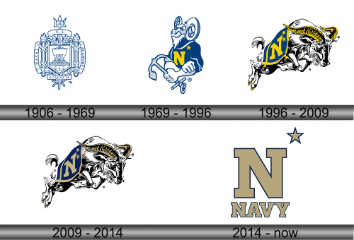
This emblem epitomizes the United States Naval Academy’s heritage. At the crest, a trident symbolizes maritime prowess, authority, and naval dominance. Encircling the shield, a rope binds the elements, suggesting unity and strength. The shield itself displays a ship upon waves, underlining the Academy’s seafaring focus. Above the ship, an open book signifies the pursuit of knowledge, a foundational pillar of the Academy. Flanking the shield, torches represent enlightenment and the path to wisdom. The banner bears the Latin motto “Ex Scientia Tridens,” translating to “From Knowledge, Sea Power,” encapsulating the Academy’s mission to empower leaders through learning. The laurel wreath surrounding the shield is a nod to victory and honor. Emblazoned in blue and white, the colors reflect the sea and the Navy’s uniform, reinforcing the identity of the institution. Overall, the logo is a visual manifesto of the Academy’s values: knowledge, leadership, and naval excellence.
1969 – 1996
In this variation, the logo features a ram, a symbol of determination and leadership. Clad in a navy blue jacket, it proudly wears an ‘N’ emblazoned on the chest, representing the Naval Academy. The ram’s determined expression and muscular arms gripping an anchor suggest strength and naval readiness. The single star above the ‘N’ signifies excellence and high achievement. Unlike the previous crest-like emblem, this logo personalizes the Midshipmen spirit through a mascot, offering a more informal yet authoritative representation. The use of blue and gold colors maintains the Naval Academy’s visual identity, with the gold symbolizing excellence and blue reflecting the maritime tradition. This emblem shifts from heraldic symbolism to a character-based mascot, providing a relatable and spirited face for the Academy’s athletic teams. The incorporation of traditional naval elements, like the anchor, connects the logo to the Academy’s maritime roots while the mascot adds a touch of competitive fierceness.
1996 – 2009
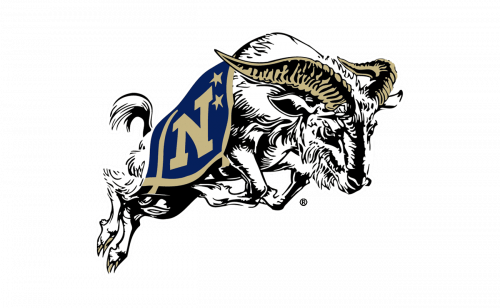
Transitioning from the previous design, this logo showcases the ram in a dynamic leap, infusing it with motion and vigor. The ‘N’ is now boldly integrated onto the ram’s side, merging identity with the mascot itself. The golden horn detail signifies achievement and the warrior spirit, resonating with the Naval Academy’s ethos. The addition of black and white to the color palette adds contrast, highlighting the ram’s fierce expression and muscular definition. In this rendition, the ram’s gaze is forward, embodying focus and forward momentum, characteristics esteemed by the Academy. The flight-inspired tail feathers suggest agility and speed, aligning with the attributes of naval aviators. This emblem captures the essence of action and readiness, qualities central to the Midshipmen’s values. The stylized portrayal of the mascot in this logo communicates a sense of action and readiness, representing the dynamic spirit of the Academy’s midshipmen.
2009 – 2014
The logo features a determined ram, its forward leap symbolizing action and readiness, with a bold ‘N’ signifying the Naval Academy. Its horns, now light brown, suggest earthiness and resilience, contrasting with the navy blue. This color shift from gold to light brown gives a softer touch to the emblem, perhaps alluding to the historical strength of wooden naval fleets. The ram’s detailed fur and dynamic posture convey strength and agility, traits valued by the Academy. The stars next to the ‘N’ appear crisp against the blue, highlighting the pursuit of excellence. The overall design merges tradition with a fresh perspective, the light brown adding a new dimension to the Academy’s identity. The logo embodies the spirit of the Midshipmen: determined, focused, and ever progressing forward.
2014 – Today
This logo departs significantly from the previous action-packed imagery, presenting a starkly minimalist and clean design. The focus is on the bold, gold-colored letter ‘N’, with the word ‘NAVY’ directly below it, showcasing straightforward branding. The lone star, detached and placed above to the right, symbolizes excellence and a guiding principle, perhaps a nod to naval navigation. The color scheme is classic navy blue and gold, reflecting the Academy’s official colors and maintaining its identity. The absence of a mascot or additional graphics suggests a return to basics, emphasizing the name itself over visual representation. This design prioritizes clarity and recognition, aligning with a more traditional and formal aesthetic. It’s a distilled version of the Academy’s spirit, focusing on the essence of the institution rather than the dynamism of its mascot.
