Illinois Fighting Illini Logo
The Illinois Fighting Illini represents the athletic teams for the University of Illinois Urbana-Champaign. They are not owned by an individual, as they are a part of a public university. The university’s athletic program competes in various sports, primarily within the Big Ten Conference. The program operates across various athletic facilities located in Urbana-Champaign, Illinois, which host a wide range of sports including football, basketball, and many others.
Meaning and history
The Illinois Fighting Illini was established with the founding of the University of Illinois Urbana-Champaign’s athletic program. While the university was founded in 1867, the formal athletics department started taking shape in the late 19th century. Over the years, the Fighting Illini has achieved significant success in various sports. They have multiple NCAA national championships in different sports, including a storied history in football and basketball. Notably, the men’s basketball team has had several successful seasons and has been a regular participant in the NCAA Tournament. The football team has also enjoyed periods of success, including multiple Big Ten Conference championships. Currently, the Illinois Fighting Illini continues to be a prominent part of collegiate athletics, maintaining strong programs in several sports and cultivating a vibrant sporting culture on campus. Their contribution to college sports remains significant, as they continue to compete at a high level and produce professional-level athletes.
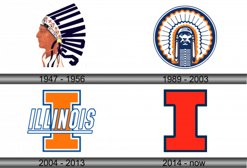
1947 – 1956
The image presents a graphical representation with a vintage aesthetic, showcasing the side profile of a Native American male figure rendered with a blend of realism and artistic abstraction. The subject’s expression exudes a stoic and introspective quality, underscored by the sharp contour of his jawline and the forward gaze that seems fixed on a distant horizon. He is adorned with an elaborate ceremonial headdress that is intricately decorated with a pattern of celestial and tribal motifs, featuring stars and cross-like symbols executed in a palette of white with touches of crimson. The feathers of the headdress are arranged in an orderly fashion, resembling the rays of a setting sun, and are adorned with a series of parallel stripes, imparting a sense of dynamism as if stirred by a gentle breeze. Overlaying the headdress is the word “ILLINOIS,” typeset in uppercase letters that graduate from a deep navy to a lighter shade, creating an illusion of depth and solidity. This typographic element is crafted to appear three-dimensional, almost as if it were chiseled from stone. The backdrop is kept deliberately simple, a blank canvas that thrusts the intricate details of the figure and text into the limelight, thereby anchoring the logo’s visual impact.
1989 – 2003
The emblem is a minimalist, yet striking depiction of a Native American chief in profile, encircled by a navy-blue border. Unlike the previous illustration with a nuanced color gradient and realistic features, this logo adopts a limited color palette of navy, white, and orange, focusing on silhouette and form. The chief’s headdress is stylized into bold, geometric shapes with linear decorations, conveying a modernist interpretation. In contrast to the previous logo’s three-dimensional lettering, this design forgoes text, allowing the iconic imagery to stand alone as the symbol of identity.
2004 – 2013
This logo is a graphic interplay of typography and geometry, featuring the bold, capitalized word “ILLINOIS” superimposed over a large orange letter ‘I’. The use of white and navy blue outlines around the ‘I’ and the text creates a striking contrast against the orange, enhancing the logo’s visual presence. Unlike the previous emblem’s representation of a Native American, this design is purely typographic and abstract, focusing on the university’s initials and devoid of any figurative elements. It’s a significant shift in style, moving from a detailed illustrative motif to a clean and modern design that emphasizes the institution’s name in a bold and contemporary fashion.
2014 – Today
The logo features a large, block ‘I’ in a vivid orange, framed by a navy-blue border. Its boldness is uncomplicated, making a statement with its simplicity and color contrast. This logo marks a departure from the previous design that included the full spelling of “ILLINOIS” over the ‘I’. It strips away the text, distilling the visual identity to its essence—the iconic and singular initial of the institution. It’s a minimalist approach, eschewing the additional textual elements and focusing on the power of a singular symbol.


