NFL Logo
NFL is the most professional you can get in American Football. It’s a nation-wide league where only the best teams from all over the country get. Each season, the teams that qualified play off to determine the meanest and strongest collection of players among them, much to the universal excitement.
Meaning and History
There wasn’t really any professional football association before 1920 in America. In 1920, the teams from all over the country came together to create such a league where people would compete on a national level. It wasn’t at first called the National Football League, as it does today, but this name was soon chosen and it stuck.
1921 – 1940
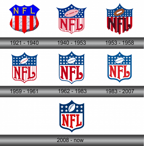
Seeing how NFL is national association, they needed to signify it on the logo. This trend was set with the very first emblem – a shield divided into two parts. The upper third was a blue background with the golden letters ‘NFL’ written with some interval between them.
The lower two thirds was a field of vertical stripes – 5 red and 4 white stripes. As you can imagine, it’s very reminiscent of the American flag.
1940 – 1953
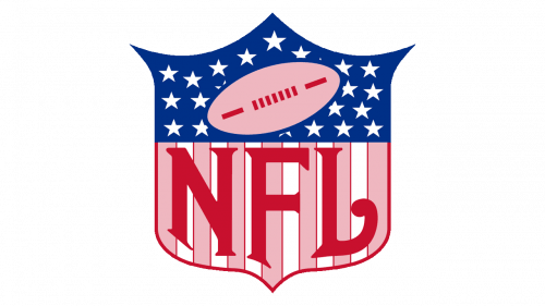
In 1940, the emblem suddenly became closer to what we have now. The roles were reversed, but the proportions stayed. The upper third was now occupied by the field of white stars set against a blue background. There was also a pink football with red outline and seams on it.
The pink became a common color now, actually. The stripes multiplied, and the red ones became pink now. Why? Well, the letters were put over them. There was more room for them down there, and they also became more like their modern counterparts. They are taller, red (which is why the stripes were repainted) and have a usual college font.
1953 – 1958
In 1953, they decided to experiment with the colors a bit.
The ball became brown and white, the stripes were turned to the bright scarlet, and the letters on top got dark brown. They also changed the shape of the shield a bit, made it a bit more streamlined and got rid of the thin red outlining. The overall result didn’t look very good.
1959 – 1961
By 1959, NFL decided that the experiment has failed, and they returned to the 40s style. That being said, they made the outlining a bit thicker, bleached the striped and only left the red edges and made the ball white instead of pink.
1962 – 1983
1962 was the year of the color blue. The outlining and the seams on the ball were made dark blue, just like the upper third of the shield. Simultaneously, they got rid of any stripes at all and made the letters a more saturated red. Basically, they pushed as close as they could to the colors of America.
1983 – 2007
In 1983, they slightly bleached the colors of everything. Barring the much thicker outline, that’s basically all that happened on this stage.
2008 – today
2008 also wasn’t keen on difference. They replaced the stars with just four now, changed the position of the ball to an even more vertical one, slightly changed the coloring, and, lastly, got rid of the little tail on the end of the letter ‘L’. That’s about it.
Emblem and History
The NFL shield is the usual medieval heater shield shape, although this exact shape wasn’t really used. More than that, this shape inspired a lot of other artists to use the shield as a symbol of American patriotism – such as with Captain America or in Bioshock: Infinite.


