NHL Logo
The National Hockey League is one of the professional sports organizations in the world. It brings together teams that play hockey in the USA and Canada. Today, most experts recognize that the NHL is one of the strongest on the planet. It is one of the major hockey leagues in the United States and is included in the list of all the major sports associations. These are NBA, NFL, and MLB. Several television channels in the USA and Canada regularly air games of the National Hockey League in North America.
Meaning and History
It was founded at the end of 1917. Only four clubs participated in the first season, which began in December of the same year. The NHL established itself as the world’s first professional hockey league. Midway through the 1960s, powerful teams capable of competing with the NHL started to appear in the minor leagues. The NHL’s growth was steady. The number of clubs in the league has expanded with the 2000–2001 season to a maximum of 30 teams from 29 American and Canadian locations. Seven teams are based in Canada, while the rest 23 are located in the United States. They compete each year for the Stanley Cup, the League’s top award.
What is NHL?
NHL games are watched by hockey enthusiasts all around the world. Teams from all throughout the United States and Canada are represented in the National Hockey League. The NHL now has the following organizational structure: there are two conferences, three divisions, and five clubs per division.
1917 – 1946
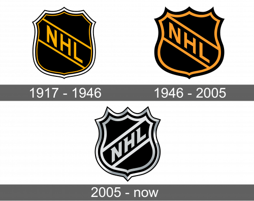
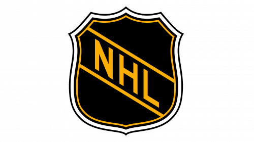
The original logo had a shape of a shield, with five peaks at the top. The shield was black inside and had multiple thin lines that create an interesting border. A gold thin line was indented inwards, while a thicker black line was indented outwards, creating a white space between the shield and this border line. The league’s initials were written on a diagonal, going from the upper left corner to the lower right one across the shield. The name was gold and framed by two diagonal gold lines.
1946 – 2005
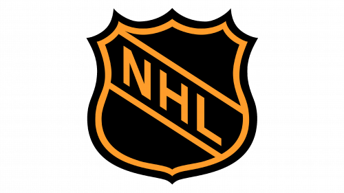
The updated logo looked very similar to the original one. The golden color was deeper, though, while the shield was squeezed vertically to give it a more square look. The peaks, on the other hand, looked sharper. Only the inner golden line was left. It looked thicker and made quite enough statement to keep the logo from looking boring.
2005 – Today
The shape of the new shield did not change much, but it looked quite different thanks to a color palette. It featured a metallic gray used in combination with white and black. The emblem had a double metallic border with black color being on the outer edge of both lines for separation and contrast. The name was written in a similar style, only now the letters were white and had serifs. Moreover, the inscription was done going from the lower-left corner to the upper-right corner. The shield had a 3D appearance and looked quite realistic.
Font and Color
The logo features a very basic font with clean, straight lines and no serifs until 2005. The color palette is also quite minimal. It was golden and black until 2005 when the golden was replaced by a metallic gray color and white. The choice of colors and simple font made the logo look professional, while the consistency reflected the stability of the league’s success.
