Omega Logo
Omega is a Swiss luxury watch brand. Over its 170-year history, the brand has an impeccable reputation and creates watches for business and sports. These chronometers fly into space during all American space missions. They are used by racing drivers, sailors, divers, and business people. Omega is undeniably one of the flagships of the Swiss watch industry. The company was one of the earliest watch businesses to start mass manufacturing. Many achievements that made Omega a leading watchmaker have been made possible thanks to perseverance and determination.
Meaning and History
A young and promising watchmaker Louis Brandt decided to create a small workshop for the assembly and sale of chronographs in 1848. Louis created high-quality watches. After the death of their father, in 1879, Cesar and Louis-Paul turned the business from a small workshop into a real watch factory. The year 1895, when the company launched its famous Labrador and Gurzelen calibers into mass production, was a turning point because they became the most successful products in the history of the watch industry. In a short period, the company became the leading manufacturer in Switzerland. The owners of the manufactory decided to rename the brand Omega. This name was chosen because it is the last letter of the Greek alphabet that symbolizes completeness and perfection.
What is Omega?
Today, Omega watches are not only a global, popular brand. Chronographs have repeatedly received all sorts of awards and prizes. Omega watches are a combination of classic design and the reliability of Swiss mechanics. They serve people in space and in the depths of the sea. They are also valued by politicians and show business stars and used during the Olympic games.
1848 – 1974
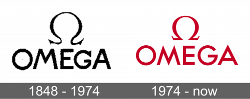
The name of the company was the key element of the logo. “Omega” was written in uppercase, sans-serif letters. They were black and bold, which created a sophisticated and timeless feel. To complete the logo, the brand added the Greek letter “Omega” above the name.
1974 – Today
The updated logo looked bolder and sharper. The main change was the color as a bright red replaced black. Although the font stayed without serifs, it was tweaked to have sharper, pointy ends. This further strengthened the fact that these watches always show precise time. The lines looked clean and thicker and combined with the bold color gave the logo a confident, powerful, and strong appearance.
Font and Color
Initially, the brand went for a classic, elegant, and luxurious color. Black was used as the sole color. It was replaced by a scarlet red that infused more energy and gave it a powerful feel. Originally, the logo used a bold, sans-serif font that featured the tops of the letters “M” and “A” were cut straight instead of having pointed tops. The next logo featured a Future typeface. It is a geometric font with bold letters and no serifs.


