POCO Logo
POCO is a technology brand that specializes in creating affordable smartphones with high performance. The brand emerged as a sub-brand of Xiaomi, a major electronics company. The creation took place in China, aiming to deliver power-packed devices to technology enthusiasts who value cost efficiency. POCO designs its products to offer high-end specifications at lower price points, catering to a global market.
Meaning and History
POCO was officially introduced by Xiaomi in 2018 as an independent brand focusing on affordable high-performance smartphones. The debut device, POCO F1, launched in August 2018, quickly gained popularity due to its competitive specs and budget-friendly price. In 2020, POCO established itself as an independent entity, distinct from Xiaomi, to enhance its brand identity and market reach. This transition marked a significant step in POCO’s strategy to capture a young, tech-savvy audience worldwide.
What is POCO?
POCO is a consumer electronics brand that primarily manufactures smartphones. It operates under the ethos of offering robust performance features at a budget-friendly price, making high-end specifications accessible to a broader audience. The brand serves the global market, emphasizing cost-effectiveness and technological innovation.
2018 – 2020
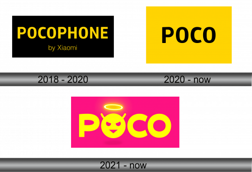
The logo displays bold, capitalized text spelling “POCOPHONE” in a striking yellow hue, set against a stark black background. Underneath, “by Xiaomi” appears in a smaller, plain white font, suggesting a collaboration or subsidiary relation. The color contrast ensures high visibility and impact, aligning with the brand’s dynamic approach to technology. The design of the logo conveys a sense of energy and innovation, reflective of the brand’s positioning in the smartphone market.
2020 – Today
In this iteration, the logo spotlights the word “POCO” in bold, black font, centered on a vibrant yellow square backdrop. Stripping away additional text, the design stands more minimalistic and focused. The stark contrast between the black lettering and the yellow background emphasizes the brand’s boldness and simplicity. This logo variant presents a visual punch, suggesting a brand that’s confident and direct, targeting a clear-cut, no-nonsense image.
2021 – Today (India)
The logo presents the “POCO” name in an electrifying yellow hue, with each letter exuding a luminous glow against a neon pink backdrop. Above the ‘O’, a radiant halo adds a celestial touch. Below, a stylized character with a halo turns the second ‘O’ into a friendly face, infusing personality into the design. This playful logo juxtaposition between divine imagery and vibrant colors creates an energetic and youthful vibe, reflecting the brand’s innovative spirit.


