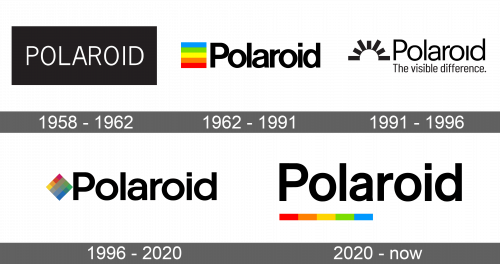
Polaroid Logo
Polaroid is known not only for its cameras but also for sunglasses. Its founder, Edwin Land, stayed with the company for almost half a century, constantly developing new products and focusing on improvement and innovation. Actually, more than 500 unique inventions are patented in his name (only Thomas Edison received more patents). Thanks to Edwin Land the world of amateur photography has changed as the Polaroid camera made photography more accessible and affordable.
Meaning and History
Edwin Land founded this well-known brand in 1937. The history of this company has many interesting facts. At first, Polaroid did nothing related to photography, fulfilling orders from the US government and making binoculars, periscopes, night vision devices, and optical devices for aerial reconnaissance. Its popularity peaked in the 1980s and 1990s when photography became more affordable. Soon, it was surpassed by its competitors and even declared bankruptcy at some point. Today, Polaroid is bringing interest in instant photography back to life.
What is Polaroid?
Polaroid is one of the most popular sunglasses, home electronics, and photography gear brands. The brand owes its birth and subsequent prosperity to Edwin Herbert Land. He was an outstanding physicist and industrialist from the US state of Connecticut with over 500 patents for various inventions.
1958 – 1962
It was not until 1958 that the company got its logo. It had no exquisite design as the emblem consisted of the name written on a black rectangle. The name was done in all uppercase letters in white. The sans-serif font was quite basic with thin, clean lines.
1962 – 1991
The next version was more colorful. In fact. It featured a square to the left of the name made up of five rainbow lines ranging from red to sky blue. The name was done using a different font. It was bold with only the first letter capitalized. The letters were closely spaced and looked basic without fancy serifs.
1991 – 1996
The next version used a similar idea, but instead of the color block, it featured an abstract image of a rising sun that had a white half circle and black rectangular rays of different lengths. The name was done using the same font, only the letters were no longer bold. There also was no dot above the “i”. In addition, the company decided to add its slogan, “The visible difference.”, under the name. The font was basic, without serifs.
1996 – 2020
The next logo looked a lot like the 1962 version. The company used the same bold font. The only difference was the fact that the letters looked rounder because the whole word was compressed vertically. The color blocked was turned sideways, so it looked like a rhombus. Instead of using color lines, the designers went for smaller squares inside of the block. Their placement resembled a color wheel.
2020 – Today
This version was also a modification of the logo introduced back in 1962. The designers kept the name of the business unchanged. Instead of forming a square with multi-colored lines, they placed them in one line right under the “Polaroid” inscription.
Font and Color
With the exception of the original logo, the company used a modified version of the Basic Commercial Pro Bold or a similar typeface. The key color of all the logos was black. It was mainly used for the name, which gave the logo a professional look. A small element with rainbow colors accompanied many versions. It was a good association with all the colorful images one could take thanks to Polaroid.


