Saints Logo
Saints are a professional sports team that plays American football. It was founded by John W. Mecom Jr. and David Dixon in the year 1966. The club is headquartered in the city of New Orleans, Louisiana. As such, it’s one of the most successful teams in the South.
Meaning and History
The elegant and stylish team’s symbol now known as French lily has a long history. This symbol was being used widely as a mark of royalty, luxury and perfection by Ancient Egyptians, Greeks, Syrians and, finally, French royal families. Also, the city of New Orleans used the lily as a reference to its French past.
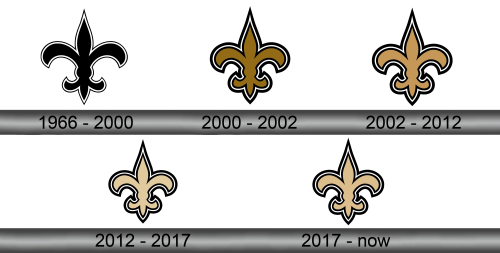
1966 – 2000
The initial symbol depicted the French lily of the black color with the twin outline of black and white colors. This version also had an interesting feature: the ‘wings’ of the symbol were wider than in the following versions.
2000 – 2002
In the year 2000 the next version of the team’s symbol appeared. The familiar flower was narrowed and gained the brown palette. Due to these features, the symbol looked much more stylish and compact. However, this version of the emblem was in use for only two years.
2002 – 2012
The Saints team continued the experiments with their brand mark and decided to change the emblem once again. This time, the team decided to use the golden color instead of brown or black ones.
2012 – 2017
The golden color palette of the French lily turned to the beige one.
2017 – Today
The current symbol represents the unchanging lily, with a bit brighter palette than it was in the previous version.
Emblem and Symbol
The team’s symbol is very flexible when it comes to using it for branding. You can find the version of the French lily on the shield, the ‘Sir Saint’ mascot of the team who wears the helmet with the team’s symbol and a shield. There is also a map of the state of Louisiana with this emblem.
There is another logotype used by the tam – a monochrome mark that depicts the letter ‘L’ intertwining with an ‘A’. Together, they form one symbol, probably inspired by the Yankees’ NY-mark. Likewise, this mark is in use on some items from the team’s merchandise, such as caps, hoodies, T-shirts or watches.

