Seagate Logo
Seagate is a renowned American company that specializes in data storage solutions. Alan Shugart and his team founded it. They created the company in California. The main purpose was to develop and produce innovative hard disk drives.
Meaning and history
Seagate, established in 1979, revolutionized data storage with its innovative hard disk drives. By 1980, they had launched the first 5.25-inch hard disk drive, which significantly impacted the computing world. Throughout the 1980s and 1990s, Seagate expanded its product lines and global presence, adapting to the evolving demands of digital storage. Notable milestones include pioneering the standardization of the SCSI interface in the mid-1980s and introducing the first 7200 RPM drive in the mid-1990s. These advancements solidified Seagate’s reputation as a leader in storage technology.
What is Seagate?
Seagate is a leading developer of data storage technology. Based in the United States, they produce hard disk drives and other storage solutions. Their innovations have greatly influenced both consumer and enterprise data management.
1979 – 1986
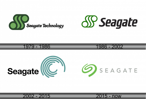
The logo depicts three stacked, abstract shapes resembling waves, set in various shades of green. Near them, “Seagate Technology” is written in a bold, serif font. The design embodies dynamism and flow, possibly representing data movement or storage layers. Simple yet distinctive, it combines geometric forms with classic typography, creating a balance between modernity and tradition.
1986 – 2002
The updated logo maintains the triad of wave-like forms, now rendered in a singular shade of vibrant green. The emblem is paired with the name “Seagate” in sleek, sans-serif typography, a departure from the previous serif font. This evolution presents a more modern and streamlined appearance, suggesting a forward-thinking and efficient approach to technology and data storage. The green hue signifies growth, renewal, and the digital frontier that Seagate navigates.
2002 – 2015
This logo iteration for Seagate shows a significant redesign, featuring a circular emblem of concentric arcs, symbolizing ripples or digital waves. The color palette shifts to varied tones of cool teal, evoking precision and technological innovation. Seagate’s wordmark appears in a modern, sans-serif font, asserting a contemporary identity. The graphic shift from geometric shapes to circular lines suggests flexibility, connectivity, and the expansive reach of Seagate’s digital influence. The entire logo conveys a more futuristic and global sensibility, in tune with the data-centric era it represents.
2015 – Today
In this latest design, Seagate introduces a minimalistic emblem with a single, fluid green swirl. This symbol evokes a sense of motion and transformation, suggesting a dynamic approach to technology. The wordmark, now in a lighter, airy grey, complements the emblem with its clean, sans-serif typography. The design exudes simplicity, a move towards a more subtle and sophisticated branding strategy. The freshness of the green swirl contrasts with the muted tones of the text, highlighting innovation within the storied brand.


