Seattle Kraken Logo
Seattle Kraken is a sport club focused on hockey. As an extension of the Seattle Franchise the club was founded in the July of 2020. Owned by David Bonderman, Jerry Bruckheimer, Tod Leiwke and managed by Ron Francis, the Kraken team is still a tough contender for the leagues to come.
Meaning and History
![]()
As a young hockey club, Seattle Kraken hasn’t made a name for themselves yet, nor could they develop a variety of visual symbols in this short span of time. However, the emblems we can look at seem engaging and elegant simultaneously.
2018 – 2020
![]()
In 2018, Seattle was granted the permit to start a hockey team. Before disclosing the name and the design, they used this image. It’s just a name of the city depicted in artistic scarlet strokes. They are wavy and styled like a signature. When in 2020 the logo was revealed, this one was forgotten.
2020 – today
![]()
The team’s general symbol is depicted with the letter ’S’ in the two tones of the colour blue. There is also a Kraken itself – sporting a smile and a red eye to inspire ferocity. There are black bold contours that make the depiction look dangerous, as well. All of this is supposed to represent the will and strength of the club.
The second one of is a volumetric sea anchor with some angles and dark shades. It looks like an arrow to remind everyone around that the club is heading straight to victory.
Emblem and Symbol
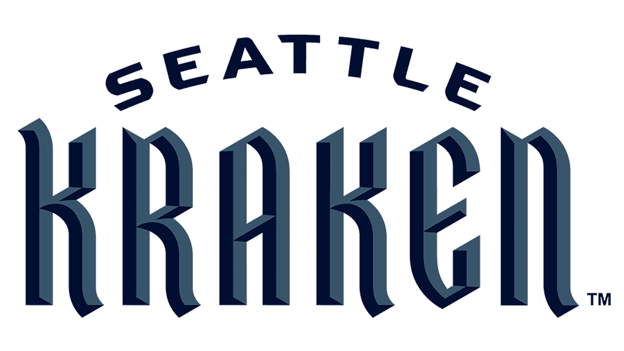
The Seattle Kraken inscription is written in two different typefaces. For ‘Seattle’ is used modern font, with bold and wide capitalized letters. For the ‘Kraken’ is used font with strong and straight gothic volumetric letters.
The colour of the team’s visuality is generally blue, often with dark shades. The only detail which is standing out of this design is the eye of the Kraken – it is dark red


