Skullcandy Logo
Skullcandy is a company that specializes in producing headphones, earbuds, and other audio listening devices. Rick Alden founded the company. The founding took place in Park City, Utah. The company aims to provide high-quality audio products that appeal to outdoor and action sports enthusiasts. Skullcandy combines design, functionality, and audio technology to create products that fit into an active lifestyle and fashion.
Meaning and history
Skullcandy was founded in 2003 in Park City, Utah, by Rick Alden. It began as an idea during a ski lift ride. The company specializes in headphones, earbuds, and other audio products. Skullcandy’s first product, Skullcandy Portable Link, combined headphones with a hands-free cellular technology.
They gained popularity for blending colorful designs with functionality. By 2005, Skullcandy had secured distribution in national retailers. The brand became known for innovative audio solutions in the action sports market. In 2008, they introduced headphones in the gaming space.
Skullcandy went public in 2011 but was taken private again in 2016. Throughout, they have focused on youth culture and lifestyle branding. The company launched initiatives like ‘Skullcandy Music’ and ‘Mood Boost’ to reach its audience. Skullcandy prides itself on accessible pricing and durable products.
They remain committed to sustainability, introducing recycled materials into their product lines. Skullcandy continues to innovate, blending style, performance, and environmental awareness in its audio designs.
What is Skullcandy?
Skullcandy is a brand known for its innovative audio products, including headphones and earbuds. The company targets consumers who enjoy music and sports. Skullcandy products are recognized for their distinctive style and quality sound. They are designed to enhance the listening experience for active users on the go.
2003 – 2007
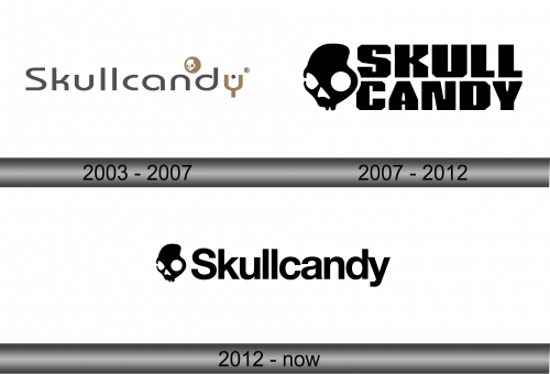
The logo showcases the word “Skullcandy” in a clean, modern sans-serif font. Accompanying the text, a distinct emblem sits atop the letters ‘nd’, featuring a stylized skull inside a circle, hinting at an edgy and youthful vibe. The skull’s presence resonates with the brand’s name, Skullcandy, while the earbud-shaped ‘d’ cleverly ties the logo back to audio products. The color palette is muted, with a combination of greyscale tones, emphasizing a sleek and understated look that stands out in the audio gear industry.
2007 – 2012
The updated logo radiates a bold vibe with stark black and a graphic skull. It features blocky, sans-serif letters. The skull’s artistic line work embodies a rebellious spirit, aligning with the brand’s youthful energy. This logo version makes a more direct visual statement, with the stark contrast and absence of colors focusing entirely on the symbol and text. The skull’s eye sockets cleverly mimic headphones, cementing the brand’s association with audio products. Overall, this logo exudes a raw, unapologetic presence that captures attention and reinforces the brand’s connection to music and lifestyle.
2012 – Today
In the latest logo, the font has undergone a notable transformation. The characters are now more uniform and streamlined, enhancing readability. The sans-serif typeface is contemporary, with a consistent stroke width throughout. The skull graphic remains a defining element, but it’s the refreshed typography that breathes new life into the brand’s visual identity, offering a cleaner and more modern aesthetic.


