St. Louis Blues Logo
The St. Louis Blues are a professional ice hockey team based in St. Louis, Missouri. Established in 1967, they compete in the NHL’s Western Conference. Known for their passionate fan base and distinctive blue jerseys, the team clinched their first Stanley Cup in 2019, marking a historic victory. The Blues’ on-ice prowess and tactical play make them a formidable opponent in the league. The team’s home games are held at the Enterprise Center, creating a vibrant atmosphere for fans and showcasing the city’s deep-rooted love for hockey.
Meaning and history
The St. Louis Blues, hailing from Missouri, made their NHL debut in 1967 as part of the league’s expansion from six to twelve teams. The franchise, named after W.C. Handy’s song “St. Louis Blues,” reflected the city’s rich musical heritage.
In the early days, the Blues achieved notable success, reaching the Stanley Cup Finals in their first three seasons, although they didn’t clinch a title. The team faced turbulent times in the ’70s and ’80s, undergoing several ownership changes. Among the notable proprietors was Ralston Purina, an animal feed company, which attempted to sell the team and relocate it. Luckily, Harry Ornest stepped in, purchasing and ensuring the team remained in St. Louis.
The ’90s saw the Blues make strategic acquisitions, such as Brett Hull and Al MacInnis, turning the team into serious contenders. Yet, the much-coveted Stanley Cup remained elusive.
The turn of the millennium brought more ownership changes. In 2012, Tom Stillman led a group to buy the Blues, ushering in a new era of stability and focus. Under his guidance, the franchise revitalized its strategies and player rosters.
The patience and perseverance of the Blues’ community paid off handsomely in 2019 when the team, against many odds, won their first Stanley Cup, a testament to their enduring spirit and dedication. Through numerous transitions and challenges, the Blues have remained a vital part of St. Louis’s cultural fabric, embodying resilience and the city’s undying love for hockey.
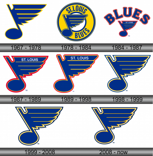
1967 – 1978
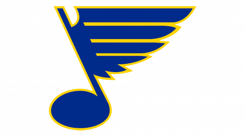
The initial design was simplistic yet profound in its symbolism. It seamlessly aligned with the team’s vision of excellence and drew inspiration from the city’s famed blues legacy that resonated globally.
The emblem features a musical note, slightly leaning towards the left, emanating a sense of movement and rhythm. Attached to the note is a stylized wing, embodying aspirations, soaring ambitions, and the potential for meteoric growth. This wing is intricately designed with four feathers, each varying in length, with the longest positioned at the top and the shortest at the base. The final feather is uniquely adorned with twin subtle extensions, adding a touch of distinctiveness. The entire design, marked by its linear precision, is encased in a radiant yellow border, adding a dash of vibrancy to the emblem’s elegance.
1978 – 1984
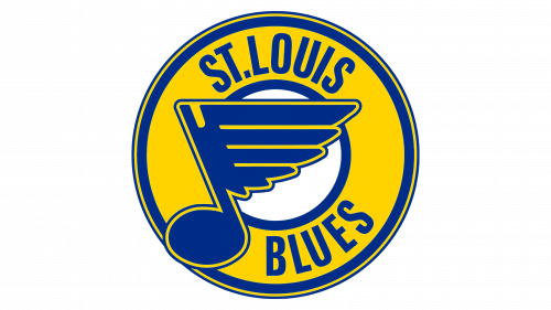
In 1978, a transformative moment for the club’s visual identity emerged. They incorporated a circular design surrounding their iconic musical note, bringing more depth to the emblem. This new circular element echoed the aesthetics of the primary symbol, characterized by a broad band enveloped by a trio of finer lines, lending intricate detail to the design.
This roundel bore a dual resemblance – akin to both a classic vinyl record and a hockey puck, subtly weaving the worlds of music and sport. The top half prominently displayed “St. Louis” while the lower segment showcased “Blues.” Contrasting blue typography against a luminous yellow backdrop ensured legibility and visual impact. Furthermore, a noticeable tweak was made to the wing, especially the pronounced indentation of the topmost feather, which now featured the same brilliant yellow, blending seamlessly with the emblem’s color palette. This revision breathed new life and modernity into the club’s branding.
1984 – 1987
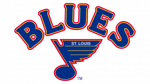
For a brief moment in the team’s history, the emblem adopted a bifurcated design approach: a visual component and a textual one. The iconic musical note was retained, albeit framed by a striking red outline, creating a distinct appearance. Above this graphic, in a curved arrangement resembling a crescent, was the inscription “Blues.” This setup was a fusion of both imagery and verbiage, showcasing the team’s musical roots and hockey essence in a novel layout. This design choice not only emphasized the importance of the team’s name but also played a homage to the city’s rich musical heritage. The separation of the elements, although fleeting in its adoption, provided a unique take on the emblem’s representation.
1987 – 1989
Twelve months on, the team’s management greenlit a revised insignia: the renowned dual-sided musical note with wings. The creators opted to do away with the preceding header text, choosing to embed “St. Louis” directly onto the primary feather. Additionally, in this rendition, they magnified the main figure to give it a more dominant presence. This evolution was seen as a blend of tradition with a fresh perspective, aligning the emblem with the club’s vision while staying true to its roots. By emphasizing the primary element, the redesign resonated more with the team’s core identity, making it both distinct and memorable in the sports arena.
1989 – 1998
In the year 1989, the squad introduced a newly-designed emblem, featuring an enhanced red line tracing its perimeter. This visual identity graced their brand for nearly a decade. During this period, the emblem became synonymous with the team’s spirit and was a familiar sight in many games and events. The inclusion of the red stripe added a touch of vibrancy, setting it apart from its predecessors. It signified a new era for the team, resonating with both fans and players alike. Over the course of these ten years, the emblem not only represented the squad on the field but also became a symbol of their resilience and passion off it.
1998 – 1999
Following a subsequent overhaul, the team reinstated a previous rendition of their emblem, which remains their symbol to this day. The creative team intensified the shade of blue, omitted the red contour, and eliminated the “St. Louis” inscription. Furthermore, they refined the upper segment of the leg, giving it a more pronounced appearance. In addition, every stroke was fine-tuned to be crisp and uniform. This revamp not only emphasized the club’s legacy but also its evolution, mirroring its steadfastness and adaptability throughout the years. The renewed emblem is a testament to the team’s commitment to excellence and tradition, resonating deeply with fans and players alike.
1999 – 2008
As the dawn of the new millennium approached, there was a noticeable transformation in the hue of the boundary line surrounding the musical symbol. This alteration saw the color deepen considerably. Such a transition was more than just an aesthetic adjustment; it hinted at the evolving maturity and depth of the team’s identity. The decision to go for a darker shade suggested a move towards a more robust and profound connection with their roots and heritage. This new shade, while a subtle change, spoke volumes about the team’s journey and their evolving narrative, bridging their rich history with a promising future in the new era. The darkened contour symbolized resilience, depth, and an unwavering commitment to excellence.
2008 – Today
In 2008, the creative team made a subtle yet impactful tweak, elevating the yellow hue to a richer, golden shade. Beyond this refined adjustment, the emblem remained untouched. This minor transformation underscored the team’s commitment to subtle evolution while upholding their core identity. By opting for a more lustrous gold, the brand not only emphasized its esteemed heritage but also signaled its aspirations for golden achievements in the future. Such small yet deliberate modifications demonstrate an understanding of the balance between innovation and tradition, ensuring that the brand remains relevant while also paying homage to its storied past. The choice of gold also resonates with themes of excellence, prestige, and the relentless pursuit of victory.

