Western Digital Logo
Western Digital stands as a notable entity in the technology sector. Its inception came from the creative minds seeking advancement in storage solutions. Founded in the United States, it aimed at revolutionizing data storage and management. This innovation hub has, over the years, become synonymous with reliability and cutting-edge technology in the realm of digital storage.
Meaning and history
Western Digital (WD) began in 1970 as a chip maker. It pivoted to storage in the 1980s, innovating with hard drives. The 90s saw growth through acquisitions, diversifying its portfolio. In 2001, WD refocused on hard drives, leading in desktop markets. The 2000s expansion included external and portable drives. The 2011 Hitachi Global Storage acquisition doubled its size, enhancing its data center presence. The 2015 purchase of SanDisk added flash storage capabilities, marking a strategic shift. Throughout, WD maintained a lead in storage solutions, adapting to industry changes. Ownership shifts reflected strategic realignments, emphasizing innovation and market adaptation.
What is Western Digital?
Western Digital is a global leader in data storage solutions. It designs, manufactures, and sells a wide array of products for data storage. These products include hard drives, SSDs, and cloud storage services. Known for innovation, Western Digital caters to both individual and enterprise needs, making data management efficient and reliable.
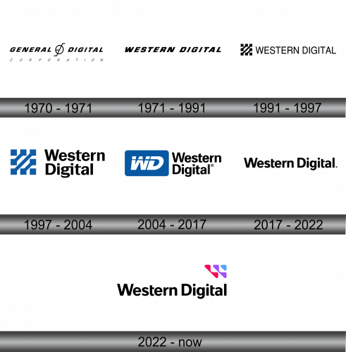
1970 – 1971
The emblem embodies sophistication, featuring stark black text with a company name. “General” and “Digital” stand prominently in uppercase, divided by a striking symbol. This symbol, a fusion of a circle and a slanted line, suggests precision and innovation. Below, “CORPORATION” anchors the design in a smaller, understated font. The overall effect is modern and clean, indicative of a brand in the digital age.
1971 – 1991
In this iteration, “WESTERN DIGITAL” boldly claims the space in an unadorned, direct font. Unlike its predecessor, this design forgoes any symbols, focusing on the strength of the name alone. The text is evenly spaced, exuding confidence and clarity. It projects an image of straightforwardness and no-frills efficiency, resonating with a company grounded in practical innovation. This logo suggests a brand that speaks for itself, with no need for graphical embellishments to assert its presence.
1991 – 1997
The logo evolves, integrating a graphic element of abstract lines and squares beside “WESTERN DIGITAL”. This geometric motif might signify connectivity and data structure, reflecting the company’s core business in digital storage. The font remains bold and forthright, yet this new symbol adds a layer of complexity, perhaps alluding to the intricate nature of technology. It’s a visual nod to the company’s progressive nature in a rapidly advancing industry.
1997 – 2004
The logo now boasts a rich blue color, infusing vitality into the abstract symbol beside “Western Digital”. The symbol’s hues suggest depth and innovation, akin to the profound expanse of the digital universe. “Western” and “Digital” appear in a harmonious balance, with a font that is both modern and approachable. This visual identity captures the essence of a brand at the intersection of tradition and forward-thinking technology. The design’s transformation reflects a company in tune with the evolving digital landscape.
2004 – 2017
The logo now spotlights a bold “WD” encased in a blue rectangle, signaling a shift towards a more emblematic representation. The abbreviated moniker “WD” presents the brand’s essence in a compact, memorable form. Adjacent, “Western Digital” is typeset in a clean, sans-serif font, complementing the emblem’s simplicity. This design conveys a blend of modernity and corporate confidence, signaling a renewed identity for the digital age.
2017 – 2022
The logo shifts to a minimalist approach, shedding any icons to favor stark typography. “Western Digital” is uniformly set in a bold, sans-serif font, reflecting a modern and streamlined sensibility. The design’s simplicity speaks to clarity and focus, resonating with a brand confident in its name and reputation alone. This clean look embodies a contemporary ethos, suited for a digital world that values directness and ease of recognition.
2022 – Today
The latest rendition introduces a splash of color with a vibrant, abstract mark to the right of “Western Digital”. Composed of overlapping magenta and blue shapes, this symbol could represent layers of data and connectivity, core themes of the company’s identity. The font remains bold and black, providing a solid counterbalance to the dynamic, colorful emblem. This updated logo suggests innovation and a fresh, tech-savvy approach while maintaining the brand’s strong name recognition. The design embodies a synthesis of tradition and transformation, mirroring the evolving digital landscape.


