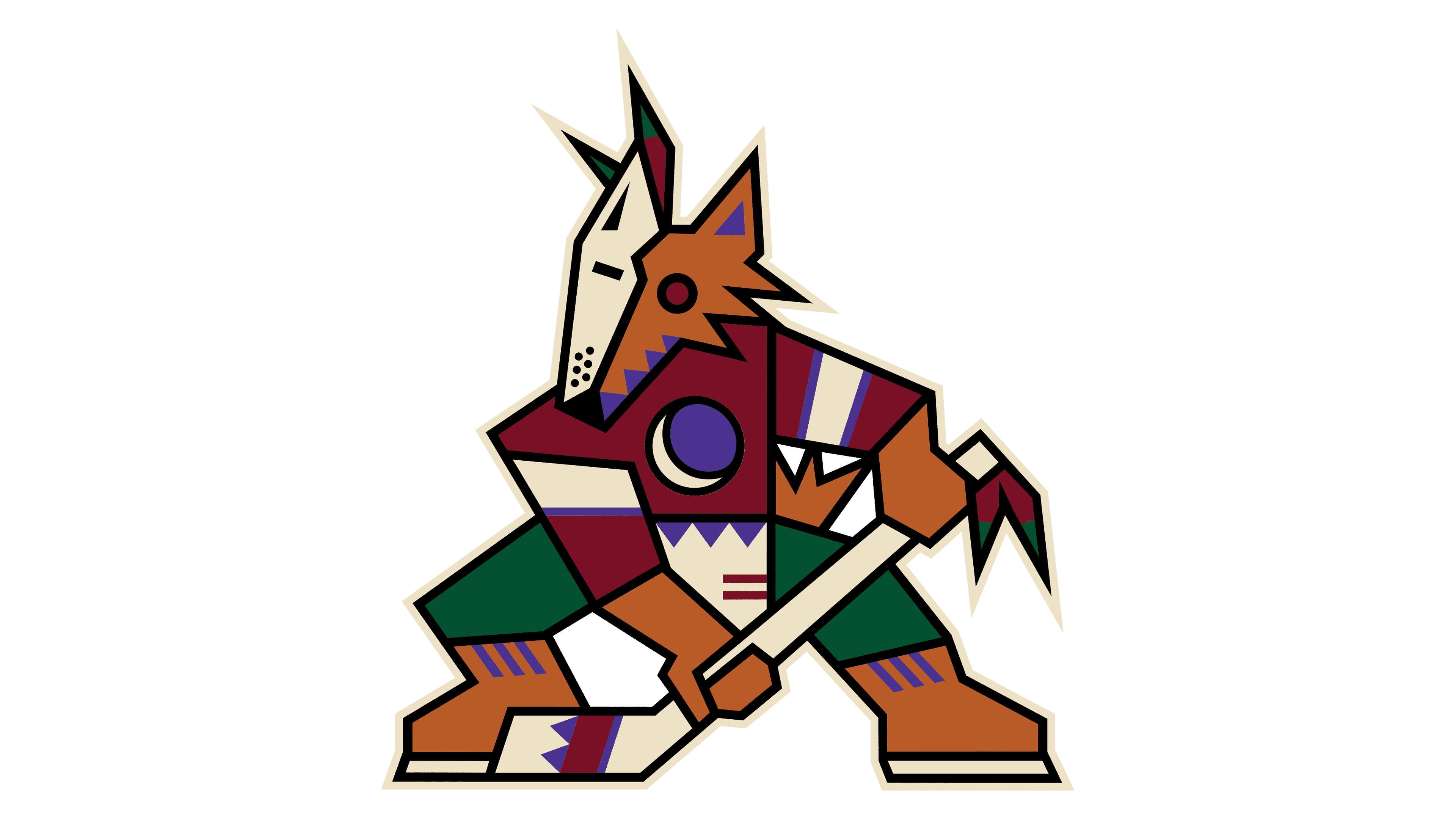
Arizona Coyotes Logo
The Arizona Coyotes stand as a professional ice hockey team. Richard Burke and Steven Gluckstern brought the team to life. They chose Arizona as the team’s home. Their main goal was to compete at the highest level in the National Hockey League (NHL). As competitors, they quickly became known for their tenacious playing style and passionate fan base. The Coyotes’ creation marked a significant moment in expanding professional ice hockey into the American Southwest, bringing the sport to new audiences.
Meaning and history
The Arizona Coyotes embarked on their journey in 1996. Initially, they dawned as the Winnipeg Jets before migrating south. This move marked a significant shift in the NHL’s landscape, introducing the sport to a new, sun-drenched audience. Over the years, the Coyotes have carved out a niche, celebrated for their resilience and community engagement. Key moments include reaching the playoffs for the first time in 1997 and achieving their deepest run in 2012 by advancing to the Western Conference Finals.
What is Arizona Coyotes?
The Arizona Coyotes are an NHL franchise. Based in Phoenix, they bring high-level ice hockey to Arizona. Known for their spirited play and community involvement, they’ve become a staple in the local sports scene.
1972 – 1973
A vivid red circle cradles a dynamic blue hockey player, forever captured in mid-stride. Soaring above, a blue airplane cuts across, epitomizing ambition. White letters proclaim “Winnipeg Jets” at the crest, while “Hockey Club” anchors the scene below. Bold lines and stark figures craft a visual ode to a simpler era of sports symbolism. This emblem breathes the raw energy of hockey and channels the team’s soul.
1973 – 1979
In this iteration, the logo evolves into a sleeker design. The red hue now shares the spotlight with a prominent navy blue. A jet, the team’s namesake, takes center stage in a simplified red silhouette against a navy background. It’s encircled by a white hockey stick, symbolizing the sport. The word “JETS” is boldly rendered in white with sharp angles, indicating speed and dynamism. Beneath, “WINNIPEG” is arched in a contrasting red, grounding the team’s identity. This emblem reflects a modern approach, emphasizing speed and power inherent to both jets and hockey.
1979 – 1990
The logo transforms, merging modernity with tradition. The red and blue colors remain, symbolizing vigor and depth. A stylized jet ascends, reflecting progress and speed. White boldly partitions the design, bringing balance and focus. “JETS” is pronounced in a futuristic font, signaling a leap forward. The name “WINNIPEG” sits confidently below, its presence reassuring and pronounced. This badge signifies a blend of movement, heritage, and aspiration, embracing the essence of the team and its ambitions.
1990 – 1996
The logo sports a new look, where geometry and abstraction take flight. A red, outlined circle surrounds the scene, symbolizing unity. Within, a bold “WINNIPEG JETS” in navy blue stands atop, commanding attention. A minimalist jet streaks forward, embodied in a simple red triangle, representing speed and ascension. The design anchors itself with a navy swoosh, resembling a jet’s contrail, doubling as a hockey stick, bridging aviation and sport. This logo signifies a forward-thinking era for the team, marrying the notions of swift motion and competitive spirit.
1996 – 1999
We’ve switched gears from the Jets to the Coyotes, a leap into a world of cultural homage. The Phoenix Coyotes logo from 1996 showcases a coyote, garbed in Southwestern attire, poised with a hockey stick. It’s a kaleidoscope of desert hues: purples, greens, and terracottas creating a patchwork of geometric shapes. Below, “PHOENIX COYOTES” is spelled out in a bold maroon block font, grounding the spirited character above. This emblem blends the region’s Native American artistry with the icy sport, bridging worlds with a singular, striking mascot.
1999 – 2003
The logo retains the distinctive coyote, now free from textual elements, allowing the mascot to stand alone. It’s a hockey player in tribal attire, striking in posture and design. This iteration removes the previous circular boundary and “PHOENIX COYOTES” text, resulting in a cleaner, more focused representation. The coyote’s form is composed of sharp, geometric patterns, infusing Native American art with modern style. The colors remain earthy yet vivid, with green, purple, and terracotta shapes outlining the coyote’s form, highlighting its connection to the Arizona landscape. This streamlined design emphasizes the mascot’s dynamic character and the team’s unique identity.
2003 – 2014
This logo marks a bold departure from past designs. The detailed coyote is replaced by a stylized, maroon howling profile, embodying raw energy. Beige and black accents create sharp contrasts, emphasizing the animal’s fierce expression. The abstract design strips away previous complexities for a striking, minimalistic silhouette. Gone are the intricate patterns, leaving a sleek representation of the team’s spirit animal. This howl captures the essence of the Arizona wilderness, echoing the primal call of the Coyotes.
2014 – 2021
This logo presents a fierce coyote head, depicted in mid-howl, capturing the essence of the Arizona Coyotes. The design is minimal yet powerful, using maroon, black, and beige tones to create a sense of depth and ferocity. The coyote’s open mouth and sharp angles convey a primal and untamed spirit, embodying the tenacity of the hockey team. The absence of extraneous detail directs all focus to the animal’s intense gaze, hinting at the determination and focus of the athletes it represents. The logo’s simplicity is its strength, conveying a clear and bold identity.
2021 – Today
Returning to a previous aesthetic, this logo revives the detailed coyote player. Geometric shapes, steeped in Southwestern art, bring the coyote to life. Earthy tones interplay with vibrant purples and greens, reflecting Arizona’s desert palette. The character wields a hockey stick, merging local culture with the sport. This design retreats from minimalism, celebrating intricate symbolism and team heritage. Each angle and hue narrates a story, connecting fans to the region’s spirit. The coyote, once abstracted, reclaims its narrative richness and visual complexity. It’s a bold reaffirmation of identity.


