Barbie Logo
Barbie is a line of toys meant for girls of early age. The bulk of these toys is comprised of various doll models, as well as accessories and property such as even houses meant for the dolls themselves (nicknamed ‘Barbies’). It’s been the most iconic series of toys for girls – so much so, many other pink dolls are called ‘Barbies’ nominally, too.
Meaning and History
![]()
A Barbie toy first say light in 1959 as an alternative to the usual toys for girls at the time, which were just babies. ‘Barbie’ is short for Barbara, the official name these toys have. Although there have been countless variations of these toys (including the early concept that were very distant from the modern toys), they are all called Barbie.
1959 – 1975
![]()
The pink color was established as the brand’s primary right away. And they used this color to create the first logo – basically a handwritten company name. A lot of the following designs were inspired by this one.
1975 – 1991
![]()
In 1975, they changed the approach just a bit. Instead of the handwritten inscription, they used a ready font. The letters there were much plainer and stricter, although still soft and fluid. They also repainted the characters themselves white this time, although they had a fat dark-pink outline behind them.
1991 – 1999
![]()
It was pretty much the same text design with some slight changes. The only real difference was the color. They got rid of the outline and instead made the letters themselves pink, although a paler hue than before.
1999 – 2004
![]()
This logo was conceptually the same as the initial attempt, but with to provisos. The hue was much closer to that from the 1991 design, and the letters positioning lifted. They now sat along the rising diagonal and not as a horizontal mish-mash.
It’s basically a 1991 design, but in handwriting.
2004 – 2005
![]()
The 2004 changes amounted to lowering the angle of the word a bit, making the coloring more saturated and changing the way several letters looked.
Notably, the ‘r’ now faced right and not left, ‘b’ now had a straight line instead of the double loop, and the ‘i’ had a flowery silhouette instead of the dot.
2005 – 2009
![]()
It’s the same design, but with yet brighter coloring and with a proper dot instead of the flower.
2009 – today
![]()
This one is complete and unchanged copy of the initial logo from year 1959.
Emblem and Symbol
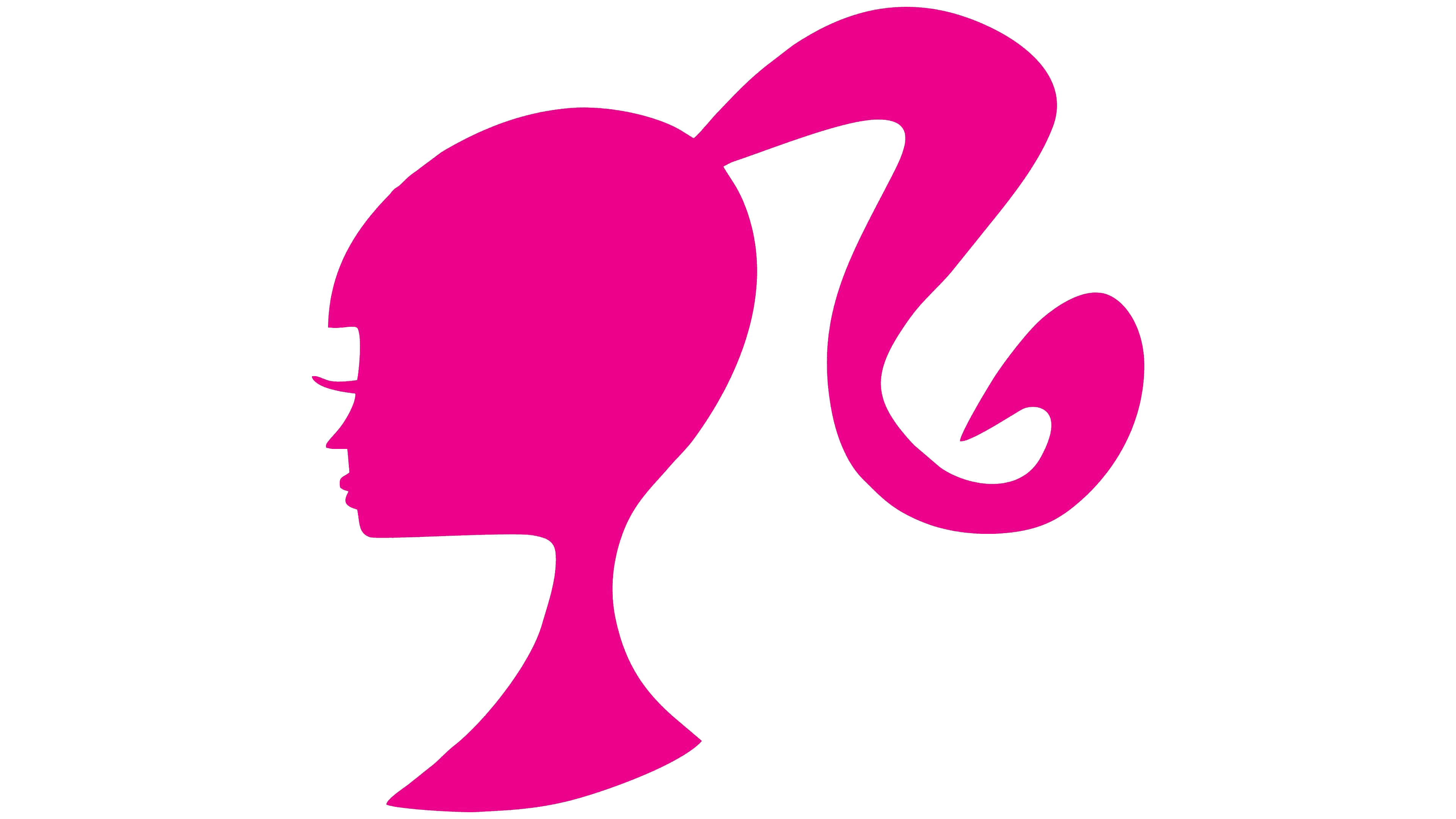
The brand has also had an additional image they used alongside the logo for years, even though it’s not used all the time. It’s a silhouette of the Barbie head facing left and painted completely in pink. Notably, she has a big ponytail and bigger-than-usual eyelashes in this image.


